
If you've ever wondered how designers at Apple defined every little element in iOS as they were building it, then you're in the right place. Ready to nerd out and get inspired all at the same time? I sure am. In this post, I'll be showing you examples of the version of these style guides for web designers, which we call digital style guides. What's a digital style guide, exactly? It's a manual that sets the design standards for a company's brand identifiers, like documents and signage. Its key purpose is to create auniversal design style for the
brand and ensure consistency across all channels and mediums. This is where you establish your logo, color palette, typography, imagery guidelines, and so on.
Style guides have always been a staple of design, with some print versions dating back to over 100 years ago. But as design for the web continues to become more formalized, style guides have begun to find their rightful place in the digital medium as well. They're especially useful for websites and products that need to produce top-notch user experiences.
But, as a UX designer myself, I've always been curious ... what can you find in the digital style guides of influential companies like Apple, Google, and Starbucks?
Believe it or not, a lot of companies actually make this information publicly available -- they just don't make it very easy to find. So, every time that I stumble across one, I bookmark it. Here are some of the best ones that I've found so far.
10 Examples of Awesome Digital Style Guides
1) Apple
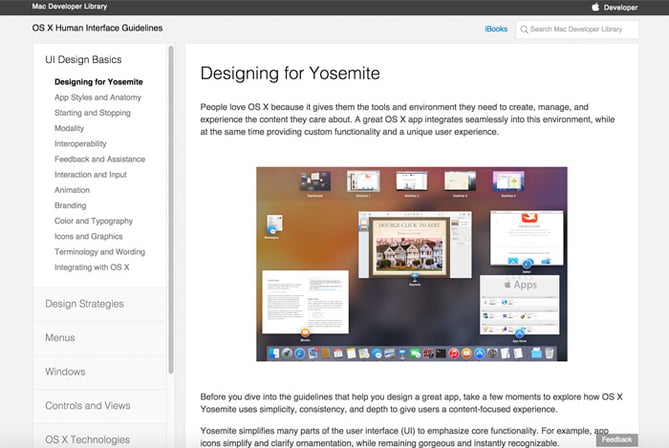
Apple's style guide is especially interesting because it details out how to design for an entire operating system. Yosemite, one of the latest versions of Apple's OS X, has a more simplified user interface than it's predecessor, Mavericks. Apple demonstrates this subtle-yet-palpable distinction with really nice graphical comparisons, and then goes on to talk about the rationale behind every single aspect of the operating system's design. It really gives you a window into the minds of the designers that created Yosemite.
2) Google
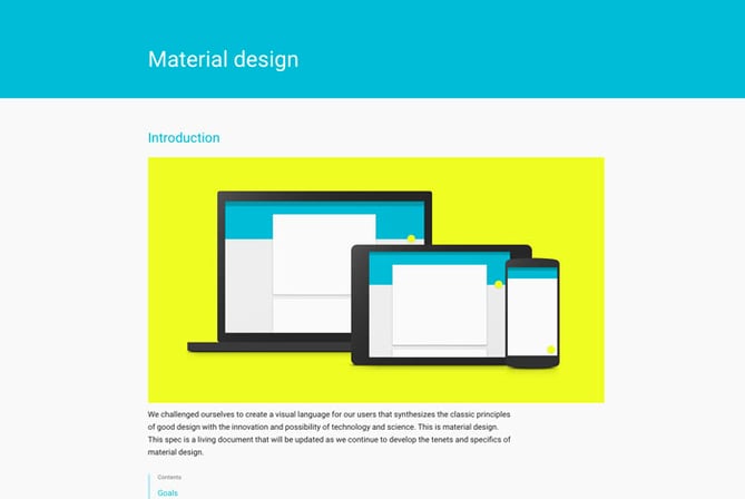
Google is pioneering a new design style called Material Design, which exists as a hybrid between Skeuomorphic Design (gradients, textures, light elements) and Flat Design (simple, colorful, geometrical). In doing this, they're hoping to scoop up the benefits that are associated with each design style, while avoiding the drawbacks. Because Google has been practicing Material Design for around a year now, you've probably already interacted with it in some capacity -- Google Calendar app, anyone? This style guide details out exactly what Material Design is and how Google uses it. I have to say that it is, by far, one of the best style guides that I've ever come across.
3) Starbucks
This is one of the most minimalistic style guides that I've seen -- and yet, it houses a ton of useful information. It places a heavy emphasis on code and you can tell that it was built by developers, for developers. It lacks brand-related elements, so it walks the line between website style guide and code library.
4) Atlassian
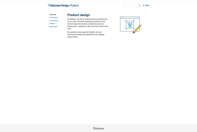
The product suite that Atlassian designs for is gigantic -- so, naturally, they have a gigantic style guide. From foundational elements (like color palette and typography), to components (like tables and tooltips), to a full-blown pattern library, this guide has just about everything that you would expect from a product of this size. Perhaps best of all, the rationale behind the entire style guide is summed up in three, deceptively simple sentences on the home page.
5) Mozilla
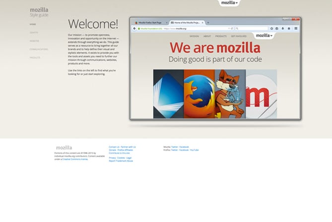
This style guide is primarily concerned with branding and communications. But with Mozilla taking a "privacy and open web" approach lately, it's cool to see how they reflect this in their design. They also structure their "do and don't" section in an interesting way, using green and red faces to distinguish between what designers should and shouldn't do.
6) Buffer
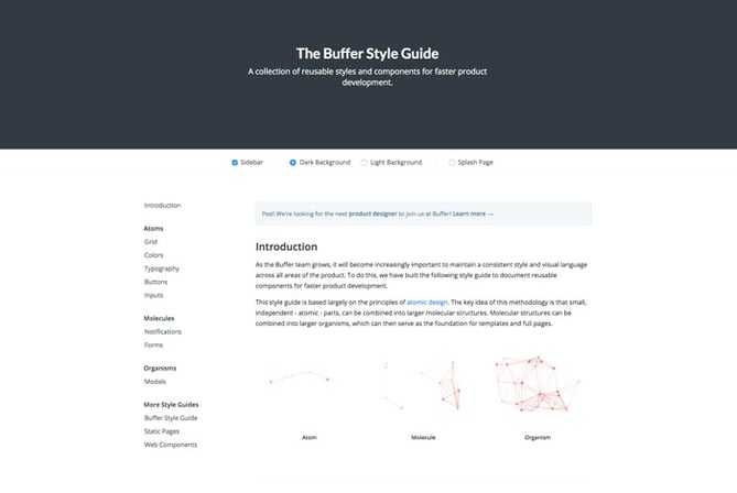
This style guide is unique in that Buffer uses Atomic Design -- which basically means that they build their designs in parts (atoms) and combine them into larger pieces (molecules), all of which make up the larger product (organism). Their style guide is small and concise, going from grid through modals all in one place.
7) Yelp
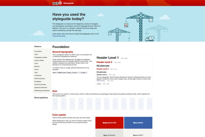
If you're looking for a solid example of a website style guide, Yelp's got that covered. This thing has it all: typography, layout, forms, containers, navigation, and code snippets for each piece. They do a really great job of explaining what each element is, where it should be used, and how it should be implemented. Also, if you want to check out their Brand Guidelines, you can do that, too.
8) GOV.UK
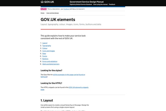
England's government services website has been widely heralded as a prime example of high quality UX. Why? Because it boasts simple and easy-to-use design that accommodates excessive amounts of information. If you're interested in what makes up a truly clean and effective design (hint: it usually starts with strong color usage, typography, and spacing), then GOV.UK's style guide is worth taking a close look at. Much like the site, it's very simple, but very informative.
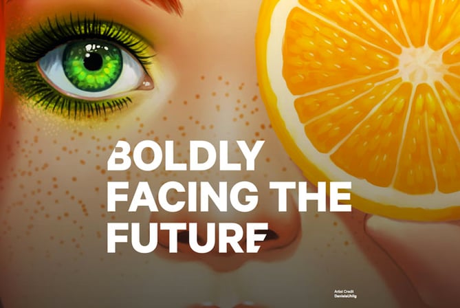
9) DeviantArt
The new DeviantArt style guide is really unique because it's more than just a guide -- it's an experience. It tells a story and leverages bold, full-width visuals to immerse the user in the emotional experience of the DeviantArt brand. That being said, it's strictly a branding style guide, so only items like color and typography are covered.
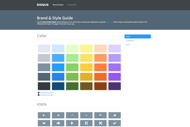
10) Disqus
Color, icons, typography, and logo ... that's it for this guide. But it's all presented in a very nice, organized manner. It looks like they built out a components section, but it's not longer visible. (Although it does direct you to a hilarious 404 page.) This guide could be used as a great example for "where to start" when creating a style guide of your own. It has all of the fundamentals.
Feeling Inspired?
Now it's your turn. By leveraging a digital style guide in your company, you can communicate your brand's design language to internal designers, agencies, advertising partners, and even customers.
Start with the basic foundational elements (color, typography, logo, imagery), add some usage guidelines ("do and don't"), and even incorporate some web components if you need to (modules, templates, code snippets). Use examples from other companies to learn from the best. Your team will be cranking out consistent designs in no time.