When it comes to organizing and designing websites, a constant challenge web designers are faced with is how to create content rich pages that look aesthetically pleasing to our visitors. If we just displayed all the content at once, it can become overwhelming to a customer or prospect that navigates to the page for the first time. That’s why this tutorial discusses how to implement expandable and collapsible accordions on your HubSpot COS pages.
Customer Use Case:
One of our clients is a medical collections company operating out of Sarasota, Florida. Time and time again, the company support team fields many of the same questions. To make it easier for customers to find the answers to these questions, they decided to implement a frequently asked questions page on their website.
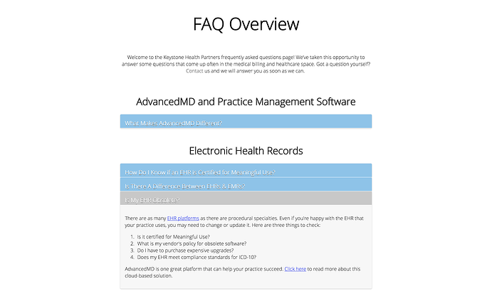
As you can imagine, there was a significant amount of content that needed to be added to this page. To accommodate this abundance of information, our team decided to implement expandable and collapsible accordions. This would allow the user to open and shut the accordions that were of interest to them while hiding the content in the other accordions from view (see the screenshot below).

How To Create Accordions on your COS Pages
The Modules
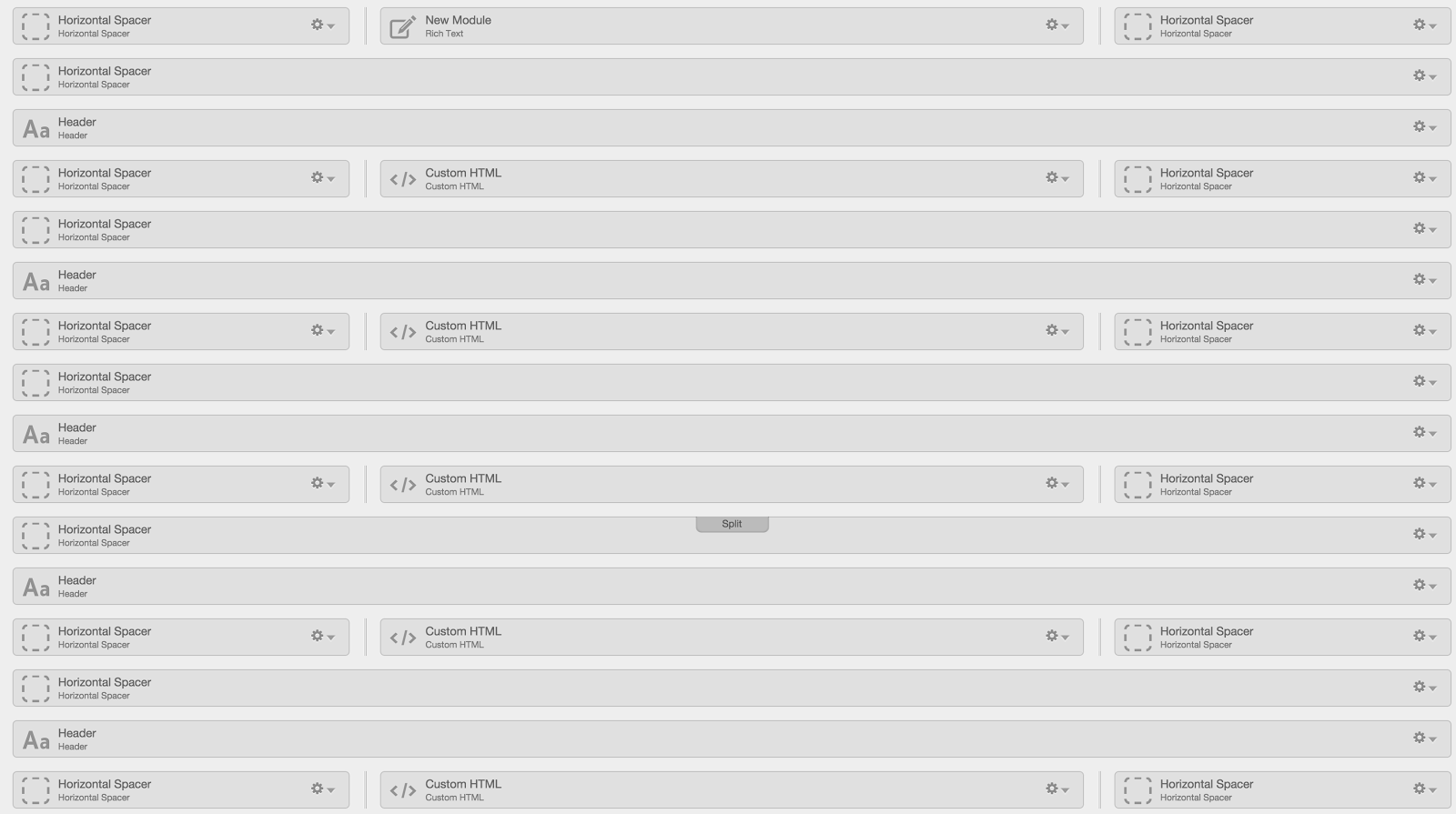
To set up the expandable and collapsible accordions, you need to use the custom HTML modules in the design manager. In our customer use case, we have 5 sections of accordions so consequently we have 5 different HTML modules set up in design manager.

The HTML
Once your modules are in place you will want to add the HTML code in site pages or landing pages.
<div class="accordion">
 <div class="accordion-section">
 <a class="accordion-section-title" href="#accordion-1">What Makes AdvancedMD Different?</a>

 <div id="accordion-1" class="accordion-section-content">

 <p>Your Content Goes In Here</p>

 </div><!--end .accordion-section-content-->
 </div><!--end .accordion-section-->
</div><!--end .accordion-->
The above HTML code snippet gives you all the appropriate id and class names to make the accordions work properly. Then, you can put in your own text or image content in between the p tags. To add multiple accordions, take the same code snippet and duplicate it, then increment up the numbers for the classes and ID’s by one. For example:
<div class="accordion">
 <div class="accordion-section">
 <a class="accordion-section-title" href="#accordion-2">What Makes AdvancedMD Different?</a>

 <div id="accordion-2" class="accordion-section-content">

 <p>Your Content Goes In Here</p>

 </div><!--end .accordion-section-content-->
 </div><!--end .accordion-section-->
</div><!--end .accordion-->div class="accordion">
 <div class="accordion-section">
 <a class="accordion-section-title" href="#accordion-1">What Makes AdvancedMD Different?</a>

 <div id="accordion-1" class="accordion-section-content">

 <p>Your Content Goes In Here</p>

 </div><!--end .accordion-section-content-->
 </div><!--end .accordion-section-->
</div><!--end .accordion-->
The CSS
Add the following CSS code below to your stylesheet in HubSpot. This will style the accordions appropriately for you. Feel free to change the text and background colors to match your website design:
.accordion, .accordion * {
 -webkit-box-sizing:border-box;
 -moz-box-sizing:border-box;
 box-sizing:border-box;
}

.accordion {
 overflow:hidden;
 box-shadow:0px 1px 3px rgba(0,0,0,0.25);
 border-radius:3px;
 background:#f7f7f7;
}

/*----- Section Titles -----*/
.accordion-section-title {
 width:100%;
 padding:15px;
 display:inline-block;
 border-bottom:1px solid #1a1a1a;
 background:#8bc2ea;
 transition:all linear 0.15s;
 /* Type */
 font-size:1.200em;
 text-shadow:0px 1px 0px #1a1a1a;
 color:#fff;
 text-decoration:none;
}

.accordion-section-title.active, .accordion-section-title:hover {
 background:#c8c8c8;
 /* Type */
 text-decoration:none;
}

.accordion-section:last-child .accordion-section-title {
 border-bottom-color:white;
 padding-bottom:2px;
}

/*----- Section Content -----*/
.accordion-section-content {
 padding:15px;
 display:none;
}
The Javascript
Now that you've set up the modules, HTML, and CSS, the Javascript (JS) is needed to actually animate the accordion behavior. The JS can be placed in a custom HTML module on the template, which should be placed as the very last module in the template (even below the footer).
<script>
$(document).ready(function() {
function close_accordion_section() {
$('.accordion .accordion-section-title').removeClass('active');
$('.accordion .accordion-section-content').slideUp(300).removeClass('open');
}

$('.accordion-section-title').click(function(e) {
// Grab current anchor value
var currentAttrValue = $(this).attr('href');

if($(e.target).is('.active')) {
close_accordion_section();
}else {
close_accordion_section();

// Add active class to section title
$(this).addClass('active');
// Open up the hidden content panel
$('.accordion ' + currentAttrValue).slideDown(300).addClass('open');
}

e.preventDefault();
});
});
</script>
Conclusion
This technique can be a great way to organize site and landing pages when you have a significant amount of content to display. In my past experiences, I have seen it work really well on FAQ pages, customer support pages help pages, and pricing pages. Let me know if you have any questions as you work through implementing this technique, as I would be happy to help. Happy HubSpotting!


