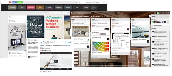
As a web designer and developer, you have probably heard about or implemented card design into your page layouts. This design trend was pioneered by Pinterest and was further thrust into the web design forefront when internet giants like Twitter started using this design technique for both their desktop and mobile layouts. Even Google has gotten into the game with Google Now. Now, it seems that card design is the norm, with products like Trello solely around card design. In this blog post, we will discuss what card design is about, and how to implement it on your HubSpot COS Website pages.
What is Card Design?
Before we jump into the nitty-gritty of how to implement card on your HubSpot COS Website pages, we will discuss a little bit about the design technique and the background on card design. A card is a design technique used to organize large amounts of content into more easily digestible pieces. It’s typical for cards to have things like images or rich media, headlines and subheadlines, brief body copy and a call to action button. A great way to think about cards is, each individual one has a unique idea or thought that it is trying to convey to the reader.
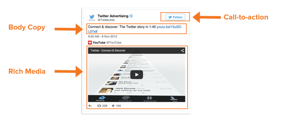
Twitter Card
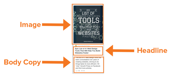
Pinterest Card
The rise of this design technique is apparent when you consider how well this design technique works in responsive frameworks like the HubSpot COS and Twitter Bootstrap. In these frameworks, the cards will collapse down into a single column when users view the websites on mobile devices. This flexible style of design can make your site more friendly across all devices, so let's dive into how to use this.
Customer Use Case
In one of our latest designs projects at Creatrix Marketing, we worked with a company called IBC International, a global shipping and logistics company. IBC, looking to update the aesthetics and professionalism of their website, wanted to tie into some of the design trends they were seeing other large brands utilize on the web. In order to segment IBC's solution offering, we decided to go with a flexible card design layout.
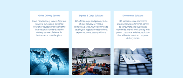
IBC International's Homepage: Card Design
Building Out Cards On Your HubSpot COS Website Pages
Building out cards on your HubSpot COS Website pages is a relatively easy process. In this blog post, we will look at the module configuration and the CSS needed to implement great looking cards on your landing pages and site pages.
Module Set
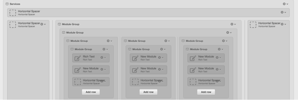
To create the cards on your COS website pages you want to follow the following steps:
-
Step One: Group the modules for your cards together. Each card is created through stacking these different modules in order of descending priority, and grouping them together.
-
Step Two: Create A Background Color: In our current design we used a white background color for the cards. However, you can set this background color to whatever you would like. This background color sets the card apart from the rest of the content on the page and helps to group the content of the card together.
The CSS
The CSS for the cards is a very important component of making the cards look and function well for both desktop, tablet, and mobile devices. Some of the key CSS code can be found below:
.service_box_text{
             min-height:290px;
             background-color:white;
             line-height:125%;
}

.arrow_box_home {
   position: relative;
            background: white;
            border: 4px solid white;
}

.arrow_box_home:after, .arrow_box_home:before {
            top: 100%;
            left: 50%;
            border: solid transparent;
            content: " ";
            height: 0;
            width: 0;
            position: absolute;
            pointer-events: none;
}

.arrow_box_home:after {
            border-color: rgba(255,255,255,0);
            border-top-color: white;
            border-width: 30px;
            margin-left: -30px;
}

.arrow_box_home:before {
            border-color: rgba(255,255,255,0);
            border-color: rgba(255,255,255,0);
            border-width: 36px;
            margin-left: -36px;
}
Code explained:
The .arrow_box_home class is the code that puts the small white triangle at the bottom of the service box that protrudes into the image below the box. The .service_box_text class sets the background color and makes sure that the boxes are all the same height regardless browser width and the amount of text in the box.
Note: Depending on the amount of body text in the card you might have to change the min-height setting at different browser widths (used media queries) to make sure that they boxes always remain a consistent height.
Voila, That's it!
This is a relatively simple design tactic that you can use that will help to spruce up your current HubSpot website pages and landing pages, and keep your designs looking up to date with the latest web trends. Remember to group the modules together for your cards, set a background color on them, and use a minimum height property to make sure the cards look consistent regardless of browser width or device size.
Let me know if you have any questions about how to layout cards or use CSS to style the cards in a way consistent with your style guide. I hope you enjoy this web page design technique. Happy HubSpotting!


