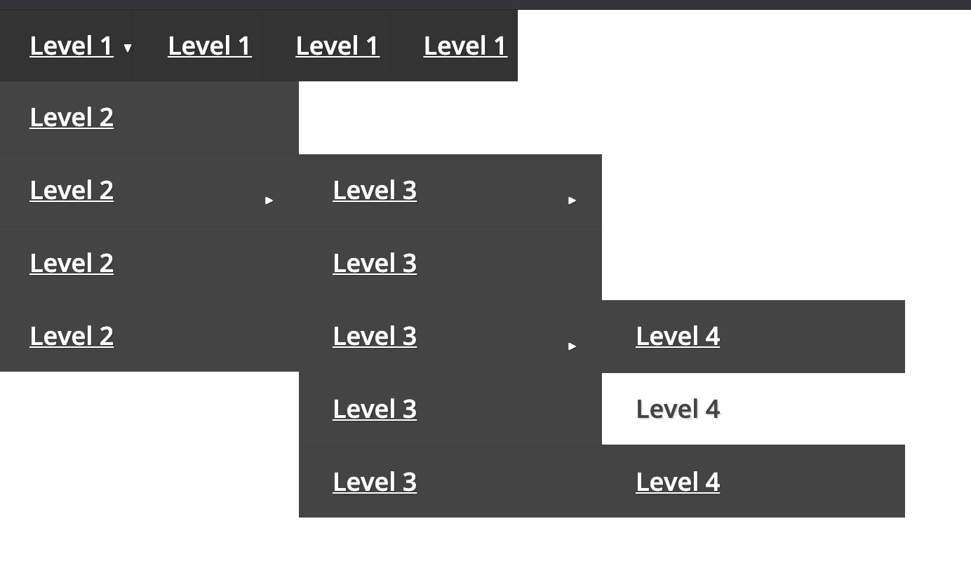
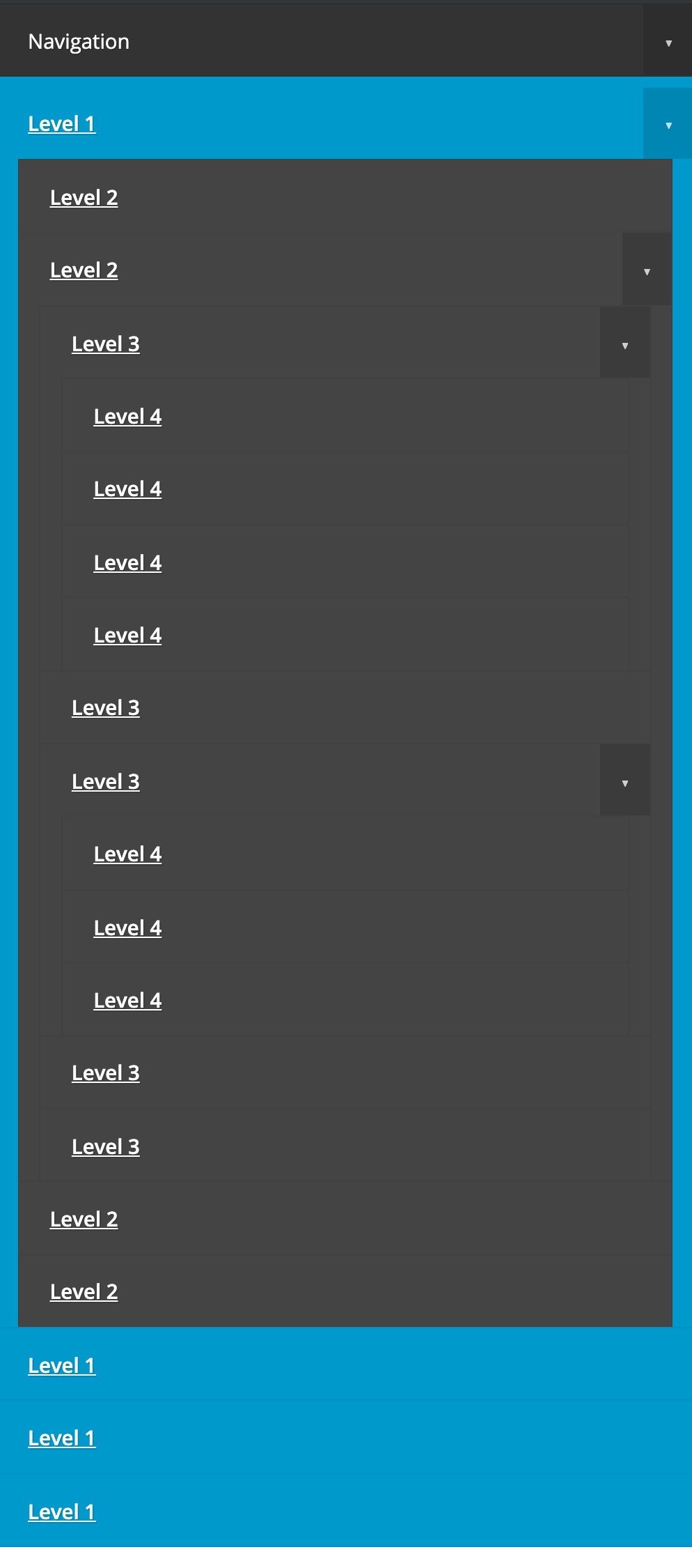
{%- macro render_link_item(link,depth,looop)-%}
{%- if link != [] && link.label -%}
<li class="menu-item menu-depth-{{depth}}{% if link.activeBranch %} active-branch{% endif %}{% if link.activeNode %} active{% endif %}">
  <a href="{{link.url if link.url else '#'}}">{{link.label}}</a>
  {%- if link.children -%}
  <span class="drop-icon">▸</span>
  <label title="Toggle Drop-down" class="drop-icon" for="sm{{looop}}_{{depth}}">▾</label>
  <input type="checkbox" id="sm{{looop}}_{{depth}}">
  <ul class="sub-menu">
    {% set depth = depth + 1%}
    {%- for sublink in link.children -%}
    {{render_link_item(sublink,depth,loop.index)}}
    {%- endfor -%}
  </ul>
  {%- endif -%}
</li>
{%- endif -%}
{%- endmacro -%}


{% set menu = menu(module.menu_field , "site_root").children %}

<nav id="menu">
  <label for="tm" id="toggle-menu">Navigation <span class="drop-icon">▾</span></label>
  <input type="checkbox" id="tm">
  <ul class="main-menu cf">

    {% for link in menu %}
    {{render_link_item(link,1,loop.index)}}
    {% endfor %}


  </ul>
</nav>
            #menu ul {
  margin: 0;
  padding: 0;
}

#menu .main-menu {
  display: none;
}

#tm:checked + .main-menu {
  display: block;
}

#menu input[type="checkbox"],
#menu ul span.drop-icon {
  display: none;
}

#menu li,
#toggle-menu,
#menu .sub-menu {
  border-style: solid;
  border-color: rgba(0, 0, 0, .05);
}

#menu li,
#toggle-menu {
  border-width: 0 0 1px;
}

#menu .sub-menu {
  background-color: #444;
  border-width: 1px 1px 0;
  margin: 0 1em;
}

#menu .sub-menu li:last-child {
  border-width: 0;
}

#menu li,
#toggle-menu,
#menu a {
  position: relative;
  display: block;
  color: white;
  text-shadow: 1px 1px 0 rgba(0, 0, 0, .125);
}

#menu {
  background-color: #09c;
}

#toggle-menu {
  background: #333;
}

#toggle-menu,
#menu a {
  padding: 1em 1.5em;
}

#menu a {
  transition: all .125s ease-in-out;
  -webkit-transition: all .125s ease-in-out;
}

#menu a:hover {
  background-color: white;
  color: #09c;
}

#menu .sub-menu {
  display: none;
}

#menu input[type="checkbox"]:checked + .sub-menu {
  display: block;
}

#menu .sub-menu a:hover {
  color: #444;
}

#toggle-menu .drop-icon,
#menu li label.drop-icon {
  position: absolute;
  right: 0;
  top: 0;
}

#menu label.drop-icon, #toggle-menu span.drop-icon {
  padding: 1em;
  font-size: 1em;
  text-align: center;
  background-color: rgba(0, 0, 0, .125);
  text-shadow: 0 0 0 transparent;
  color: rgba(255, 255, 255, .75);
}

@media only screen and (min-width: 1024px) {
  #menu .main-menu {
    display: block;
  }

  #toggle-menu,
  #menu label.drop-icon {
    display: none;
  }

  #menu ul span.drop-icon {
    display: inline-block;
  }

  #menu li {
    float: left;
    border-width: 0 1px 0 0;
  }
  #menu li.active-branch > a,
  #menu li.active > a {
    color:#02b4e6;
  }
  #menu .sub-menu li {
    float: none;
  }

  #menu .sub-menu {
    border-width: 0;
    margin: 0;
    position: absolute;
    top: 100%;
    left: 0;
    width: 12em;
    z-index: 3000;
  }

  #menu .sub-menu,
  #menu input[type="checkbox"]:checked + .sub-menu {
    display: none;
  }

  #menu .sub-menu li {
    border-width: 0 0 1px;
  }

  #menu .sub-menu .sub-menu {
    top: 0;
    left: 100%;
  }

  #menu .sub-menu .drop-icon {
    position: absolute;
    top: 0;
    right: 0;
    padding: 1em;
  }

  #menu li:hover > input[type="checkbox"] + .sub-menu {
    display: block;
  }
}
// No JS needed

This is a basic menu module to use as a starter for your own menus using the HubSpot menu() function.
Basic styling is applyed to accheave a dropdown effect on desktop and a hamburger style nav on mobile using only CSS.
You can then easily modify the html to fit your specific needs to build mega menus or other advanced features.

Find an entry with an issue, bug, or abuse?
Please complete the below information in detail and we will investigate.

Reporting as Luke Summerfield

Copyright © 2019 HubSpot, Inc.
 VIEW LIVE DEMO
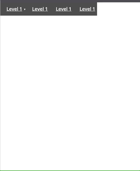


 Return to Top