HubSpot CMS

Hubspot Mobile Menu

This is a menu designed to work with the hubspot default menu system. It currently is only good for 2 levels of menu but can be expanded from there.

Created by: Chad Pierce

Tags: Menus and navigation

Unverified
?

After receiving a minimum of 25 recommendations, an entry earns the "Community Approved" badge.

Please keep in mind, all entries are community created and may not be fully supported by HubSpot.

4 Recommendations

View on:

GitHub

HTML + HUBL
<!-- HTML & HubL code goes here -->
<!--

	The only HTML you need is the wrapper class you are using for the main menu and the link class for the logo
	My scripts and css does the rest

 -->


<!DOCTYPE html>
<html lang="en">
<head>
	<meta charset="UTF-8">
	<title>Document</title>
	<link rel="stylesheet" href="style.css">
</head>
<body>
	<!-- // Logo HTML -->
	<!-- // Menu HTML -->

	 <script src="https://code.jquery.com/jquery-3.3.1.min.js"></script>
	 <script src="plugin.js"></script>
	 <script src="yourscripts.js"></script>
</body>
</html>
          
        
CSS
          
            /* HUBSPOT MOBILE MENU */
/* If you want to remove the css variables just
   replace the var name with the corrolatring color. */

   :root {
     --white: #fff;
     --color1: #4168b1;
     --color2: #eee;
     --color3: rgba(33, 59, 110, 0.9);
     --color4: #252525;
     --color5: rgba(0, 0, 0, .25);
     
   }
   *,*:before, *:after {
   		box-sizing: border-box;
   }
   .main-menu, .courtesy-menu {
     display: none !important;
   }
   .mobile-menu {
     display: block;
     overflow: auto;
     margin: 0 !important;
     position: fixed;
     top: 0;
     bottom: 0;
     left: 0;
     height: 100vh;
     width: 100%;
     max-width: 300px;
     background: var(--white);
     z-index: 2010;
     transform: translateX(-200%);
     transition: transform 0.25s cubic-bezier(1, -0.06, 0, 0.92);
   }
   .mobile-menu .logo {
     display: block;
     padding: 1rem;
     margin: 0;
     text-align: center;
     color: var(--color1);
   }
   .mobile-menu .logo svg {
     height: 80px;
   }
   .mobile-menu > ul {
     font-size: 0.8em;
     background: var(--color2);
   }
   .mobile-menu > ul a {
     padding: 0.25rem 1rem;
     font-size: 16px;
     line-height: 27px;
   }
   .mobile-menu > ul {
     display: block;
     padding: 0;
     margin: 0;
     list-style: none !important;
   }
   .mobile-menu > ul > li {
     display: block;
     width: 100%;
     border-bottom: 1px solid var(--color2);
   }
   .mobile-menu > ul > li > a {
     display: block !important;
     padding: 1em !important;
     white-space: inherit !important;
     max-width: 100% !important;
     text-overflow: inherit !important;
     line-height: auto;
     text-decoration: none;
     color: var(--color4);
     border-top: 3px solid transparent;
   }
   .mobile-menu > ul > li:hover > a,
   .mobile-menu > ul > li.active > a {
     color: var(--white);
     background-color: var(--color1);
   }
   .mobile-menu > ul > li > ul {
     display: block !important;
     position: relative !important;
     opacity: 1 !important;
     visibility: inherit !important;
     max-height: 0px;
     background: var(--color3);
     border-top: 0 none;
     box-shadow: none;
     overflow: hidden;
     list-style: none;
     margin: 0;
     padding: 0;
     -webkit-transition: max-height 0.125s ease-in-out !important;
     transition: max-height 0.125s ease-in-out !important;
   }
   .mobile-menu > ul > li > ul li a {
     padding: 0.5em 1em !important;
     width: 100% !important;
     color: var(--white);
     display: block;
     text-decoration: none;
   }
   .mobile-menu .hs-item-has-children {
     float: none !important;
   }
   .mobile-menu .hs-item-has-children:after {
     content: "";
     display: table;
     width: 100%;
     height: 0;
     clear: both;
   }
   .mobile-menu .hs-item-has-children > * {
     -webkit-box-flex: 1;
     -webkit-flex: 1 100%;
     -ms-flex: 1 100%;
     flex: 1 100%;
   }
   .mobile-menu .hs-item-has-children > a {
     display: inline-block;
     float: left;
     width: 80%;
   }
   .mobile-menu .hs-item-has-children > button {
     display: inline-block;
     float: left;
     width: 20%;
     line-height: 60px;
     border: 0 none;
     background: var(--color2);
     -webkit-appearance: none !important;
     outline: none !important;
   }
   .mobile-menu .hs-item-has-children > button svg {
     height: 16px;
     width: 16px;
   }
   .mobile-menu .hs-item-has-children > button.active {
     background: var(--color3);
   }
   .mobile-menu .hs-item-has-children > button.active svg {
     transform: rotate(180deg);
     fill: var(--white);
   }
   .mobile-menu .hs-item-has-children > button.active + ul {
     max-height: 1000px !important;
   }
   .mobile-menu .hs-item-has-children > ul.hs-menu-children-wrapper {
     width: 100%;
     display: block;
   }
   .mobile-menu .hs-item-has-children > ul.hs-menu-children-wrapper ul {
     display: none;
   }
   .menu-overlay {
     opacity: 0;
     -webkit-transition: opacity 0.5s ease-in-out;
     transition: opacity 0.5s ease-in-out;
   }
   .mobileMenuTrigger {
     display: block;
     border: 0 none;
     outline: none;
     position: fixed;
     padding: 5px;
     top: 1rem;
     right: 1rem;
     z-index: 2020;
     height: 50px;
     background: var(--white);
     width: auto;
     box-shadow: 0 15px 25px var(--color5);
   }
   .mobileMenuTrigger:focus {
     outline: none;
   }
   .mobileMenuTrigger svg {
     fill: var(--color3);
     width: 40px;
     height: 40px;
   }
   .menu-open {
     overflow: hidden;
   }
   .menu-open .mobile-menu {
     -webkit-transform: translateX(0);
     transform: translateX(0);
   }
   .menu-open .menu-overlay {
     background: var(--color3);
     position: fixed;
     top: 0;
     right: 0;
     height: 100vh;
     left: 0;
     z-index: 2000;
     opacity: 1;
   }
   .menu-open .mobileMenuTrigger {
     position: fixed;
     left: calc(300px + .25em);
     top: 1rem;
     right: 1rem;
     background: transparent;
     box-shadow: 0 0 0 transparent;
   }
   .menu-open .mobileMenuTrigger svg {
     fill: var(--white);
   }
   .hs-menu-depth-2.hs-item-has-children ul {
     display: none;
   }
   @media screen and (min-width: 768px) {
     .courtesy-menu, .main-menu {
       display: block !important;
     }
     .mobileMenuTrigger, .mobile-menu, .main-menu .hs-item-has-children > button {
       display: none;
     }
   }


JS
          
            //  Initialize The JS
$(function(){

	// ************************
	// Mobile Menu For Hubspot
	// See plugin.js for the script where this functions.
	//
	// Works As Below
	// -------------------
	// mobileMenu(< MENU WRAPPERS HERE >, < LOGO LINK HERE >);

	mobileMenu('.menu-wrapper-1,.menu-wrapper-2', '.logo-wrapper > a');

}());


Have Questions?

Ask technical questions in Slack.

HubSpot Developer Slack

Not a member yet? - join here
READ ME (VIEW IN GITHUB)

Mobile Menu For Hubspot Websites

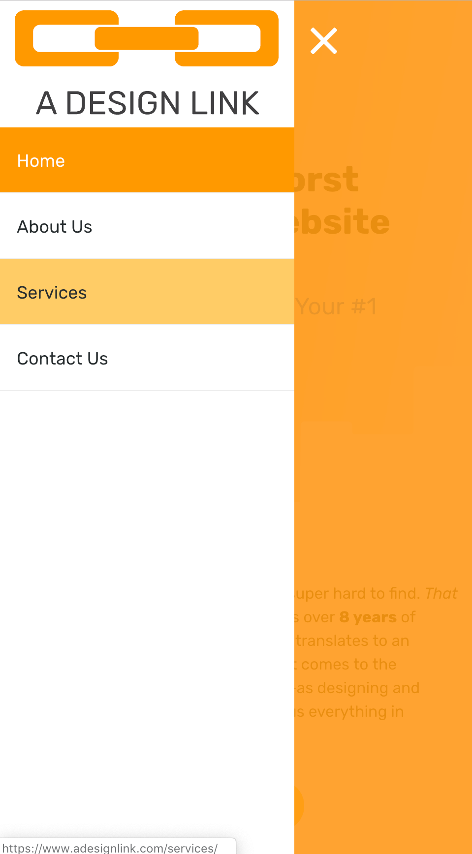
A mobile menu designed to work with the hubspot framework.

Installation

Add the plugins.js to your template. Then add the app.js to your template below the plugins file.

Once those two files are added change the mobileMenu script to match the classes you are using fo rthe menu and the logo of your website. mobileMenu('.menu-wrapper','.logo-class')

if you do not wish to add a logo to the menu you can just leave that part out. menuMobile('.menu-wrapper')

If you have a secondary menu you would like to add you can do so by seperating its wrapper with a comma like so: menuMobile('.courtesy-menu-wrapper, .main-menu-wrapper', '.logo-class')

Styles

The syles are added via the style.css file. You can add those css styles to your current stylesheet as well.

To change colors please just change this block.

    :root {
        --white: #ffffff;
        --color1: #4168B1;
        --color2: #EEEEEE;
        --color3: rgba(33, 59, 110, 0.9);
        --color4: #252525;
        --color5: rgba(0,0,0,.25);
    }

Future Additions

This menu is only good for 2 levels currently which is all I usually use. I will be updating it to include unlimited levels soon.

 
4 Recommendations

Chad Pierce

A Design Link

8+ Years developing on the HubSpot CMS. Javascript/HTML/CSS and design.

View Chad Pierce’s Gallery (2 Entries)

Other Open Source Projects

Browse all other open source projects

CrankShaft Framework

A modern framework for accelerating build times on the HubSpot CMS. Based on a modified Bootstrap 4 framework.

Lead developers: Jon McLaren

Developer Chrome Extension

Chrome/Chromium extension for HubSpot CMS Developers that adds a developer menu, dark theme and useful shortcuts to commonly used HubSpot query parameters, resources, and tools for making HubSpot Development easier and more enjoyable.

Lead developers: Jon McLaren , William Spiro , Gonzalo Torreras

VS Code HubL Language Extension

This extension enables super fast local development of CMS pages, and is a great compliment to using the new local HubL server. It contains comprehensive HubL tag, function, filter and expression test auto-complete snippets, as well as their documentation.

Lead developers: William Spiro

Not coding on HubSpot CMS yet?

We invite you to explore why thousands of developers LOVE coding with HubSpot!

Contribute
Made with  by community members: InboundLabs.co