CMS Reference

Table of contents
Close

HubSpot menu markup

Menu modules render navigation menus on your templates and pages, based on various settings and the menu trees tied to them. This article explains the markup that is outputted by menu modules and goes over some of the CSS selectors that can be used to style them.

There are two menu modules, the Menu module(formerly called Advanced Menu), and the Simple Menu module.

The key difference being the source of the menu information. The standard Menu module pulls the menu structure from Content Settings > Navigation. The Simple Menu module, displays the template default menu structure or the menu structure set at the page level(if one is set).

If you'd like full control over the menu markup, you should use the menu() function instead of the menu modules.

Menu markup explained

example menu

Like every other module in HubSpot, menu modules are wrapped in module wrapper markup. These div and span tags make the module editable via the content editor UI and include classes for the module type as well as drag and drop template's responsive grid. The menu markup of both the menu and simple menu modules is the same, with the exception of some of the classes applied to wrapper and menu div.

The actual menu renders as an ul wrapped in a class="hs-menu-wrapper" divThe hs-menu-wrapper div has additional classes based upon the menu modules settings. Within the ul each menu item is an a tag wrapped in a li. The li tag has a class that indicates the depth of the item in the menu tree (ex. hs-menu-depth-1). 

If the li item contains a nested child menu, it will have the additional class of hs-item-has-children. The child menu renders as a nested ul with the class hs-menu-children-wrapper. When you visit a page that is included in your menu tree, the class active-branch is added to the parent li items and a class of active is added to that page's particular li item.

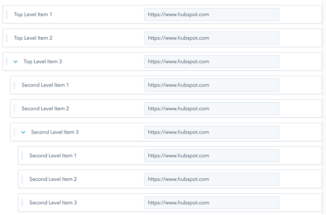
Below is the markup of the advanced menu tree depicted here.

Sample menu markup

    
<div id="hs_cos_wrapper_my_menu" class="hs_cos_wrapper hs_cos_wrapper_widget hs_cos_wrapper_type_module widget-type-menu" style="" data-hs-cos-general-type="widget" data-hs-cos-type="module">
  <span id="hs_cos_wrapper_my_menu_" class="hs_cos_wrapper hs_cos_wrapper_widget hs_cos_wrapper_type_menu" style="" data-hs-cos-general-type="widget" data-hs-cos-type="menu">
      <div id="hs_menu_wrapper_my_menu_" class="hs-menu-wrapper active-branch flyouts hs-menu-flow-horizontal" role="navigation" data-sitemap-name="default" data-menu-id="12514065329" aria-label="Navigation Menu">
       <ul>
        <li class="hs-menu-item hs-menu-depth-1"><a href="https://www.hubspot.com" role="menuitem">Top Level Item 1</a></li>
        <li class="hs-menu-item hs-menu-depth-1"><a href="https://www.hubspot.com" role="menuitem">Top Level Item 2</a></li>
        <li class="hs-menu-item hs-menu-depth-1 hs-item-has-children" role="menu"><a href="https://www.hubspot.com" aria-haspopup="true" aria-expanded="false" role="menuitem">Top Level Item 3</a>
         <ul class="hs-menu-children-wrapper">
          <li class="hs-menu-item hs-menu-depth-2"><a href="https://www.hubspot.com" role="menuitem">Second Level Item 1</a></li>
          <li class="hs-menu-item hs-menu-depth-2"><a href="https://www.hubspot.com" role="menuitem">Second Level Item 2</a></li>
          <li class="hs-menu-item hs-menu-depth-2 hs-item-has-children"><a href="https://www.hubspot.com" role="menuitem">Second Level Item 3</a></li>
         </ul>
        </li>
       </ul>
    </div>
  </span>
</div>
    

Classes added by settings

Advanced menu module settings control what markup gets rendered by HubSpot and add classes that be used to style certain menu features. The Advanced menu type and the Max levels settings control what parts of the menu tree render in the menu markup. Additionally, the Menu control selects which advanced menu to use.

The Orientation setting adds a class hs-menu-flow-horizontal or hs-menu-flow-vertical to the menu wrapper div. This class can be used in CSS selectors to style horizontal and vertical menus differently.

The Enable Flyouts? setting adds the class of flyouts or no-flyouts to the menu wrapper div. This class can be used in CSS selectors to target menus with or without dropdowns to hide them based upon this setting.

Styling menus

Below are some example CSS selectors that can can be used to style HubSpot menus. You can see some of these selectors in use with CSS declarations in HubSpot's Boilerplate CSS file


/* Menus */
.hs-menu-wrapper ul {
   /* Targets all unordered lists within HubSpot menus */
}

/* Horizontal Menu
   ========================================================================== */

.hs-menu-wrapper.hs-menu-flow-horizontal ul {
/* Targets all unordered lists within horizontal menus */
}
.hs-menu-wrapper.hs-menu-flow-horizontal ul li{
/* Targets all list items within horizontal menus */
}
.hs-menu-wrapper.hs-menu-flow-horizontal ul li a{
/* Targets all links within horizontal menus */
}
.hs-menu-wrapper.hs-menu-flow-horizontal > ul {
/* Targets the top-level unordered list within horizontal menus */
}
.hs-menu-wrapper.hs-menu-flow-horizontal > ul li.hs-menu-depth-1 {
/* Targets top-level list items within the top-level unordered list */
}
.hs-menu-wrapper.hs-menu-flow-horizontal > ul li a {
/* Targets top-level list links within the top-level unordered list */
}
.hs-menu-wrapper.hs-menu-flow-horizontal > ul li.hs-item-has-children {
/* Targets list items with children with the top-level unordered list */
}
.hs-menu-wrapper.hs-menu-flow-horizontal.flyouts > ul li.hs-item-has-children ul.hs-menu-children-wrapper {
/* Targets second-level unordered lists when flyouts are enabled (for styling dropdowns) */
}
.hs-menu-wrapper.hs-menu-flow-horizontal > ul li.hs-item-has-children ul.hs-menu-children-wrapper li a {
/* Targets links within second-level unordered lists  */
}
.hs-menu-wrapper.hs-menu-flow-horizontal.flyouts > ul li.hs-item-has-children ul.hs-menu-children-wrapper li.hs-item-has-children ul.hs-menu-children-wrapper {
/* Targets third-level unordered lists (for styling dropdowns)*/
}
.hs-menu-wrapper.hs-menu-flow-horizontal.flyouts > ul li.hs-item-has-children:hover > ul.hs-menu-children-wrapper {
/* Targets second-level unordered list when top-level menu item is hovered (use to reveal dropdowns) */
}
.hs-menu-wrapper.hs-menu-flow-horizontal > ul li.hs-item-has-children.active-branch{
/* Targets top-level active branch unordered list */
}
.hs-menu-wrapper.hs-menu-flow-horizontal > ul li.hs-item-has-children.active-branch > ul.hs-menu-children-wrapper {
/* Targets second-level unordered list within active branch */
}
.hs-menu-wrapper.hs-menu-flow-horizontal li.active a{
/* Targets the link within the active list item */
}

/* Vertical Menu
   ========================================================================== */ 

.hs-menu-wrapper.hs-menu-flow-vertical ul {
/* Targets all unordered lists within vertical menus */
}
.hs-menu-wrapper.hs-menu-flow-vertical ul li a {
/* Targets all list items within vertical menus */
}
.hs-menu-wrapper.hs-menu-flow-vertical ul li a {
/* Targets all links within vertical menus */
}
.hs-menu-wrapper.hs-menu-flow-vertical > ul {
/* Targets the top-level unordered list within vertical menus */
}
.hs-menu-wrapper.hs-menu-flow-vertical > ul li.hs-menu-depth-1 > a {
/* Targets top-level links in vertical menus */
}
.hs-menu-wrapper.hs-menu-flow-vertical > ul li.hs-item-has-children {
/* Targets top-level list items with children */
}


/* No flyouts
   ========================================================================== */ 
.hs-menu-wrapper.hs-menu-flow-vertical.no-flyouts .hs-menu-children-wrapper {
/* Targets child menus when flyouts are disabled */
}
.hs-menu-wrapper.hs-menu-flow-horizontal.no-flyouts > ul li.hs-item-has-children ul.hs-menu-children-wrapper {
/* Targets second-level child menus when flyouts are disabled */
}    

Mobile menus

While menus can be made "mobile-friendly" using purely CSS, creating dynamic mobile menus that support multiple levels of navigation requires the use of Javascript or clever CSS tricks. This tutorial describes the implementation of such a mobile menu using Javascript.