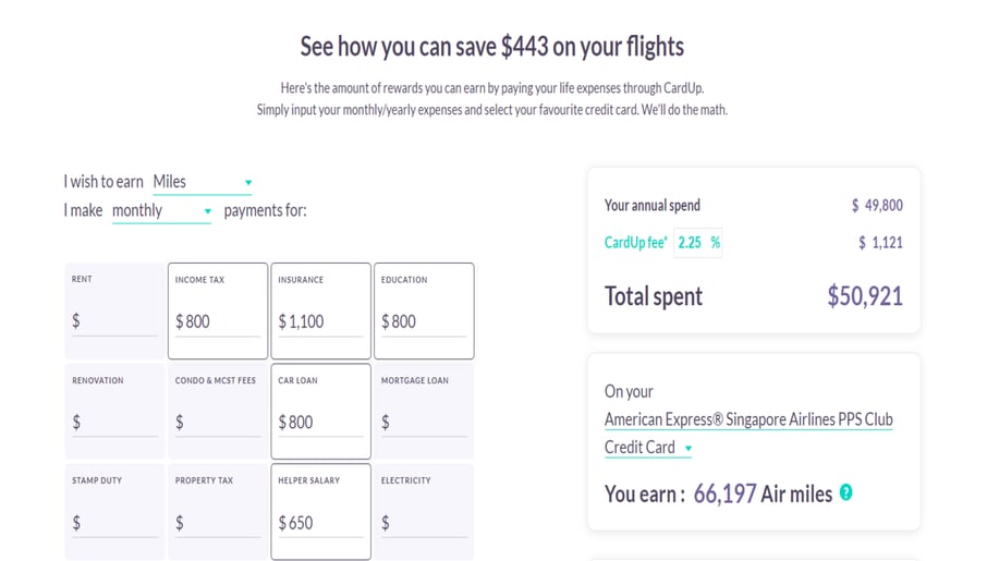
A User-Friendly Custom Calculator

A website page that provides users with comprehensive information on the rewards they can earn by using their card.

Details:

Company name:

Cardup

HubSpot Products:

Content Hub

Web Design Agency:

Name:

Reviews:

HubSpot Service Partner Tier:

Overview:

Cardup requested a website page that would provide users with comprehensive information on the rewards they could earn by using their card. Additionally, users should be able to calculate the rewards they could receive from using the Cardup card. The page was designed to be user-friendly and easily understandable. Straight growth created a page that ensured ease of use for all visitors by creating a well-organized and user-friendly page with clear navigation and a responsive design that could be easily browsed on any device, including desktops, tablets, and mobile devices. Users could quickly and easily check how much reward they could earn by using the Cardup card. To encourage visitors to take action, a "Get started" footer was also included on the page.

Problem the company had:

Before creating a dedicated rewards and benefits page, Cardup did not have a comprehensive way to inform their users about the perks and advantages of using their cards. As a result, many users were not fully aware of the card's potential benefits or how to take advantage of them.

The Hubspot Content Hub solution:

With the goal of enhancing the user experience and highlighting the various rewards and benefits offered by Cardup, the Straight Growth team has completely revamped the Cardup website page. The team has developed a user-friendly platform that enables users to calculate their own rewards and understand the full range of benefits associated with their Cardup card. The new page has been optimized for mobile devices, making it simple and intuitive for users to navigate and use on their smartphones and tablets. As a result of this redesign, Cardup customers now have easy access to information about the rewards and benefits available to them, enabling them to make more informed decisions and get the most out of their card usage. Overall, the new page represents a significant step forward in providing a more engaging, rewarding, and accessible experience for Cardup users.

Results:

The improved user experience and transparent information about rewards and benefits, contributed to increased user satisfaction, engagement, and ultimately, increased card usage and customer retention for Cardup. With higher levels of engagement and more satisfied users, Cardup had seen an increase in sales and revenue.

Details:

Company name:

Cardup

HubSpot Products:

Content Hub

Web Design Agency:

Name:

Reviews:

HubSpot Service Partner Tier:

More Financial Services HubSpot Content Hub website examples:
Connecting Teams with Fractional Financial ServicesConnecting Teams with Fractional Financial Services
Financial Services
Company: Savvy CFO
Agency: SmartBug 🚀 Largest, Most Decorated Elite Partner
Discover how SmartBug created a dynamic, interactive online presence for Savvy CFO, a fractional professional services provider.
Providing Premier Real Estate Loans in CaliforniaProviding Premier Real Estate Loans in California
Financial Services
Company: Herzer Financial
Agency: SmartBug 🚀 Largest, Most Decorated Elite Partner
Learn how SmartBug Media® accomplished a complete overhaul of our client’s online presence in private money lending with dynamic modules, iconography, and UX.
New website supports unparalleled growth New website supports unparalleled growth
Financial Services
Company: Allica Bank
Agency: Blend | The HubSpot Website Agency
Allica Bank wanted to enhance their online presence through a new website. The goal was to communicate their solutions' value, boost their brand image, and create a scalable platform for growth.
A CPA and Advisory Firm Website Redesign and RebrandA CPA and Advisory Firm Website Redesign and Rebrand
Financial Services
Company: Herbein - CPAs and Advisors
Agency: Stream Creative
HubSpot website redesign for an award-winning accounting firm. Our focus was to create a modern design that prioritizes user experience and a clean site structure. The redesigned website highlights the firm's services and company culture.
Creation of Multilingual landing page with creative designCreation of Multilingual landing page with creative design
Financial Services
Company: C2 Corner
Agency: Straight Growth
A unique and engaging landing page that effectively communicates C2's message and allows users to test their eligibility by filling out a single form.