Websites have evolved dramatically in the last 15 years as technology advancements have enabled consumers to view the internet on their mobile phones. This mobile evolution has driven the need for online marketing strategy to advance similarly for those that wish to reach prospects and customers effectively online. This post illustrates how website homepages, in particular, have completely changed their strategy and layout, and why these changes allow your website's home page to serve visitors so much more effectively than they did at the turn of the century.
The Evolution of Web Design Over The Last 15 Years
First Turning Point - The Turn of the Century Brought Mobile Viewing
Before smartphones, websites were only viewed from a fairly standardized monitor resolution. Whether you viewed the internet from your PC or laptop, the screen size was relatively static and consistent. Homepages in particular were much different than they are today. Positioning your homepage content 'above the fold' was standard practice as putting all of your content on the viewable screen made it easier on viewers to find what they were looking for. Accordingly, website design strategy was built around this technology.
In the early 2000's, the rise of smartphones brought the need for 'mobile viewing', and changes in technology led the demand for the evolution of homepages:
In early 2000, the Ericsson R380 was released by Ericsson Mobile Communications, and was the first device marketed as a "smartphone". - Wikipedia
In 2007, Apple Inc. introduced the iPhone, one of the first mobile phones to use a multi-touch interface. The iPhone was notable for its use of a large touchscreen for direct finger input as its main means of interaction, instead of a stylus, keyboard, or keypad typical for smartphones at the time. 2008 saw the release of the first phone to use Android called the HTC Dream (also known as the T-Mobile G1). - Wikipedia
Because websites needed to look completely different on phones, webmasters raced to create alternative versions of their client's existing websites. Enter the mobile website, and it's swift advancement in features throughout the first decade of the new century. These alternative versions were aided by technological developments that allowed websites URLs to provide different displays for different devices. If a website was viewed from a monitor it would display the traditional site whereas visits from a smartphone would display a thinner, longer page. This longer page had the elements of a traditional website tiled vertically to display elements in a format large enough to be viewed properly. While this advancement solved the visitor's viewing dilemma, it presented a whole new set of challenges and costs for the companies trying to market their business online.
Second Turning Point - The Tablet Computer
When Apple released the iPad in 2010, the way people viewed websites forever changed. The tablet computer's 'in-between' screen sizes offered portrait and landscape viewing, creating serious challenges with the traditional desktop monitor and mobile display options. Once again, technology was going to have to change if websites were going to serve visitors properly across all of their devices. This paved the way for responsive website design technology, which leveraged intelligent design and development to allow websites to recognize and respond to the device that was viewing them.
Responsive web design is an approach to web design aimed at crafting sites to provide an optimal viewing experience—easy reading and navigation with a minimum of resizing, panning, and scrolling—across a wide range of devices (from desktop computer monitors to mobile phones). - Wikipedia
State of the Union in 2015 - Homepages, they Have A-Changed
Today, homepages have evolved far from 15 years ago when content had to live above-the-fold. Responsive website design technologies and mobile viewing devices like smartphones and tablets allow for a different user experience than at the turn of the century. With the average consumer's extensive use of these technologies, visitors have naturally adapted to the need to scroll vertically and are therefore willing to scroll 'below the fold' on their desktops as well.
Marketers have responded with new strategies, bringing more of the website's content 'forward' to the homepage. Now websites present much of the information that used to live on sub-pages right up front, below the 'traditional fold lines'. Modern homepage design offers insights, calls-to-action, and navigation options for the entire website, well beyond the primary navigation architectures.
Why Your Website Has To Be Modernized
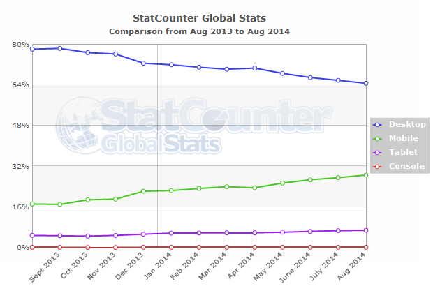
More and more website visits are coming from mobile devices, and today's consumers have high expectations.
As of last September, the use of mobile devices to access the internet has increased by 67% worldwide over 12 months according to StatCounter, the independent website analytics company.
If you want to convert those visitors into leads and customers, you have to appeal to their needs and expectations with a sound strategy for your website design. Serving your prospects and customers in today's mobile world requires an update to your website that is on par with the very best the web has to offer. Whether you built your website in 2000 or 2010, it simply isn't equipped to handle today's technology requirements. You need to implement the latest user-experience strategies and development technologies if you want to serve your visitors effectively. As Comscore illustrates, we're past the mobile tipping point.

A Before And After Example
Let's take a look at an example. By taking a look back in time with the use of https://web.archive.org/, we evaluate how M-Scribe Technologies addressed the need to modernize their homepage with the rise of mobile viewing demand. Below, their old homepage primary view shows the entirety of their content, meaning no vertical scroll is necessary to see all of their content from a PC. While this presentation is acceptable from a desktop, the mobile viewing experience was considerably flawed, requiring horizontal and vertical scroll to view their content.

Comparing this to their current homepage design, viewers can see vast improvements. Their homepage now requires vertical scroll to view the site from all viewing devices, including from a PC. The site contains more content and more visual representation of both services and educational resources. The site also responds to viewing devices, as the following screenshots illustrate. While the need to scroll vertically still exists, the need to scroll horizontally has been eliminated and the site reformats for each device.
Complete Homepage Desktop Experience

iPhone Portrait View

iPad Landscape View

So, What Do You Do From Here?
Now is the time to evaluate your website with these modernization needs in mind. Start by seeing how your website looks on different devices using our responsinator page. If you'd like to see how the latest responsive web design technologies can be used to update your website, check out our content optimization system page.


