This post originally appeared on the Inbound Hub Marketing section.
Pablo Picasso once said, "Why do two colors, put one next to the other, sing? Can one really explain this? No. Just as one can never learn how to paint."
Ladies and gentlemen, Picasso was wrong.
You actually can figure out why “two colors, put one next to the other, sing.” Or, more accurately, you can figure out why some color combinations work (i.e., look good) and why other color combinations don’t work (i.e., look terrible).
I realize that Picasso probably meant “one can never learn how to paint” in a less literal, more philosophical way. As in, you can’t teach someone to have a sense of style or how to develop artistic sensibilities; that there is some innate, incomprehensible trait that some people have and some people don’t.
It would seem, according to Picasso’s quote, that being able to determine what colors look good next to each other is a talent you’re born with, and not something you can learn.
Again, I would disagree.
From a scientific standpoint, it’s certainly plausible that some people are genetically predisposed to being good at art and design. But I’d argue that the "10,000 hours theory” makes that notion irrelevant. For those unfamiliar with the 10,000 hours theory, it states that anyone can become a master of a particular skill provided that they practice that skill for, approximately, 10,000 hours during their lifetime.
So, while Picasso may have been born with some level of predisposition toward being good at painting, the primary reason why he was so good is quite simple: he painted a lot. And if you practice a lot, you can get better at picking the right color palettes, too.
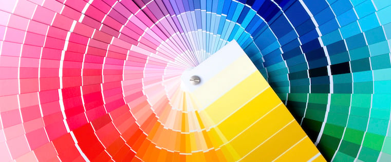
Practice Makes a Perfect Palette
Now that we’ve thoroughly ripped apart a quote from one of history’s most famous artists, let’s get practicing!
In the rest of this article, I’ll walk you through seven, real-word examples of color palettes on the web. For each example, we’ll see if you can guess which company or brand the color palette comes from. Then, we’ll dive into the color theory behind what makes a particular color palette work (or not work, if that happens to be the case).
Note: Be sure to scroll down nice and slow so you have a chance to guess before revealing the answer!
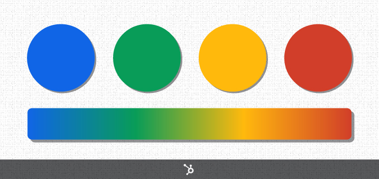
Example #1: Understanding Different Color Models
Alright, here we go: Which website does the color scheme below come from?
Scroll down to see if you’re right!
.
.
.
.
.
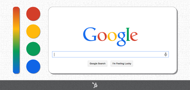
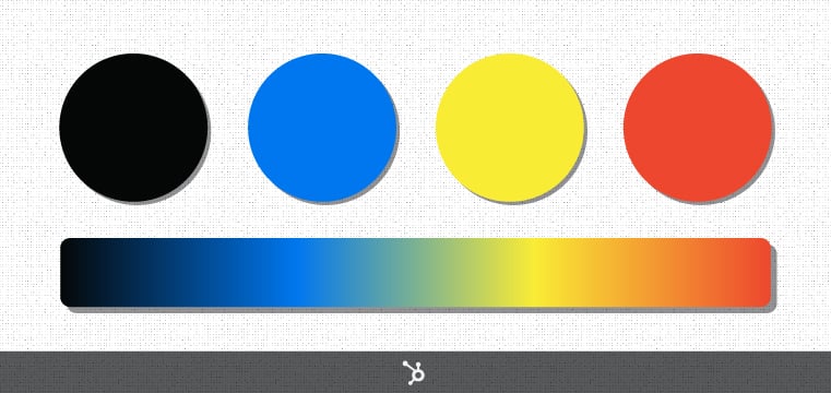
Of course, that blue, green, yellow, and red color palette belongs to none other than the great Google.
Even without having any previous education around color theory, there are some basic lessons we can take away from this palette on how different color models work.
For starters, you may have noticed that the red, blue, and yellow in Google's palette are primary colors -- colors you can mix together to form all of the other colors. So, to create green -- the only secondary color in Google’s color palette -- one simply needs to mix blue and yellow together.
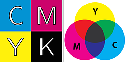 Now, if we were mixing blue and yellow paint, that idea of "mixing" would hold true. But that’s because the world of painting (and printing) adheres to the CMYK — cyan (blue-ish), magenta (reddish), yellow, and key (black) — color model. Essentially, this color model is comprised of the three primary colors plus black, the latter of which is used for creating darker versions of colors.
Here’s where things can get a little confusing: CMYK is a subtractive color model, which means colors are created through absorbing, or subtracting, particular wavelengths of visible light. The wavelengths of light that don’t get absorbed are reflected, and that reflected light ends up being the color we see.
So, using this model, you could argue that a green object isn’t really green at all: it’s simply an object that’s reflecting the wavelength for green and absorbing the wavelengths for all the other colors.
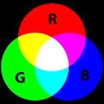 With me so far? Great! Because the colors you saw in the above example weren’t created using the CMYK color model: they were created using the RGB (red, green, blue) color model, which is the model that computers, televisions, and other electronic devices use. Unlike CMYK, RGB is an additive model. Red, green, and blue light waves are added together in particular combinations in order to produce colors.
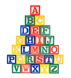
So while the green in Google's color palette is a secondary color in the CMYK system, it’s actually a primary color in the RGB system. And overall, Google’s color scheme does feel very primary; or basic. Like preschool or kindergarten. (I always think of those wood blocks with the letters painted on them when I see Google’s colors.)
Alright, that’s enough with the CMKY / RGB stuff -- it's just to give you a reference point for later on in the post. Let's move on to the next example.
Example #2: Hue, Shade, Tint, Tone & Saturation
What company's website does the color palette below belong to?

Scroll down to see if you’re right!.
.
.
.
.

Twitter’s color palette provides us with a superb example of a monochromatic color scheme. Instead of thinking of the gray, dark blue, and light blue in Twitter’s palette as separate colors, think of them as different flavors of the same color. Or more accurately, different flavors of the same hue.
Let’s run through some terminology real quick and this will all start to make a lot more sense:
Hue: What we usually mean when we talk about color. The hue is the overarching, discerning quality of a color (e.g. “red” or “blue”).
Shade: What you get when you add black to a particular hue (e.g. dark blue is a shade of blue).
Tint: What you get when you add white to a particular hue (e.g. light blue is a tint of blue).
Tone: What you get when you add both black and white — a.k.a. gray — to a particular hue (e.g. pastel blue is a tone of blue).
Saturation: While “tone” is a popular painting term, in the world of graphic design you’ll be more likely to encounter the term “saturation” when dealing with adding gray to color. More specifically, saturation defines a range of color starting with gray (0% saturation) and ending with a pure, gray-less form of the color (100% saturation). Desaturated colors are softer, and potentially duller in comparison to their highly saturated counterparts, which are more vivid.
Now, back to Twitter: Let’s use the blue from the logo, the lighter blue, as our reference point. That’s our hue. That’s “Twitter blue.” The darker blue is simply a shade of that Twitter blue, yet it has a higher saturation, making it a bit more vivid and eye-catching (which makes a whole lot of sense considering Twitter is using that blue to draw attention to their primary CTA: “Tweet”).
The gray used for the icons is also a shade of the Twitter blue, but it has a considerably lower saturation (around 20%).
All said and done, we can describe Twitter’s color scheme as being monochromatic. The colors all look good next to each other because they all have the same root color in them: it’s just the shading, tinting, and saturation levels that make them different.
This is in stark contrast to Google’s polychromatic color scheme, where there are four distinct hues and no root color binding them all together. So, why do Google’s colors still seem to mesh and look good next to each other? A key reason is because they all have similarly high saturation levels.
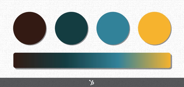
Example #3: Determining a Color Scheme
Aright, on to our next example. Whose website does this color palette come from?
Scroll down to see if you’re right!
.
.
.
.
.
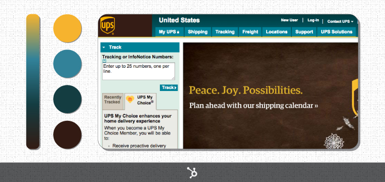
This one was a bit trickier. While most of us are familiar with UPS’s famous (and trademarked) brown, that blue may -- at first glance -- seem to come out of left field. But regardless of whether or not you like that blue color, there's a clear reason why UPS chose it: It's complementary to the brown.
In the world of color theory, complementary colors are pairs of colors that sit directly across from each other on the color wheel. When you put complementary colors next to each other in a design, they create a high degree of contrast (i.e., both colors really stick out) and the result is usually quite harmonious.
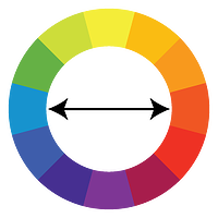 Now, there's one more piece to this UPS complementary color puzzle: Where the heck do you find brown on the color wheel?
The answer: brown is actually just a shade -- or darker version -- of reddish-orange. So to find brown's complement, you first need to find reddish-orange on the color wheel. And when you do that, you'll see that blue appears right across from it.
Of course, complementary colors aren't the only combination of colors that can make for a pleasing palette. There are also ...
- Analogous colors, which are colors that appear next to each other on the color wheel.
- Triadic colors, which are three colors that are evenly spaced around the color wheel.
- Split-complementary colors, which consist of a base color plus the two colors that are adjacent to the base color's complement on the color wheel.
Here's a little diagram to help you understand these better:
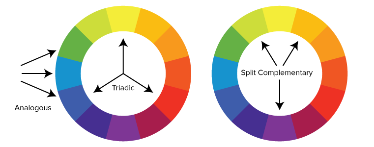
Now, truth be told, there are several other types of color combinations that are based on the color wheel -- these are just the most basic. (If you're looking for a deeper dive, check out the Tiger Color website.)
The main takeaway here is that the observable qualities of colors (e.g., hue, shade, tint, etc.) aren't the only factors that affect how colors interact. By understanding how different colors are oriented on the color wheel, you'll be able to make more harmonious color choices.
Example #4: Color and Branding
Which company's website does the color palette below come from?
Scroll down to see if you’re right!
.
.
.
.
.
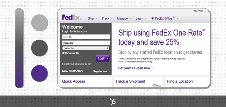
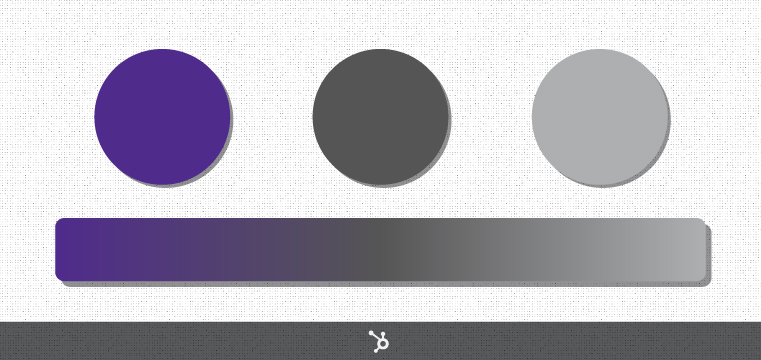
Whereas UPS added a new color (blue) to its typical brown and yellow color palette when designing their website, rival FedEx did the opposite: FedEx removed the orange that we usually see on their trucks and instead doubled down on the purple.
As a result, UPS's and FedEx's website color palettes couldn't be more different. While UPS has this whole earth-tone vibe going on, using colors that could appear in nature, FedEx has more of a "strictly business" vibe. Their monochromatic scheme uses purple as the sole accent color, which also adds to this palette's inorganic, corporate feel, as the color purple rarely occurs in nature (some folks even claim that purple is an artificial color).
The takeaway here: Remember that your website's color palette can affect how people perceive you and your business. Different colors correlate to different emotions. Brown, for example, is commonly associated with ruggedness and dependability. Purple, meanwhile, is associated with authority and sophistication.
We'll explore the relationship between color and psychology a bit further in the examples to follow.
Example #5: Pairing Complementary Colors
Which popular news website does the color palette below come from?
Scroll down to see if you’re right!
.
.
.
.
.
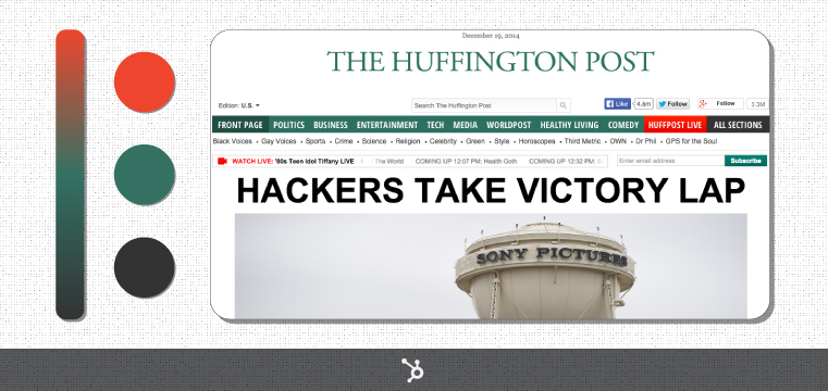
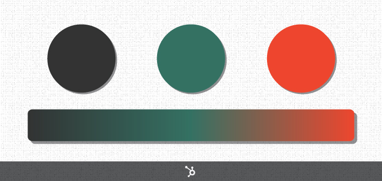
Ah yes, HuffPost green. From a psychological perspective, the color green is associated with balance, harmony, and reassurance (making it a good choice for a news website, no doubt).
However, HuffPost's green is notably dark and desaturated -- like a pine green -- which means it's also associated with wealth and ambition.
Now, how about that red? Red is the most emotionally charged color, tied to passion and love and hate and all that good stuff. So, when we look at HuffPost's homepage, it's not surprising that our eyes are immediately drawn to those two red call-outs: the "Watch Live" call-out on the left and the "HuffPost Live" call-out on the right.
Another reason why the red really pops in this situation? It's complementary to the green.
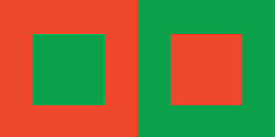
Interestingly, it's a general rule in design that you should avoid pairing red with green, despite their complementary relationship on the color wheel. For starters, this is because seeing red adjacent to green creates a Christmasy feel that most designers try to avoid. Unless, ya know, they're designing Christmas stuff.
 A second reason why you should avoid pairing red with green: People suffering from color blindness -- specifically deuteranopia, which is the most common form of color blindness -- can have trouble distinguishing between the two colors.
A third reason: Red and green often "compete" with each other for visual attention when they're paired together, which results in both colors appearing brighter than usual (see left).
 The designers behind HuffPost's color palette were certainly aware of these phenomena, which is why A) they use the red very sparingly in the design, and B) they chose a dark, desaturated green, which plays nicer with the red (see right).
Example #6: Deep Saturation and Primary Colors
Which popular website does the color palette below come from?
Scroll down to see if you’re right!
.
.
.
.
.
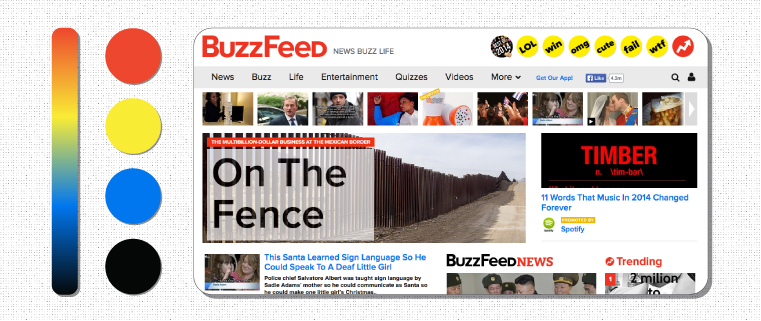
The first few words that come to mind when looking at BuzzFeed's color palette include "bright," "vivid," "in-your-face," and "stop-what-you're-doing-right-now-and-read-this-OMG-OMG-OMG!!!"
Clearly, BuzzFeed's goal with this color palette is to attract our attention. But in terms of color theory, what's going on here?
For starters, BuzzFeed -- like Google -- uses primary colors: red, yellow, and blue. But BuzzFeed's red, yellow, blue are brighter and more deeply saturated, and thus more eye-catching.
Also, if we ignore that black (which isn't really a color, per se, but is rather what results from the total absence -- or total absorption -- of visible light waves), we could say that BuzzFeed uses a triadic color scheme, as red, yellow, and blue are spaced out evenly around the color wheel.
In terms of color psychology, red (as I mentioned in the previous example) is the most emotionally charged color around, so it's not surprising that BuzzFeed employs it in their logo: They want you to feel energized and excited.
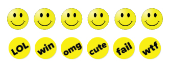 Yellow, another prominent color in BuzzFeed's palette, is associated with both energy and happiness. And speaking of happiness ... doesn't that row of yellow circles with the black text at the top of BuzzFeed's homepage remind you of a row of smiley faces?
The blue in BuzzFeed's color palette is reserved exclusively for links and call-to-action buttons, which is a smart move. Blue, you see, is associated with calmness and trustworthiness. So, amidst all the emotional chaos of BuzzFeed's red and yellow, the blue links feel inviting, as if to say, "Don't worry, we know it's crazy here, but you can trust us! Go ahead, give us a click!"
Example #7: Desaturated Palettes
Alright, it's time for our final example: Which popular website does the color palette below come from?
Scroll down to see if you’re right!
.
.
.
.
.
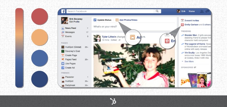
If you had trouble figuring out that the above palette was from Facebook, don't feel bad: I deliberately made it a little tricky by including the red and the yellow.
Truth be told, if you scroll around Facebook, you'll see that they employ a variety of colors, especially when it comes to sidebar icons. (For our purposes, I focused specifically on the icons near the top of the page in order to extract the yellow and the red.)
Now, this is where my master plan comes together: Take a look at the Facebook color palette, then scroll back up to BuzzFeed's. Both sites employ yellow, red, and blue in their colors schemes ... yet the schemes couldn't feel more different!
By now, you're probably able to explain why this is. But let's run through it together just for funsies.
For starters, Facebook employs a few different shades of its iconic blue (just like Twitter does). It's an easy way to add some contrast to a design without veering off into an entirely different stylistic direction.
However, the main culprit here is saturation: Facebook's yellow, red, and blue are all desaturated to a similar degree. And as a result, they all feel calm and relaxed. Whereas seeing BuzzFeed's color palette feels like taking a shot of espresso, seeing Facebook's palette feels like getting wrapped up in a cozy blanket.
Of course, the way the two sites employ their colors is very different. With BuzzFeed, blue -- a color that instills trust and calmness -- only appears on links. With Facebook, there's a fixed blue bar running right across the top of the site, so those feelings of trust and calmness are ever-present.
All said and done, Facebook's muted, blue-centric color palette makes us want to kick off our shoes and relax a while. And considering the average American spends about 40 minutes each day checking Facebook, those color choices seems to be working out.
Have some color theory wisdom you'd like to share? Sound off in the comments section below!