
This post originally appeared on HubSpots's Marketing Blog
You never get a second chance to make a first impression -- that’s why your homepage is undoubtedly one of the most important web pages on your website.
For any given company, the homepage is its virtual front door. If a new visitor doesn't like what they see, their knee-jerk reaction is to hit the "back" button.
That's right -- unfortunately, a lot of people still judge a book by its cover.
What makes a website's homepage design brilliant instead of blah? Well, it takes more than looks alone -- it also has to work well. That's why the most brilliant homepages on this list don't just score high in beauty, but also in brains. But before we dive into the 15-real-life examples, let's dissect some of the best practices of homepage design.
Want even more website homepage design inspiration? Click here to download 53 more website design examples.
What Makes a Good Website Homepage Design
All of the homepage designs shown here utilize a combination of the following elements. Not every page is perfect, but the best homepage designs get many of these right:
1) Clearly answers "Who I am," "What I do," and/or "What can you (the visitor) do here."
If you're a well-known brand or company (i.e. Coca Cola) you may be able to get away with not having to describe who you are and what you do; but the reality is, most businesses still need to answer these questions so that each visitor knows they are in the "right place." Steven Krugg sums it up best in his best-selling book, Don't Make Me Think: If visitors can't identify what it is you do within seconds, they won't stick around long.
2) Resonates with the target audience.
A homepage needs to be narrowly focused -- speaking to the right people in their language. The best homepages avoid "corporate gobbledygook," and eliminate the fluff.
3) Communicates a compelling value-proposition.
When a visitor arrives on your homepage, it needs to compel them to stick around. The homepage is the best place to nail your value proposition so that prospects choose to stay on your website and not navigate to your competitors'.
4) Optimizes for multi-device usability.
All the homepages listed here are highly usable, meaning they are easy to navigate and there aren't "flashy" objects that get in the way of browsing, such as flash banners, animations, pop-ups, or overly-complicated and unnecessary elements. Many of them are also mobile-optimized, which is an incredibly important must-have in today's mobile world.
5) Includes calls-to-action (CTAs).
Every homepage listed here effectively uses primary and secondary calls-to-action to direct visitors to the next logical step. Examples include "Free Trial," "Schedule a Demo," "Buy Now," or "Learn More." Remember, the goal of the homepage is to compel visitors to dig deeper into your website and move them further down the funnel. CTAs tell them what to do next so they don't get overwhelmed or lost. More importantly, CTAs turn your homepage into a sales- or lead-generation engine, and not just brochure-wear.
6) Always changes.
The best homepages aren't always static. Some of them, like Whitehouse.gov, are constantly changing to reflect the needs, problems, and questions of their visitors. Some homepages also change from A/B testing or dynamic content.
7) Employs great overall design.
A well-designed page is important to building trust, communicating value, and navigating visitors to the next step. As such, these homepages effectively use layout, CTA placement, whitespace, colors, fonts, and other supporting elements.
Now, get ready to learn about excellent homepage design through the following 15 real-life examples.
15 of the Best Examples of Website Homepage Design
1) FreshBooks
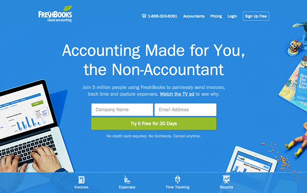
Why It's Brilliant
- It's easy to consume. There is much debate on whether short or long homepages work better. If you choose to do the latter, you need to make it easy to scroll and read -- and that's exactly what this site does. It almost acts like a story.
- There's great use of contrast and positioning with the primary calls-to-action -- it's clear what the company wants you to convert on when you arrive.
- The copy used in the calls-to-action "Try it Free for 30 Days" is very compelling.
- The sub-headline is also great: "Join 5 million people using FreshBooks to painlessly send invoices, track time and capture expenses." It zeros in on a common pain point for freelancers and small businesses (FreshBooks' target audience) -- typically accounting software is often "painfully complex."
2) Mint
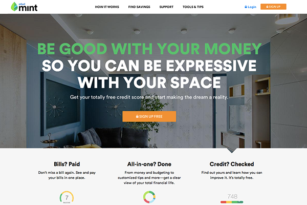
Why It's Brilliant
- It's a super simple design with a strong, no-jargon headline and sub-headline.
- The homepage gives off a secure but easy-going vibe, which is important for a product that handles financial information.
- It also contains simple, direct, and compelling call-to-action copy: "Sign up free." The CTA design is also brilliant -- the secured lock icon hits home the safety message once again.
3) Jill Konrath
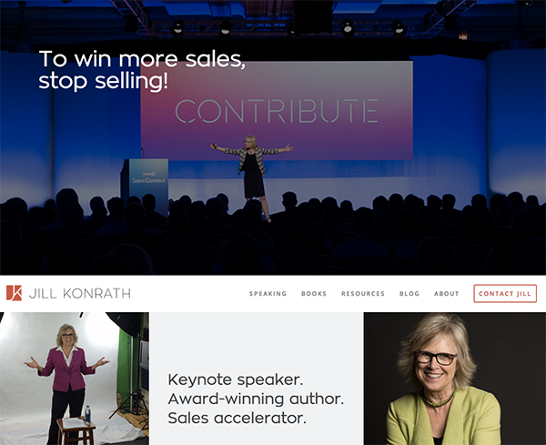
Why It's Brilliant
- It's simple and straight to the point -- from the headline and sub-headline, it's clear exactly what Jill Konrath does (and how she can help your business).
- It also gives easy access to Jill's thought leadership materials, which is important to establishing her credibility as a keynote speaker.
- It's easy to subscribe to the newsletter and get in touch -- two of her primary calls-to-action.
4) Dropbox (Consumer)

Why It's Brilliant
- Dropbox's homepage and website is the ultimate example of simplicity. It limits its use of copy and visuals, and embraces whitespace.
- Their headline, "Your stuff, anywhere" is simple, yet powerful. No need to decode jargon to figure out what Dropbox really does.
- It has a focus on one primary call-to-action: "Sign up" ... But if you want to learn more first, that's easy, too. Click "Learn more," and see how Dropbox describes its primary benefits with four, easy-to-scan statements directly below the primary CTA.
5) Dropbox (Business)

Why It's Briliant
- The homepage for Dropbox's business offering is a great example of providing a different website experience for a different audience. Unlike their main homepage, which was originally built for the consumer side (above), their business users require more information and additional proof points that Dropbox for Business a safe and scalable solution for companies (a perception issue that Dropbox addresses on their homepage directly).
- Dropbox continues to carry over it's simple design and branding. It includes only what is important: elements such as customer logos and testimonials, and a video with supporting copy.
6) Whitehouse.gov
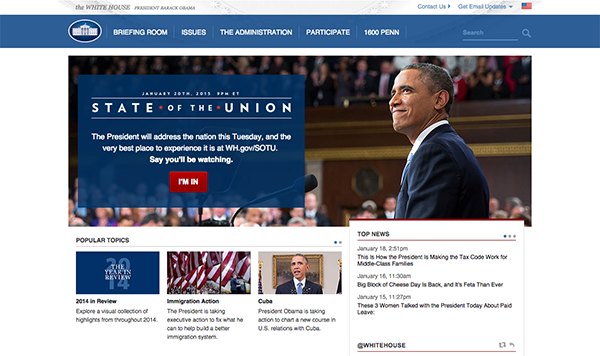
Why It's Brilliant
- Building a website that supports an entire nation is no easy task. Whitehouse.gov is a constantly changing to reflect top concerns and priorities -- the homepage alone has gone through hundreds of revisions. Testing and optimization is a key component to a brilliant homepage design.
- What's particularly great about Whitehouse.gov is that it is completely unlike most government-related websites. It has a clean design and fosters a community.
- It's fairly easy to find what you're looking for when you land here. And if you can't find it immediately, there's even a "What are you looking for?" search box.
7) Scrapd

Why It's Brilliant
- While it's difficult to tell from the static screenshot above, this site captures your attention with its subtle use of animation while scrolling down the page. It's a very clever way to organize information without interfering with user experience.
- It also has a very clean and simple design. The design highlights the features of the app, and then immediately shows the primary call-to-action -- not much else.
8) 4 Rivers Smokehouse

Why It's Brilliant
- Drool. That's what I think when I arrive at the website for 4 Rivers Smokehouse. Combined with great photography, the headline "Brisket. 18 years to master. Yours to savor." sounds like an experience worth trying.
- The parallax scrolling guides you on a tour through their services, menu, and people having a great time -- a great use of this popular design trend.
- The only negative? I don't live close enough to this place. Boo.
9) Evernote.com

Why It's Brilliant
- Over the years, Evernote has turned from a simple note-saving app into a suite of business products. This isn't always easy to convey on a homepage, but Evernote does a nice job packaging many potential messages into a few key benefits.
- This homepage is uses a combination of rich, muted background colors and bright green or white highlights to make conversion paths stand out.
- Following a simple headline, the eye path then leads you to their call-to-action, "Sign up now."
10) Telerik

Why It's Brilliant
- "Stuffy enterprise" isn't the feeling you get when you arrive at Telerik's website. For a company that offers many technology products, their bold colors, fun designs, and photography give off a Google-like vibe. Just one important aspect to making visitors feel welcome and letting them know they're dealing with real people,.
- I love the simple, high-level overview to their six product offers. It's very clear way of communicating what the company does and how people can learn more.
- The copy is lightweight and easy to read. They speak the language of their customers.
11) Gogoro

Why It's Brilliant
- Probably one of my favorite consumer-tech websites. It's brilliantly elegant and simple.
- This website is highly interactive, and a static screenshot does not do justice. I'd highly recommend browsing it for yourself.
12) eWedding
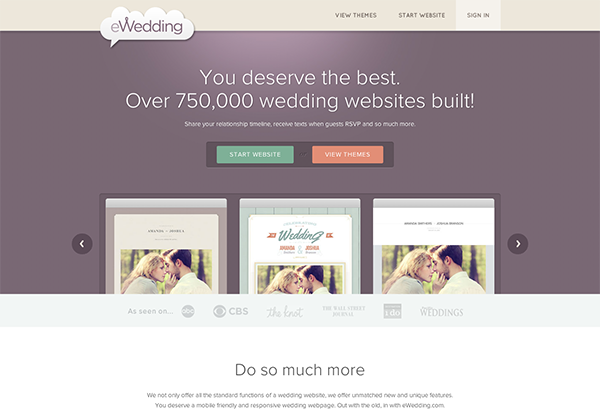
Why It's Brilliant
- For those love birds planning their big day, eWedding is a great destination to building a custom wedding website.
- The homepage isn't cluttered and only includes the necessary elements to get people to starting building their websites.
- They've included excellent product visuals, a great headline, and a call-to-action that reduces friction with the copy, "Create your free website in under 5 minutes." Genius!
13) Basecamp

Why It's Brilliant
- For a long time, Basecamp has had brilliant homepages, and here you can see why. They often feature awesome headlines and clever cartoons.
- The call-to-action is bold and above the fold.
- In this example, the company chose a more blog-like homepage (or single page site approach), which provides much more information on the product.
14) charity: water

Why It's Brilliant
- This isn't your typical non-profit website. Lots of visuals, creative copy, and use of interactive web design make this stand out.
- The animated headline is a great way to capture multiple messages on one line.
- Great use of video and photography, particularly in capturing emotion that causes action.
15) TechValidate

Why It's Brilliant
- This homepage is beautifully designed. I particularly love their use of white space, contrasting colors, and customer-centric design.
- The headline is clear and compelling, as are the calls-to-action.
- There's also a great information hierarchy, making it easy to scan and understand the page quickly.
What do you think of these homepages? What are your favorites? Are there other great website designs I missed? If so, list them in the comments!
Editor's Note: This post was originally published in January 2013 and has been updated for accuracy and comprehensiveness.