If you've ever built a custom module in the HubSpot CMS, there's a good chance you noticed that it wasn't possible to create fields that a content editor could duplicate or subtract from a module. Sure, you could add toggles to allow editors to keep fields from appearing in the markup and display of a page. And, if you added enough of them you could simulate something like a module that switches between 2, 3, or 4 columns. If you ever tried this you're probably well aware that the editing experience for this sort of thing was... not awesome.
Well, good news folks. Repeating fields are here. Actually repeating groups of fields are too, which is where things really get interesting. You can now build complex and flexible modules that won't cause your site editors to recoil in horror. The process is pretty straightforward. First you turn on the new Repeater Options switch for a field or group of fields. Then in the HTML + HUBL section of the module editor you loop through the field and plug tokens into your markup. If you'd like to skip ahead to the reference docs on this subject, they can be found here.
How it works
Let's take a quick look at this process in the context of a typical module and get a feel for how it works. Since we used a multi-column module as an example of something that was formerly tricky to pull off, let's go ahead and use that example to show how things have changed.
The screenshot below is the finished result of our multi column content module. Each box has a headline, content, and a button to click through for more info.

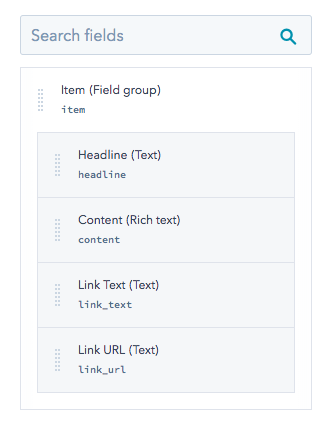
This layout itself isn't too groundbreaking, we could have built something like this with the old module framework. The exciting bits are in the editing experience. If we take a look at this module from a content editors perspective, we can immediately see the intuitive flexibility that the new module framework affords us. The screenshot below shows three boxes and their representation in the module drawer.

If an editor decides they want another box, they just click the Add button.

The entire editing experience is intuitive and self explanatory. No long lists of fields or ambiguous flex columns. Let's take a look at how we set something like this up in the module editor.
The screenshot below shows the inspector with all the fields used in this module. There are fields for Headline, Content, Link Text, and Link URL. All of these fields are inside a group named Item.

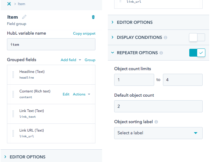
If we drill down into the options for Item we can see that Repeater options has been switched on. Also, object count limits have been set to 1 to 4. This is a nice way for designers to give editors some guardrails. If there were fewer than one boxes, the module wouldn't appear on the page and it may cause confusion. If there were more than four boxes, things would start getting a little too tight and the design would break down. There is also a Default object count of 2. This is a nice way of giving the content editor an intuitive first impression of what this module does and how it looks. If the default state of the module was one column (or worse, blank), the editor would have to waste mental energy conceptualizing what they are building with the module.

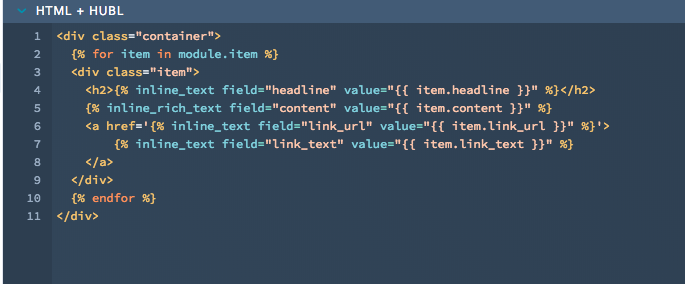
Let's take a look at the code that renders these fields. As illustrated in the screenshot below, we've created a div named container. Inside this div we loop through the Item group and plug each of its fields into a div named item. If you're not familiar with HubL loops, the documentation can be found here. To be clear though, you don't need to write this loop from scratch. The Copy snippet option in the Actions drop down for the Item field group will give you all the necessary code for outputting each instance of this repeatable group. You can then fold the HubL into whatever markup you need for your specific scenario.

Hopefully this little runthrough gave you a few ideas about building intuitive stuff for your clients and colleagues. In the coming weeks there will be some modules added to the marketplace that can give you a headstart on common interfaces like sliders, tabbers, and accordions. It’s also worth mentioning tables in this context. Building branded, responsive tables using this functionality allows you to create a nice sandboxed editing experience while maintaining total control over the markup. Here’s a link to a brief explanation of that process.
Postscript shout out to flexbox
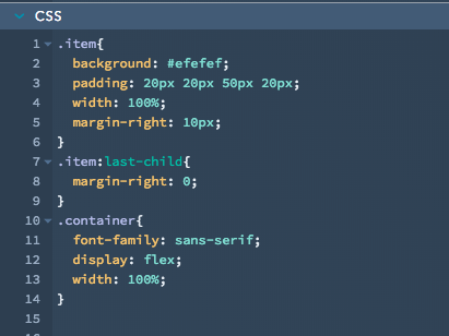
If you've done this sort of thing in the past, you may be calling shenanigans on that markup for not addressing the number of boxes. Typically if you have a variable number of columns in a dynamically generated layout you'll need conditionals to swap classes around for the CSS. In this case, we used flexbox to build the columns. Conveniently this makes the markup much easier to read so that we could focus on the topic of this post. More to the point, flexbox is awesome and it makes everything about this kind of module simpler and more robust from a responsiveness perspective. Here's the CSS running this layout if you’re curious. If we were doing this sort of thing on a production site we’d probably need some fallbacks and media queries as well.


