 The emphasis on user experience or UX has done a great deal in jolting designers and developers into the realization that a design that intuitively caters to the needs of the users is crucial to success. However, when some web designs out there grace your screen, you are bound to be stunned at many of the web design atrocities you see. This leaves our heart screaming from the very depths, “Why? Why can't they just get It?”
Some may site the ever-changing and fast-paced nature of design best practices as a reason for falling behind. The design process itself can get tricky, especially if you end up falling into that pit when you’ve got a bunch of projects all piled up. It's hard to keep up, yet dropping your entire arsenal of design tricks and bombs on any single element of a web design alone isn’t the solution to any problem. Along with this, there are some other, more critical mistakes and UX fails that must be avoided at all cost to make the User Experience (UX) an absolute hit.
Redesigning for the Sake of a Redesign
Giving your web design a makeover is something that brands tend to do for any number of reasons. For instance, you may want to catch up on changing consumer behavior or align your website with new business objectives. However, giving your website a redesign for the sake of a redesign isn’t why the redesigning project is put on the table. There must be some factors in place that insisted persistently on having the project redesigned. For instance:
- Showing an evolved business model
- Fixing false or confusing information that cannot be done with minor edits
- Giving more insights into the products or services
- Engaging users on cross-devices
- Making interactions more simple
Tactics like user surveys, user testing and doing an in-depth to dig into the results of those studies are the ideal methods to go about identifying key insights on what the current design was missing and what can be done to the new design to enhance the User Experience.
Designing UX for the Non-Target Audience
When a website is developed, its aim is to cater to the needs of a specific group of people or demographics. Just as you can’t just sell a lawn-mower to someone who doesn’t own a front lawn or a backyard, you can’t build the UX for just anyone. In short, you must direct your website at your audience and buyer personas with elements that resonate with them. That last part is important: elements have to resonate. If you're targeting your audience with the wrong approach, you won't capture their attention.

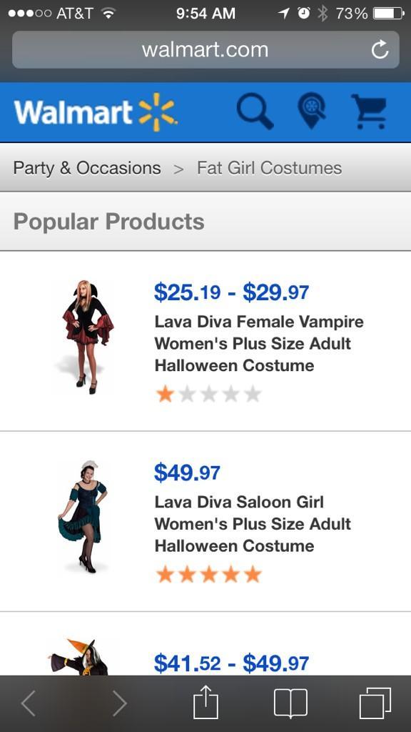
Walmart: "Get your 'Fat girl' costumes here! Erm, make that 'Plus Sized'." Image via UX Epix Fails.
Don’t just offer them everything on just one page as it would be distracting to them. Remember that your users have come to your website with a specific purpose. If the web page does not specifically serve that purpose, they will just bounce back. So, if you want to grab the attention of your audience immediately, you’ve to aim your web design, content, and website elements exclusively at them. As a result, you’ll be able to make them inclined to hear more about your product or service.
Putting UX on the Back Burner
It is not unusual amongst some designers to trigger the UX phase once the designing is completed. The end result: a broken design that doesn't work for the intended audience. It's key to get a UX professional onboard right from the very early stages. Not only do they have expert insights into the key components that help initiate the project, but they can also offer the right strategic approach.
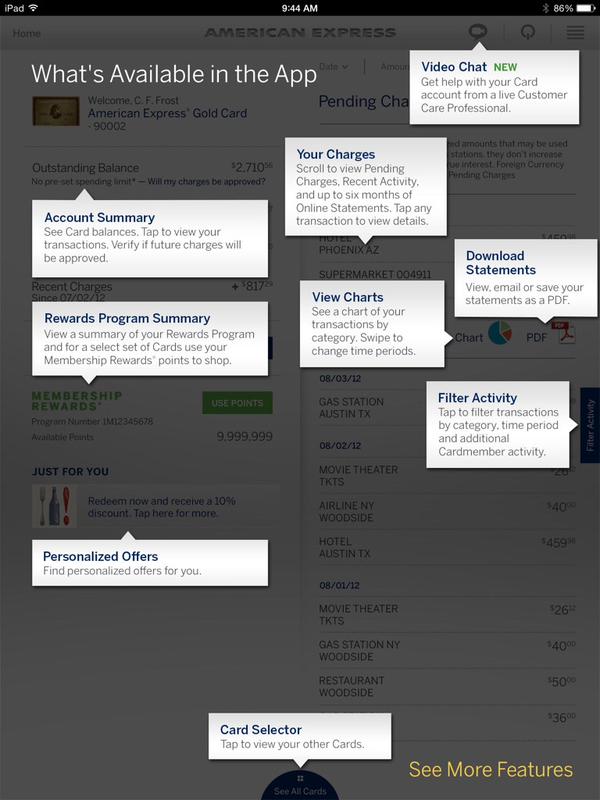
 Don’t know what they were even thinking. Image via UX Epic Fails.
By getting the UX team initiated early, you significantly reduce the risk of derailing from the project. Moreover, it may also help you avoid messing up an already developed project that needs a simple makeover. There’s a whole set of UX techniques available to use. However, only an expert in UX would know what technique(s) fits the project best.
Creating a Text-Dominated UI
 Too much text on a small screen is annoying. Image via UX Epic Fails.
If you believe the age old adage “a picture is worth a thousand words”, then why design a text dominated UI? Unless you’ve got a product that offers text-based insights and an avid reader base, going with an all-text approach would only hinder you from producing a great UI for the user experience. It's a thousand times more engaging if you present your content in other formats like videos, images, and podcasts.
“Something is happening. We are becoming a visually mediated society. For many, understanding of the world is being accomplished, not through words, but by reading images.”
- Paul Martin Lester, “Syntactic Theory of Visual Communication”.
Remember that a great UI can be enhanced with the inclusion of rich media to effectively deliver a message. However, it should be noted that rich media, like a website redesign, should not be used for the sake of it. Each element must provide value to the user.
Making Forms Utterly Frustrating
More often than not, the key reason why some users tend to leave a website without even achieving their desired goal is a frustrating web form. It shouldn’t be ignored that forms are a vital commodity to not only websites but also thousands of mobile apps as they facilitate conversions. Regardless of whatever purposes they are used for, they should be as simple and as direct as possible.

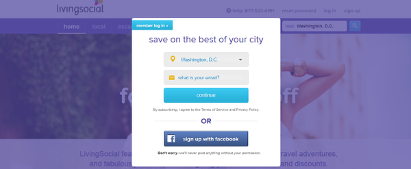
Forcing users to fill out the form? Don’t complain when your bounce rate increases. Image via @stevenbirr.
For instance, there’s no reason to separate the “First Name” and “Last Name” blanks when you can merge them as a single blank, “Full Name”. Likewise, the forms should be made intelligent in that it can correct the users if they have made an error in any field instead of displaying the error when the users have clicked the submit button.
User Experience is a vast realm in itself. Boiling down the worst mistakes into few points on a blog isn’t going to be enough. However, it's a start. Good luck on your journey to create a great web design that produces a great UX!


