Even when your website project is shipped, your job isn't over yet.
You may have heard of “growth driven design,” the idea that a website project is ongoing, much like a marketing strategy.
It’s the model that we use at SparkReaction for all of our client website projects. Why? Because it works to drive long-term value on a web project.You don’t let your website gather dust until its next redesign. Instead, you continually monitor performance and react to the data. That means making frequent improvements — and you’ll have a website that’s always performing at its best.
Here’s a mix of tools we use and recommend to monitor website performance.
Incorporate them into your web workflow, and you’ll keep growing and improving your online presence.
Hotjar
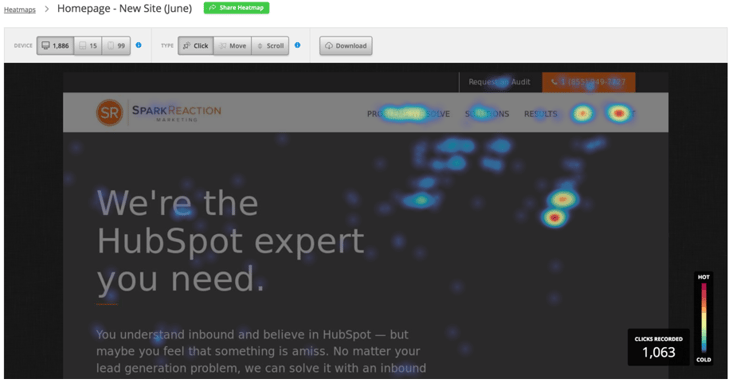
Your website looks good — but how are visitors using it? That’s the question Hot Jar sets out to answer.
Hotjar (lauded as the “more affordable” version of Crazy Egg) shows heat maps of your website so you can monitor page engagement from one dashboard.
Some of the main features include:
- Heat maps that show you where people are clicking, and which percentage of viewers click through vs. bounce.
- Recordings of how people are using your site, so you can see which elements are engaging, and which are confusing or uninteresting.
- “Conversion funnels” that let you set up intended page visits in a certain order, so you can monitor clicks through the entire pathway.
As a web designer, you must hold yourself accountable to data. How are people actually moving through your site? You can’t just rely on your assumptions or best practices.
By setting up heat maps for the “before” and “after” versions of a page layout, you can put your assumptions to the test.
The best websites contribute to the digital marketing funnel. Hotjar gives you metrics for monitoring the journey people are taking through your website — and if your intended path is working.
While Hotjar is more cost-effective with their Basic and Plus plans, the con is that it measures only a sample of your web visitors.
This shows how your website engages a representative slice of people — but it’s not the entire picture.
Crazy Egg
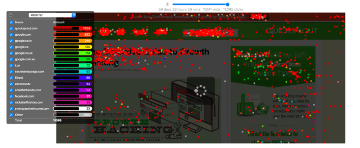
If your budget allows, invest in Crazy Egg, a bulked out version of Hotjar that comprehensively records how each visitor interacts with your website.
With a handful of tools, you can answer: What are visitors clicking? When are they bouncing? How far down the page are they scrolling? Which elements drive the most conversions?
Crazy Egg’s tools include:
- Heat maps to show you where people are clicking (and not clicking), so you can identify changes that boost conversions.
- Scroll maps that identify the point where people stop engaging with your page. This can tell you if your page is too long, or if you need to introduce elements at a certain point to hold interest longer.
- An overlay report that shows you how many clicks each page element received — helpful to know the quality and source of clicks each conversion element is earning you.
Altogether, this data helps you prioritize which pages to monitor and update.
You can also highlight which usability errors are holding people up, to ensure a smooth pathway through your digital funnel.
Usability Hub
Ever wish you could just ask someone what they really think of your website, instead of relying on percentages and click rates?
Usability Hub is a great way to engage with a neutral audience of website visitors. You pay a small fee to the service to get real, human feedback on usability.
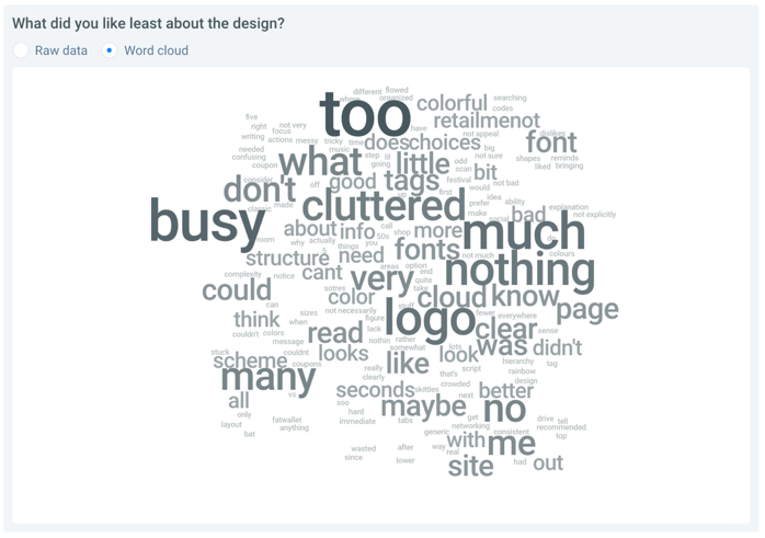
For example, we selected 25 people at random to take a 5-second test through Usability Hub.
This group quickly looked at two versions of our client’s homepage banner, and then answered five simple questions:
- What service or product do you think this company sells?
- What industry is this company in?
- Does this company target employees or employers?
- Did the brand appear trustworthy?
- What was the company name?
We gathered the data and analyzed word clouds of the most common responses. This showed us that one banner version clearly stood out as the best user experience.
This test identified the design that resonated with viewers and hit our client’s message home.
Data backed up an assumption we had made, and helped us convince the client that a redesign was necessary.
You can set up your own test on Usability Hub easily. Try asking questions about the clarity of your site, or how compelling your design and copy is.
HubSpot's Website Grader
HubSpot’s free website grader is an incredibly useful (and free) tool to measure four aspects of your website:
- Performance (i.e. speed)
- Mobile-friendliness
- SEO effectiveness
- Security
All you do is input your website URL and email, and let the grader do the crunching.
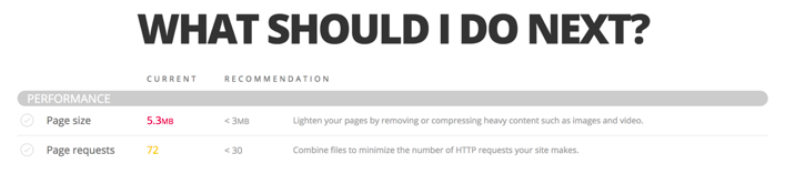
The online tool will give you an overall score, then break down your report in each of the four areas.
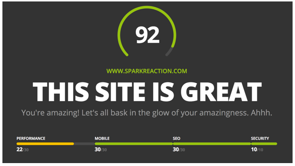
You’ll see how you rank in each fundamental area. And at the end of the comprehensive report, you’ll get a simple checklist with areas to improve.
If you want a quick, simple test to get you started with usability analytics, try a free report with HubSpot’s grader.
WooRank
So your website looks great, functions well, and converts people once they visit… but is it being found in Google at a satisfactory rate?
That’s where WooRank comes in.
Sometimes SEO knocks can come from unlikely places… like broken links, keyword inconsistency, or site speed.
WooRank is a comprehensive tool that analyzes your SEO success by picking apart all contributing factors.
While you can pay for the tool and install the handy Chrome extension, I recommend running the free report first. Just input your website URL and watch the data flow in.
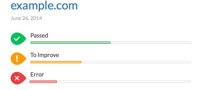
You’ll get a “grade” for each SEO factor: a pass, improvement area, or error.
(You can even export the report into PDF slides — useful for explaining major SEO takeaways to clients or coworkers.)
You’ll get an in-depth SEO and usability review across different important factors:
- SEO (like metadata, title tags, and keyword consistency)
- Mobile friendliness
- Usability
- Embedded technologies
- Crawl errors
- Backlinks
- Social media engagement
- Traffic rank and visitor stats
You can see the “impact” each report has on your overall SEO success. This culminates in a simple “marketing checklist,” organized by priority of the actions you should take.
Consider signing up for the free trial to start identifying problem areas — then you can decide if it’s worth the $49/monthly investment.
Page Analytics by Google
This is my personal favorite tool, because it brings the power of Google Analytics right to your website pages.
It’s a free way to get meaningful analytics, too — unlike some of the costlier tools.
This Chrome extension connects to your Google Analytics account. All you do is log in, navigate to one of your site pages, click the extension icon, and watch an overlay appear on your website page.
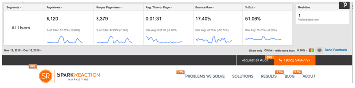
The data dashboard tells you your page views, unique page views, average time on page, bounce rate, and the percentage of people who exit after viewing this page.
Click through to your other site pages and the overlay data will refresh.
You can further crunch the data into different audience segments and date ranges — useful for identifying how your various buyer personas interact.
The extension also creates a click report on your page, showing you where most people who visit click to next.
This is incredibly useful for seeing how effective your page content is at moving people throughout your site — and down the marketing funnel.
The data tells you which pages are high converters, or pages you should focus on driving traffic to.
And it also identifies “dead ends” in your content where people stop engaging and leave your website. When you know which gaps to fill, you can create a monthly schedule of website improvements to make.
That’s a lot of data — now what?
The important thing is not that you gather data… it’s that you react to it and continually monitor and improve your website.
That’s the backbone of an inbound website: A website that contributes to the inbound marketing customer journey and improves regularly.
These tools are only the first step in your journey to a high-performing website.
Download our free eBook to learn how an inbound website can maximize the value of your website long after the design is finished.