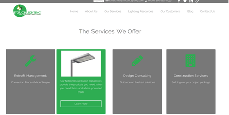
In this “how-to” blog post, we’ll look at how a new Hubspot COS website (www.stouchlighting.com) uses CSS flip animation. As designers and developers, we’re always looking for new ways to make the website experience engaging for our visitors. The goal of this functionality is to motivate page viewers to click through on the call to action that resides on the back of the CSS panels (see screenshot below). So let’s get started learning how to implement this tactic on your site and landing pages.

Customer Use Case
In this website project, the client wanted to have a unique way to showcase the top 4 services that his organization provides while simultaneously having a quick and easy way for visitors to “drill down” to get additional content. After some back and forth brainstorming we came up with the idea of doing the CSS flip animation panels. This accomplished both of his goals in an fun and visually stimulating way.
The Module Configuration
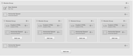
Now let’s take a look at the “nuts and bolts” of how to implement this tactic on your COS site pages. We’ll first take a look at the module stack that you need in order to set up this functionality. A screenshot is showcased below:
 Basically all that you need is a set of custom HTML modules, you will need one HTML module for each panel. In our customer use case we had 4 because we had four different services that we wanted to showcase. However this might be different for your project. Once you have the modules configured you want to set up your HTML, we’ll look at that next.
The HTML
Once your modules are configured you will need to copy and paste the below HTML into your custom html modules:
<div class="flip-container">
<div class="flipper">
<div class="front" style="padding:3%;">
… Your code goes here for the front pane
</div>
<div class="back" style="padding:3%;">
… Your code for the back pane goes in here
</div>
</div>
</div>
Explanation
Above is some simple HTML that has two content panes: the “front” pane and the “back” pane. Additionally, these are nested in two containing divs “flip-container” and “flipper” divs. Any content that you would like on the front of your pane should go in the “front” div. You can put anything that you want in there: headings, paragraphs, images, icons, and calls to action. The same is true for the back pane.
The CSS
Below is the CSS code that you will need to use to animate the panels. Take the code below and paste it into your stylesheet. The CSS code below uses a combination of the CSS transform property, backface visibility and preserve 3d property to create the effect. It’s important to use the vendor prefixes here, if you don’t use them this functionality won’t work in popular browsers like IE and Firefox.
/* flip the pane when hovered */
.flip-container:hover .flipper, .flip-container.hover .flipper {
transform: rotateY(180deg);
-ms-transform: rotateY(180deg);
-webkit-transform: rotateY(180deg);
}
.flip-container, .front, .back {
width: 100%;
height: 350px;
}
/* flip speed goes here */
.flipper {
transition: 0.9s;
transform-style: preserve-3d;
-webkit-transform-style: preserve-3d;
-ms-transform-style:preserve-3d;
position: relative;
}
/* hide back of pane during swap */
.front, .back {
backface-visibility: hidden;
-webkit-backface-visibility: hidden;
-ms-backface-visibility: hidden;
position: absolute;
top: 0;
left: 0;
}
/* front pane, placed above back */
.front {
z-index: 2;
/* for firefox 31 */
transform: rotateY(0deg);
background-color:rgb(120,120,120);
border-radius:3px;
}
/* back, initially hidden pane */
.back {
transform: rotateY(180deg);
-ms-transform: rotateY(180deg);
-webkit-transform: rotateY(180deg);
background-color:#25ae4e;
border-radius:3px;
}
.flip-container:hover .flipper, .flip-container.hover .flipper, .flip-container.flip .flipper {
transform: rotateY(180deg);
-ms-transform: rotateY(180deg);
-webkit-transform: rotateY(180deg);
}
/*Service flippers end*/
Conclusion
Once you have added the modules, written the HTML code and attached the CSS your flippers should be animating away. This is a great way to add some visual interest to your HubSpot COS landing pages and site pages. Just make sure that you don’t overuse the tactic to the point where it feels gimmicky.
Thanks, let me know if you have any questions implementing the tactic by commenting below. Best of luck and happy HubSpotting!


