This post originally appeared on HubSpots Marketing Blog.
Data can be very powerful if you can actually understand what it's telling you. It's not easy to get clear takeaways by looking at a slew of numbers and stats -- you've got to have the data presented in a logical, easy-to-understand way.
Enter data visualization. Using charts, graphs, and design elements, data visualization can help you easily explain trends and stats. But not all data visualization is created equal -- just check out “Why Most People’s Charts and Graphs Look Like Crap” to see what I mean.
So how do you create data visualizations that are both compelling and easy to digest? Get inspired by 10 examples of data visualization that communicate interesting information with both style and substance.
1) The Daily Routines of Famous Creative People

This interactive data visualization is a simple concept executed fantastically. (Click on the image to interact with it.)
Using information from the book Daily Rituals by Mason Currey, the site showcases the daily schedules of famous creatives broken down by time and activity. Not only is this an example of engaging data (as you can explore the schedules by individual activity), it is a fantastic editorial piece for a brand.
2) The Year in News
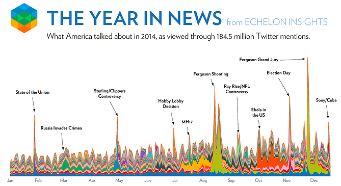
The best data visualizations communicate information and do so in an intuitive and beautiful way. Echelon Insights nailed it with this piece -- it visualizes the most talked-about news stories of 2014 on Twitter. What do 184.5 million tweets look like? Rad spin art.
3) Most Valuable Sports Franchises
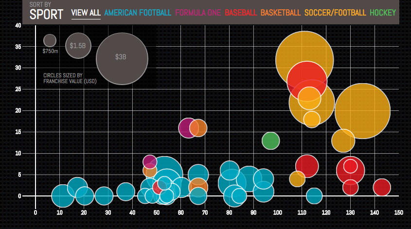
Here is an example of telling a deeper story by adding data. This interactive, created by Column Five, was inspired by Forbes’ "Top 50 Most Valuable Sports Franchises 2014" list. But instead of just visualizing the list, the interactive also lets users see the number of years each team has competed, as well as the number of championships won. This offers a more comprehensive view of the each team’s history and success as a franchise.
4) Languages in the World
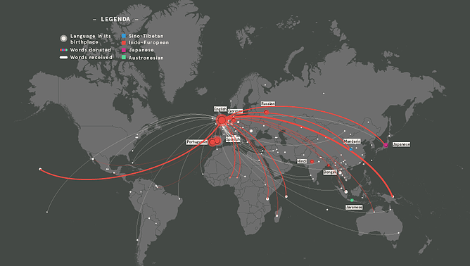
This interactive by DensityDesign does an impressive job of introducing the non-linguist (a.k.a. most of us) to the many world languages -- all 2,678 of them. This piece allows you to explore common languages families, see which languages are most spoken, and view where languages are spoken around the world. This is great visual storytelling: taking an in-depth subject and breaking it down in an easy-to-understand way.
5) Funding the Final Frontier
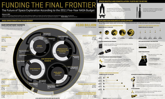
A well-designed infographic delivers a large amount of data, but it's in a simple and clean format that makes it easy for readers to understand the data. This infographic, created by GOOD Magazine and Column Five, breaks down NASA’s five-year budget to show how and where the money will be spent in an easy-to-understand way. Plus, it has an on-theme design -- an all-around win.
6) Why Peyton Manning’s Record Will Be Hard to Beat
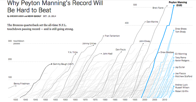
Sports is a data-rich world, but that data isn’t always presented effectively (or accurately, for that matter). Adding data to a news story (Peyton Manning’s record-setting for the most touchdown passes in NFL history) is a great way to provide context. This interactive visualization lets viewers compare Manning’s success to the other 250 quarterbacks with at least 30 career touchdown passes since 1930, adding a richer layer of storytelling.
7) Entertainment Media Use in the Middle East
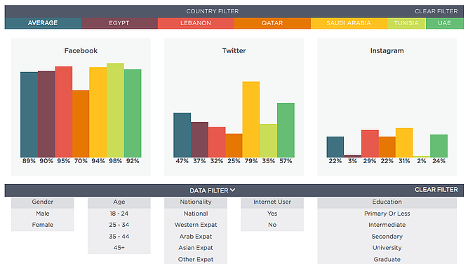
Comprehensive surveys can produce a bulk of data that is useful but difficult to interpret without appropriate visualization. This interactive visualization presents the results of a six-country survey conducted by Northwestern University in Qatar/Doha Film Institute, which reveals attitudes toward entertainment and media in the Middle East. A simple color palette and easy navigation lets users view data by subject, question, and country -- delivering a large data set in an easy-to-digest portions.
8) Caritas Kontakladen Annual Report

Not all data visualizations need to be animated. When real-world data is visualized with real-life examples, the results can be stunning.
Designer Marion Luttenberger took a unique approach to the data contained in Caritas Kontakladen’s annual report. The organization provides support to drug addicts in Austria, so Luttenberger focused on communicating the mission through real-life visuals. For example, this shopping cart visualization represents how much of life’s necessities a welfare recipient can afford each day.
9) Percent of U.S. Population by Age Group

This is a great example of how to present a single data set in a compelling way. Pew Research created this GIF composite to show shifts in population demographics over time. It’s a great way to tell a larger story in a neat package, plus this type of micro-content is easy to share on social or embed in blogs, extending the content’s reach.
10) Austria Solar Annual Report
While there are many ways to visualize data, using the information subject to actually create the data visualization (follow me here) can be pretty profound. This annual report from Austria Solar uses actual solar power to bring the company’s data to life through solar-activated inks on the page. In a word: Genius.