Evolution of HubSpot’s CMS
Over the years, HubSpot went from a blogging platform to a versatile and robust web content system. After constantly refining their CMS, HubSpot is THE secret weapon that allows marketers and sales teams to take their marketing to the next level.
It's no wonder why G2 Crowd ranked HubSpot as leader in fields like Web Content Management or Marketing Automation. HubSpot has always been pushing boundaries, but the new Design Manager is a major update and will affect the way we build websites from the ground up. This update makes a great CMS even greater and contributes to HubSpot’s mission of allowing marketers and designers to more efficiently and seamlessly build landing and website pages.
After falling in love with HubSpot’s CMS a few years back, we jumped aboard this fast moving train. In 2014, we became an official HubSpot partner. Over the years, we have built more than 200 HubSpot websites and developed several software apps that work natively with HubSpot, such as our adaptation of the Startup Framework by Designmodo with its own web app to build pages in a drag and drop interface.
What's New in the Design Manager?
In addition to the innumerable stunning features for developers and the intuitive new look, the new Design Manager also offers something we are most excited about:
New module fields allow you to build website, landing, and blog pages faster and more intuitively than ever before.
We consider these four new module fields the most important.
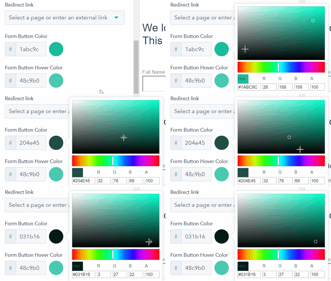
- The color picker allows you to pick colors for elements.
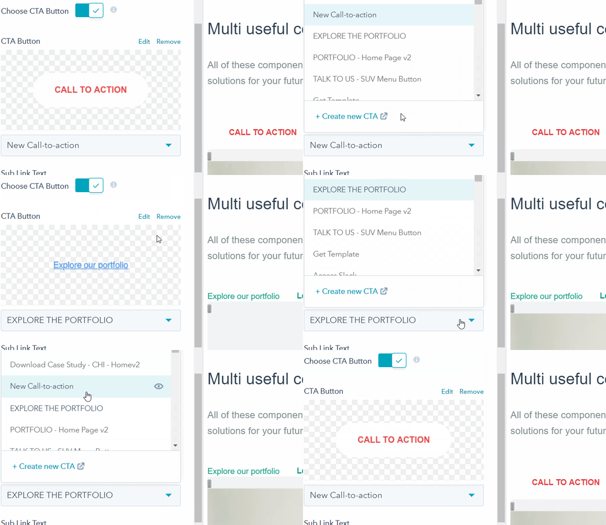
- The CTA picker allows you to include your existing CTAs within modules.
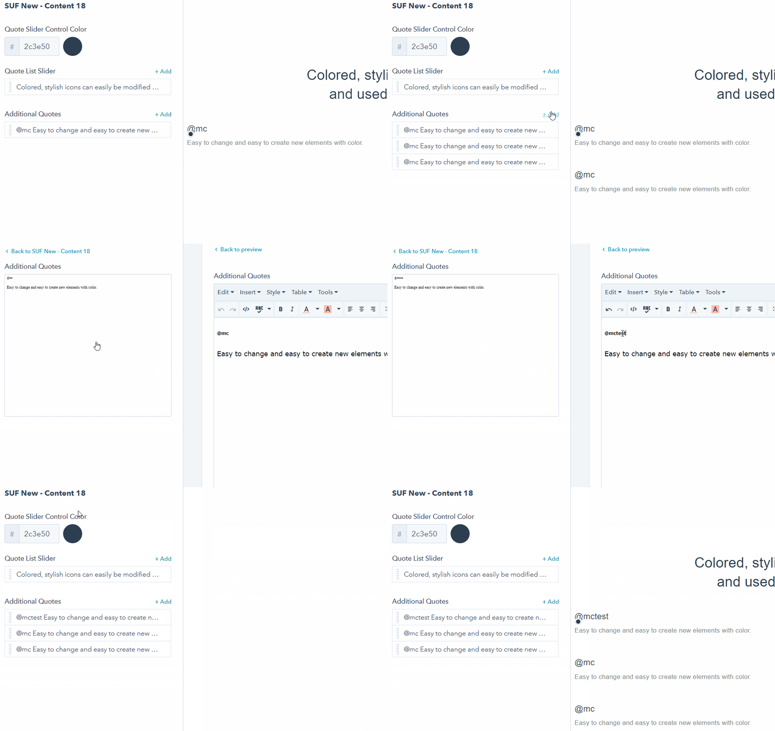
- The repeater allows you to create modules within modules.
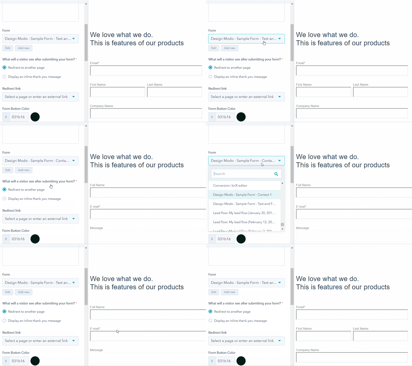
- The form picker allows you to include your existing forms within modules.
We were one of the first to test the new Design Manager in BETA and upgraded the Startup Framework to take full advantage of these new module fields.
Our Startup Framework includes 120 different modules. We went through them one by one and added new module functionalities to 103 of them. Now, 51 of our modules include a color picker. The CTA picker has been added to 23 modules. Moreover, we added the repeater field to 54 modules and the form picker to 11 modules.
Let’s check out the new module features that will make your life easier and compare the now and then.
The Color Picker
Then
If you were using custom-built elements within your modules like we do with the Startup Framework, you were able to change colors using CSS or choose from a limited set of predefined colors. Yet, there was no intuitive way of changing colors.
Now
The new color picker field allows you to pick the color you want to use easily and intuitively. Now you can adapt your module’s design to your expectations (or brand guidelines) without any CSS coding.

The CTA Picker
Then
You couldn’t associate one of your existing CTAs with one of your modules. You had to use CSS or needed to style the CTA within the module again using the available fields.
Now
Thanks to the new Design Manager, you can now leverage your existing CTAs and include them within your modules. You save time previously spent on recreating CTAs and are able to easily repurpose your existing CTAs.

The Repeater
Then
To build modules including a variable number of elements like image sliders, users had to use HubDB (HubSpot’s powerful relational database that can store a lot of your information). Each time you wanted to add an element like an image to the slider, you had to go to HubDB and add a new database row (by the way, If you prefer this way of working, we will still allow you to use our HubDB modules).
Now
If you now want to set up an image slider with a variable number of images, you can achieve that directly within the module. You can create one tab per image. Each tab is structured like a sub module with its own module field. This allows you to build even more complex and multi-layered modules without coding.

The Form Picker
Then
You could add an existing form to a page easily but it was not possible to assign forms to custom modules using a module field.
Now
You can now easily choose the desired form you want to include within a module. This is another step in the direction of a modular approach and will help you to use your existing forms wherever you want. Forms will no longer look isolated and can be integrated easily into your other modules to improve the user experience.

These four updates (and all the other new Design Manager features) will drastically change the way you build websites in HubSpot. Now, after reading this article, are you ready to get your hands dirty and test the upgraded module fields yourself?
You can learn more about the Startup Framework and start working with the new module fields here.
We are curious about your opinion as well. What is your favorite Design Manager update? I would love to hear about it in the comments.


