Note from Hubspot Designer's Blog Editor:
Mega Menus are drop down menus, usually triggered by a user hovering over a designated area. After hovering, options are displayed in grouped menus or in one large main menu. Megan Drop Down Menus can help enhance the navigation quality of a site, and can provide an additional valuable SEO opportunity. Trevor Hatfield, the founder of Inturact, will be helping us learn how to implement a Mega Menu in the Hubspot COS. You will need to have some knowledge of HTML and CSS to implemenet this tutorial in your website designs.
Implementing a HubSpot COS Mega Menu
A Mega Menu can be an important organizational tool for larger websites. So, when we (Inturact) came accross this problem when looking to organize a sitemap of a larger site we wanted to install a Mega Menu onto the HubSpot COS.
The first thing we did was to look for a Mega Drop Down Menu that was already developed to save a little customization time. So we chose to work from the Mash: Mega Menus from Code Canyon that you can purchase for $7 here. This gave us a good starting point and the tools we needed to get our Mega Menu started.
NOTE: Basic HTML & CSS knowledge is required. You will not be able to use the menu that comes with HubSpot, it will have to be edited and managed in a custom HTML module. This will not effect how the site is managed other then having to manage your main navigation through this module
How To Install & Setup Your Mega Menu
1. Unzip the files & Review the Documentation Folder
The documentation folder will show you all of the options for the mega menu out-of-the-box and allow you to map out the features you would like to include in your HubSpot Mega Menu.
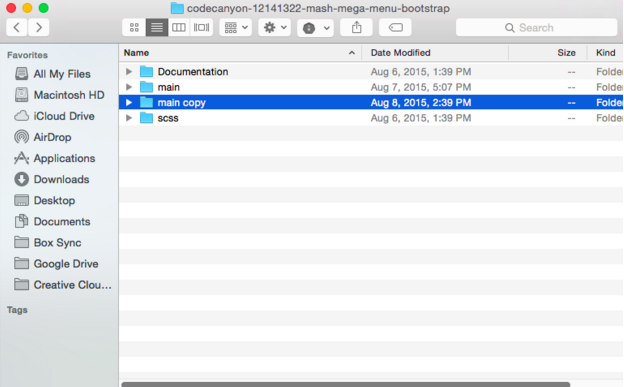
2. Make a copy of the “main” folder
This will give us a folder to manipulate and get the menu as we want it before installing it onto HubSpot, while keeping the original menu for reference if needed. So your folder structure should look like this:
3. Organize your menu items first
The mega menu comes with many default navigation items to show you the features the mega menu offers out of the box. You will want to organize your menu items locally first through a text editor, such as Sublime Text, or using a tool like Dreamweaver, whatever you are comfortable with. So, go ahead and open the index.html file within the “main copy” folder and start getting your menu structure setup. This is where you will need some basic HTML knowledge in order to get your menu setup as you would like. It doesn’t need to look styled like it may need to be on your site right now, but you will want all of the menu items and drop-downs organized before moving the code into the HubSpot template.
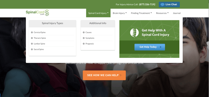
Expert Tip: Add HubSpot CTA’s to your Mega Menu for an additional conversion opportunity. Here is an example of ours:
Once you have your menu structure setup locally, your menu is ready to be moved into the HubSpot COS.
Implementing the mega menu into the HubSpot COS
First we need to get the files into HubSpot. There are 2 main folders we will need to implement:
1. css
2. js
The optional folder if you would like to include FontAwesome is:
1. fonts
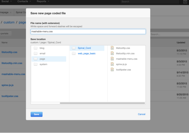
4. Setting up the CSS file on HubSpot
We will need to move the file mashable-menu.css into HubSpot first. I always like to add CSS files to the Template Builder as editable files so you can manipulate the styles as needed after the menu is setup on HubSpot. So, create a new coded file and name it “mashable-menu.css”. This will be the main file that will control the styles of the menu.
 5. Setting up the JS files on HubSpot
The next files we will need to move over are the .js files. Lets open the File Manager and create a folder called “js”. There are 2 files we will need to upload and be able to reference:
1. mashable-menu.min.js
2. material.min.js
Upload these 2 files to the “js” folder.
Font Awesome
If you would like to utilize Font Awesome you can also create a folder called “fonts” in the File Manager. Upload all files in the local “fonts” folder into the new “fonts” folder you just created in HubSpot.
6. Reference the New Files
Now that we have up the needed files on HubSpot we will need to reference them in the Header of our site.
Go to Content > Content Settings and in the “Site Header HTML” area add the code:
<!-- Menu Stylesheet -->
<link href="" rel="stylesheet">
<!-- Include all compiled plugins (below), or include individual files as needed -->
<script src="/js/mashable-menu.min.js"></script>
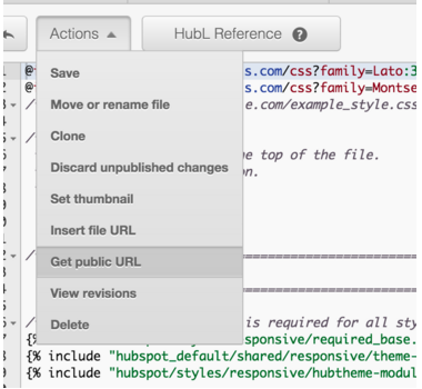
<script src="/js/material.min.js"></script>IMPORTANT: You will need to replace each src file URL with your public URL of each of the files. For the CSS file, open it in the Template Builder and go to Actions > Get public URL
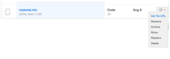
For the .js files go to the File Manager click on the gear to the right of the filename and select “Get file URL”
Add Menu initialization script
Add the below script in the same Header section below the scripts that were just added:
<!-- menu initialize -->
    <script>
        jQuery(document).ready(function () {
            jQuery('.mash-menu').mashableMenu({
                // COLORS TIMER SETTINGS
                color_timer           : {
                    timer_on       : false,
                    morning_color  : 'cyan',
                    afternoon_color: 'red',
                    evening_color  : 'teal'
                },
                separator             : true,      // options (true) or (false). This option showing the 1 px border between menu list items.
                ripple_effect         : true,      // options (true) or (false). This option enable the google material mouse click effect on menu components
                trigger               : 'click',   // options (hover) or (click). This option used for change the drop down showing trigger
                outside_close_dropDown: true,      // options (true) or (false). This option used for hide the showing drop downs when click outside the menu.
                search_bar_hide       : false,     // options (true) or (false). This option used for hide the search bar
                top_fixed             : false,     // options (true) or (false). This option used for fixed the menu top of the screen. Note: This option works if the (header_enable) option false;
                full_width            : false,     // options (true) or (false). This option used for make the menu full width.
                right_to_left         : false,     // options (true) or (false). This option used for align the menu items right to left side.
                // DROP DOWN SETTINGS
                drop_down             : {
                    effect_in_speed : 200,         // drop down showing speed. Speed in milliseconds
                    effect_out_speed: 200,         // drop down hiding speed. Speed in milliseconds
                    effect_in_delay : 200,         // drop down showing delay. Speed in milliseconds
                    effect_out_delay: 100          // drop down hiding delay. Speed in milliseconds
                },
                // STICKY HEADER
                sticky_header         : {
                    header_enable: false,         // options (true) or (false). This option used for fixed the menu top of the screen when user scroll down. Note This option works if the (top_fixed) option false.
                    header_height: 400            // This option used for trigger the sticky header when user scroll down or reach the header height. height used in px unit
                },
                // MOBILE SETTINGS
                mobile                : {
                    search_bar_hide: false        // options (true) or (false). This option used for hide the search bar on mobile mode
                },
                // MEDIA QUERY WIDTH
                media_query_max_width : 768        // This is media query max width in px unit. Used for mobile screen. Don't change if you don't know about media query
            });
        });
    </script>
This script allows you to easily manipulate some of the menu features. You can find more about this in section D) Javascript in the documentation file.
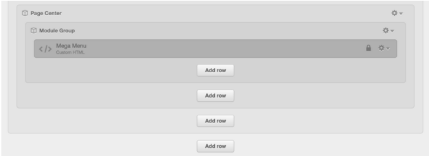
Adding the Menu into Your Template
The menu is now ready to be added to your Template. You will need to open your global module that is used for your header and main navigation. We will need to have the Mega Menu in it’s own Custom HTML module, so if you have a module that is a HubSpot Menu module it will need to be replaced. Our menu (which includes the Logo), simply looks like this in the Template Builder:
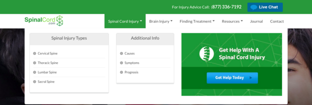
 In the custom HTML you will then paste your menu code you organized in step 3. The default menu code, unmodified, would look like this:
Style Your Menu
<!-- container -->
<nav class="mash-menu" data-color="">
 <section class="mash-menu-inner-container">

 <!-- brand -->
 <ul class="mash-brand">
 <li>
 <a href="#"> <i class="fa fa-pagelines"></i> <!--<img src="images/logo.png">--> Brand </a>
 <!-- mobile button -->
 <button class="mash-mobile-button"><span></span></button>
 </li>
 </ul>

 <!-- list items -->
 <ul class="mash-list-items">
 <!-- active -->
 <li class="active"><a href="#"> <i class="fa fa-anchor"></i> Active</a></li>
 <li><a href="#">Vertical Tabs <i class="fa fa-caret-down fa-indicator"></i> </a>

 <!-- full size drop down -->
 <div class="drop-down-large">
 <!-- vertical tabs container -->
 <div class="vertical-tabs-container">
 <!-- bootstrap start -->
 <div class="container-fluid space-0"> <!-- bootstrap fluid container -->
 <!-- bootstrap columns -->
 <div class="col-sm-3 col-md-2 clearfix space-0">
 <!-- vertical tab -->
 <div class="vertical-tabs">
 <!-- active --> <!-- hidden-xs,sm,md-lg id bootstrap classes -->
 <a class="active" href="#content-1">All Social Media <i class="fa fa-angle-right hidden-xs"></i> <i class="fa fa-angle-down hidden-sm hidden-md hidden-lg"></i> </a>
 <a href="#content-2">Typography <i class="fa fa-angle-right hidden-xs"></i> <i class="fa fa-angle-down hidden-sm hidden-md hidden-lg"></i> </a>
 <a href="#content-3">Image Card <i class="fa fa-angle-right hidden-xs"></i> <i class="fa fa-angle-down hidden-sm hidden-md hidden-lg"></i> </a>
 <a href="#content-4">Collapsible <i class="fa fa-angle-right hidden-xs"></i> <i class="fa fa-angle-down hidden-sm hidden-md hidden-lg"></i> </a>
 <a href="#content-5">List Items <i class="fa fa-angle-right hidden-xs"></i> <i class="fa fa-angle-down hidden-sm hidden-md hidden-lg"></i> </a>
 <a href="#content-6">Videos <i class="fa fa-angle-right hidden-xs"></i> <i class="fa fa-angle-down hidden-sm hidden-md hidden-lg"></i> </a>
 <a href="#content-7">Tables <i class="fa fa-angle-right hidden-xs"></i> <i class="fa fa-angle-down hidden-sm hidden-md hidden-lg"></i> </a>
 <a href="#content-8">Tabs <i class="fa fa-angle-right hidden-xs"></i> <i class="fa fa-angle-down hidden-sm hidden-md hidden-lg"></i> </a>
 </div>
 </div>

 <div class="col-sm-9 col-md-10 space-0">
 <!-- this is vertical tabs content 1 -->
 <div id="content-1" class="vertical-tabs-content">
 <!-- bootstrap start -->
 <div class="container-fluid">
 <div class="row">
 <div class="col-sm-4 col-md-2">
 <!-- image 1 -->
 <a href="#">
 <img src="images/img.jpg" alt="img" class="thumbnail">

 <p> Lorem ipsum dolor sit amet, adipiscing elit. Praesent dapibus velit
 non facilisis. Mauhghris congue metus sebnvjd predltium lacbjfioinia. </p>
 </a>
 </div>
 <div class="col-sm-4 col-md-2">
 <!-- image 2 -->
 <a href="#">
 <img src="images/img.jpg" alt="img" class="thumbnail">

 <p>
 Lorem ipsum dolor sit amet, adipiscing elit. Praesent dapibus
 velit non facilisis. Mauhghris congue metus sebnvjd predltium
 lacbjfioinia.
 </p>
 </a>
 </div>
 <div class="col-sm-4 col-md-2">
 <!-- image 3 -->
 <a href="#">
 <img src="images/img.jpg" alt="img" class="thumbnail">

 <p>
 Lorem ipsum dolor sit amet, adipiscing elit. Praesent dapibus
 velit non facilisis. Mauhghris congue metus sebnvjd predltium
 lacbjfioinia.
 </p>
 </a>
 </div>
 <div class="col-sm-4 col-md-2">
 <!-- image 4 -->
 <a href="#">
 <img src="images/img.jpg" alt="img" class="thumbnail">

 <p>
 Lorem ipsum dolor sit amet, adipiscing elit. Praesent dapibus
 velit non facilisis. Mauhghris congue metus sebnvjd predltium
 lacbjfioinia.
 </p>
 </a>
 </div>
 <div class="col-sm-4 col-md-2">
 <!-- image 5 -->
 <a href="#">
 <img src="images/img.jpg" alt="img" class="thumbnail">

 <p>
 Lorem ipsum dolor sit amet, adipiscing elit. Praesent dapibus
 velit non facilisis. Mauhghris congue metus sebnvjd predltium
 lacbjfioinia.
 </p>
 </a>
 </div>
 <div class="col-sm-4 col-md-2">
 <!-- image 6 -->
 <a href="#">
 <img src="images/img.jpg" alt="img" class="thumbnail">

 <p>
 Lorem ipsum dolor sit amet, adipiscing elit. Praesent dapibus
 velit non facilisis. Mauhghris congue metus sebnvjd predltium
 lacbjfioinia.
 </p>
 </a>
 </div>
 </div>
 </div>
 <!-- bootstrap end -->
 </div>
 <!-- this is vertical tabs content 2 -->
 <div id="content-2" class="vertical-tabs-content">
 <!-- bootstrap start -->
 <div class="container-fluid">
 <div class="row">
 <div class="col-sm-6 col-md-4">
 <h1>Heading 1</h1>

 <h2>Heading 2</h2>

 <h3>Heading 3</h3>
 <h4>Heading 4</h4>
 <h5>Heading 5</h5>
 <h6>Heading 6</h6>

 <p class="lead">Vivamus sagittis lacus vel augue laoreet rutrum faucibus dolor auctor.</p>
 </div>

 <div class="col-sm-6 col-md-4">
 <h2>Example body text</h2>

 <p>Nullam quis risus eget <a href="#">urna mollis ornare</a> vel eu leo. Cum sociis
 natoque penatibus et magnis dis parturient montes, nascetur ridiculus mus. Nullam
 id dolor id nibh ultricies vehicula.</p>

 <p>
 <small>This line of text is meant to be treated as fine print.</small>
 </p>

 <p>The following snippet of text is <strong>rendered as bold text</strong>.</p>

 <p>The following snippet of text is <em>rendered as italicized text</em>. </p>

 <p>An abbreviation of the word attribute is <abbr title="attribute">attr</abbr>.</p>
 </div>

 <div class="clearfix hidden-md hidden-lg"></div>

 <div class="col-sm-6 col-md-4">
 <h2>Emphasis classes</h2>

 <p class="text-muted">Fusce dapibus, tellus ac cursus commodo, tortormauris nibh.</p>

 <p class="text-primary">Nullam id dolor id nibh ultricies vehicula ut idelit.</p>

 <p class="text-warning">Etiam porta sem malesuada magna molliseuismod.</p>

 <p class="text-danger">Donec ullamcorper nulla non metus auctorfringilla.</p>

 <p class="text-success">Duis mollis, est non commodo luctus, nisi eratporttitor ligula.</p>

 <p class="text-info">Maecenas sed diam eget risus varius blandit sitamet non magna.</p>
 </div>

 <div class="col-sm-6 col-md-4">
 <h4>Blockquotes</h4>
 <blockquote>
 <small>This is an example quotation that uses the blockquote tag.
 </small>
 </blockquote>
 </div>
 </div>
 </div>
 <!-- bootstrap end -->
 </div>
 <!-- this is vertical tabs content 3 -->
 <div id="content-3" class="vertical-tabs-content">
 <!-- bootstrap start -->
 <div class="container-fluid">
 <div class="row">

 <div class="col-sm-6 col-md-3">
 <!-- heading -->
 <h2>Card Reveal</h2>
 <!-- image card Reveal -->
 <div class="card reveal">
 <!-- image -->
 <div class="card-image">
 <img src="images/img.jpg">
 </div>
 <!-- content -->
 <div class="card-content">
 <!-- title -->
 <span class="card-title">Card Title</span>
 <!-- link -->
 <p><a href="#">This is a link</a></p>
 </div>
 <!-- hover content show -->
 <div class="card-reveal">
 <p>Here is some more information about this product that is only
 revealed once clicked on.</p>
 </div>
 </div>
 </div>

 <div class="col-sm-6 col-md-3">
 <!-- image card -->
 <div class="card">
 <!-- image -->
 <div class="card-image">
 <img src="images/img.jpg">
 <!-- title -->
 <span class="card-title">Card Title</span>
 </div>
 <!-- content -->
 <div class="card-content">
 <p>I am a very simple card. I am good at containing small bits
 of information.</p>
 </div>
 <!-- link -->
 <div class="card-action">
 <a href="#">This is a link</a>
 </div>
 </div>
 </div>

 </div>
 </div>
 <!-- bootstrap end -->
 </div>
 <!-- this is vertical tabs content 4 -->
 <div id="content-4" class="vertical-tabs-content">
 <!-- bootstrap start -->
 <div class="container-fluid">
 <div class="row">
 <div class="col-md-3">
 <!-- heading -->
 <h3>Introduction</h3>
 <!-- paragraph -->
 <p>Collapsibles are accordion elements that expand when clicked on. They allow you
 to hide content that is not immediately relevant to the user. </p>
 <!-- divider -->
 <div class="divider"></div>
 <!-- paragraph -->
 <p>Lorem ipsum dolor sit amet, consectetur adipiscing elit, sed do
 eiusmod tempor incididunt ut labore et dolore magna aliqua. Ut enim
 ad minim veniam, quis nostrud exercitation ullamco laboris nisi ut
 aliquip ex ea commodo consequat.</p>
 <!-- href tag -->
 <a class="btn btn-custom small space-0" href="#">Read more..</a>

 </div>

 <div class="col-md-4">
 <!-- heading -->
 <h3>Collapsible Accordion</h3>
 <!-- collapsible accordion -->
 <ul class="collapsible collapsible-accordion">
 <!-- active class + first list item -->
 <li class="active">
 <!-- heading -->
 <div class="collapsible-header"><i class="fa fa-cloud"></i>First</div>
 <!-- content -->
 <div class="collapsible-body">
 <p>Lorem ipsum dolor sit amet,
 consectetur adipiscing elit, sed do eiusmod tempor
 incididunt ut labore et dolore magna aliqua. Ut enim ad
 minim veniam, quis nostrud exercitation ullamco laboris nisi
 ut aliquip ex ea commodo consequat.</p>
 </div>
 </li>
 <!-- second list item -->
 <li>
 <!-- heading -->
 <div class="collapsible-header"><i class="fa fa-map-marker"></i>Second</div>
 <!-- content -->
 <div class="collapsible-body"><p>Lorem ipsum dolor sit amet,
 consectetur adipiscing elit, sed do eiusmod tempor
 incididunt ut labore et dolore magna aliqua. Ut enim ad
 minim veniam, quis nostrud exercitation ullamco laboris nisi
 ut aliquip ex ea commodo consequat.</p>
 </div>
 </li>
 <!-- third list item -->
 <li>
 <!-- heading -->
 <div class="collapsible-header"><i class="fa fa-fire"></i>Third</div>
 <!-- content -->
 <div class="collapsible-body"><p>Lorem ipsum dolor sit amet,
 consectetur adipiscing elit, sed do eiusmod tempor
 incididunt ut labore et dolore magna aliqua. Ut enim ad
 minim veniam, quis nostrud exercitation ullamco laboris nisi
 ut aliquip ex ea commodo consequat.</p>
 </div>
 </li>

 </ul>

 </div>

 <div class="col-md-4">
 <!-- heading -->
 <h3>Expandable</h3>
 <!-- collapsible expand -->
 <ul class="collapsible collapsible-expandable">
 <!-- first list item -->
 <li>
 <!-- heading -->
 <div class="collapsible-header"><i class="fa fa-cloud"></i>First</div>
 <!-- content -->
 <div class="collapsible-body">
 <a href="#">
 <img src="images/img.jpg" alt="img" class="thumbnail">

 <p> Lorem ipsum dolor sit amet, adipiscing elit. Praesent dapibus velit
 non facilisis. Mauhghris congue metus sebnvjd predltium lacbjfioinia. </p>
 </a>
 </div>
 </li>
 <!-- active class + second list item -->
 <li class="active">
 <!-- heading -->
 <div class="collapsible-header"><i class="fa fa-map-marker"></i>Second</div>
 <!-- content -->
 <div class="collapsible-body"><p>Lorem ipsum dolor sit amet,
 consectetur adipiscing elit, sed do eiusmod tempor
 incididunt ut labore et dolore magna aliqua. Ut enim ad
 minim veniam, quis nostrud exercitation ullamco laboris nisi
 ut aliquip ex ea commodo consequat.</p></div>
 </li>
 <!-- third list item -->
 <li>
 <!-- heading -->
 <div class="collapsible-header"><i class="fa fa-fire"></i>Third</div>
 <!-- content -->
 <div class="collapsible-body"><p>Lorem ipsum dolor sit amet,
 consectetur adipiscing elit, sed do eiusmod tempor
 incididunt ut labore et dolore magna aliqua. Ut enim ad
 minim veniam, quis nostrud exercitation ullamco laboris nisi
 ut aliquip ex ea commodo consequat.</p></div>
 </li>

 </ul>
 </div>
 </div>
 </div>
 <!-- bootstrap end -->
 </div>
 <!-- this is vertical tabs content 5 -->
 <div id="content-5" class="vertical-tabs-content">
 <!-- bootstrap start -->
 <div class="container-fluid">
 <div class="row">
 <div class="col-sm-6 col-md-3">
 <!-- list-items -->
 <ul class="list-items">
 <h4>List Items</h4>
 <li><a href="#">Web Design <i class="fa fa-laptop fa-indicator"></i></a></li>
 <li><a href="#">Web Development <i class="fa fa-gear fa-indicator"></i> </a></li>
 <li><a href="#">Graphic Design <i class="fa fa-leaf fa-indicator"></i> </a></li>
 <li><a href="#">Logo Design <i class="fa fa-pencil fa-indicator"></i> </a></li>
 <li><a href="#">Mockup Design <i class="fa fa-magic fa-indicator"></i> </a></li>
 </ul>
 </div>

 <div class="col-sm-6 col-md-3">
 <!-- list items -->
 <ul class="list-items">
 <h4>List Items</h4>
 <li><a href="#"> <i class="fa fa-dot-circle-o"></i> HTML5 CSS3</a></li>
 <li><a href="#"> <i class="fa fa-dot-circle-o"></i> Responsive Layout</a></li>
 <li><a href="#"> <i class="fa fa-dot-circle-o"></i> Gradient Colors</a></li>
 <li><a href="#"> <i class="fa fa-dot-circle-o"></i> Detailed Documentation</a></li>
 <li><a href="#"> <i class="fa fa-dot-circle-o"></i> User Friendly</a></li>
 </ul>
 </div>

 <div class="col-sm-6 col-md-3">
 <!-- list items -->
 <ol class="order-items">
 <h4>Order Items</h4>
 <li><a href="#">HTML5 CSS3</a></li>
 <li><a href="#">Responsive Layout</a></li>
 <li><a href="#">Gradient Colors</a></li>
 <li><a href="#">Detailed Documentation</a></li>
 <li><a href="#">User Friendly</a></li>
 </ol>
 </div>

 <div class="col-sm-6 col-md-3">
 <h4>List Group</h4>
 <!-- list groups -->
 <div class="list-items-group"> <!--image-->
 <div class="list-group-image">
 <img src="images/img-2.png" alt="img">
 </div>
 <!-- title -->
 <h4 class="list-group-heading">Tile with avatar</h4>
 <!-- text -->
 <p class="list-group-text">Donec id elit non mi porta gravida at eget metus.</p>
 <!-- divider -->
 <div class="divider"></div>
 </div>

 <!-- list groups -->
 <div class="list-items-group">
 <!--image-->
 <div class="list-group-image">
 <img src="images/img-2.png" alt="img">
 </div>
 <!-- title -->
 <h4 class="list-group-heading">Tile with avatar</h4>
 <!-- text -->
 <p class="list-group-text">Donec id elit non mi porta gravida at eget metus.</p>
 <!-- divider -->
 <div class="divider"></div>
 </div>
 </div>

 </div>
 </div>
 <!-- bootstrap end -->
 </div>
 <!-- this is vertical tabs content 6 -->
 <div id="content-6" class="vertical-tabs-content">
 <!-- bootstrap start -->
 <div class="container-fluid">
 <div class="row">
 <div class="col-sm-12">
 <h3>Responsive Video</h3>
 </div>
 <div class="col-sm-6">
 <!-- youtube videos -->
 <!-- 4:3 aspect ratio -->
 <div class="embed-responsive embed-responsive-4by3">
 <iframe class="embed-responsive-item" src="https://www.youtube.com/embed/tFhEh41aX2k"></iframe>
 </div>
 </div>
 <div class="col-sm-6">
 <!-- youtube videos -->
 <!-- 4:3 aspect ratio -->
 <div class="embed-responsive embed-responsive-4by3">
 <iframe class="embed-responsive-item" src="https://www.youtube.com/embed/AASd5ewKNSw"></iframe>
 </div>
 </div>
 </div>
 </div>
 <!-- bootstrap end -->
 </div>
 <!-- this is vertical tabs content 7 -->
 <div id="content-7" class="vertical-tabs-content">
 <!-- bootstrap start -->
 <div class="container-fluid">
 <div class="row">
 <div class="col-lg-12">
 <!-- heading -->
 <h4>Tables Headline</h4>
 </div>
 <div class="col-md-6">

 <!-- responsive table -->
 <table class="mash-table">
 <!-- table head -->
 <thead>
 <!-- table row -->
 <tr>
 <!-- table headings -->
 <th class="mash-table-heading">Table</th>
 <th class="mash-table-heading">Title</th>
 <th class="mash-table-heading">Description</th>
 </tr>
 </thead>
 <!-- table body -->
 <tbody>
 <!-- table row -->
 <tr>
 <!-- table data -->
 <td>Quisque</td>
 <td>Maecenas a lorem aug</td>
 <td>Maecenas a lorem aug</td>
 </tr>
 <!-- table row -->
 <tr>
 <!-- table data -->
 <td>Quisque</td>
 <td>Maecenas a lorem aug</td>
 <td>Maecenas a lorem aug</td>
 </tr>
 <!-- table row -->
 <tr>
 <!-- table data -->
 <td>Quisque</td>
 <td>Maecenas a lorem aug</td>
 <td>Maecenas a lorem aug</td>
 </tr>
 <!-- table row -->
 <tr>
 <!-- table data -->
 <td>Quisque</td>
 <td>Maecenas a lorem aug</td>
 <td>Maecenas a lorem aug</td>
 </tr>
 </tbody>
 </table>

 </div>
 </div>
 </div>
 <!-- bootstrap end -->
 </div>
 <!-- this is vertical tabs content 8 -->
 <div id="content-8" class="vertical-tabs-content">
 <!-- bootstrap start -->
 <div class="container-fluid">
 <div class="row">
 <div class="col-sm-6">
 <!-- heading -->
 <h4>Responsive Tabs</h4>
 <!-- tabs container -->
 <div class="mash-tabs-container">
 <!-- tabs -->
 <div class="mash-tabs">
 <a class="active" href="#tab-1">Tab Title</a>
 <a href="#tab-2">Tab Title</a>
 <a href="#tab-3">Tab Title</a>
 <a href="#tab-4">Tab Title</a>
 </div>
 <!-- tabs content -->
 <div id="tab-1" class="mash-tabs-content">
 <div class="container-fluid">
 <div class="row">
 <div class="col-md-6 col-xs-12">
 <p>
 Vivamus eget ante bibendum arcu vehicula ultricies. Integer venenatis
 mattis nisl, vitae pulvinar dui tempor.Ut eleifend libero sed neque
 rhoncus consequat. Maecenas tincidunt, augue et rutrum condimentum,
 libero lectus mattis orci, ut commodo. Vivamus eget ante bibendum ar
 dui tempor.Ut eleifend libero sed neque rhoncus consequat.
 </p>
 </div>
 <div class="col-md-6 col-xs-12">
 <a href="#">
 <img src="images/img.jpg" alt="img" class="thumbnail">
 </a>
 </div>
 </div>
 </div>
 </div>
 <div id="tab-2" class="mash-tabs-content">
 <div class="container-fluid">
 <div class="row">
 <div class="col-lg-12">
 <p>
 Quisque id tellus quis risus vehicula vehicula ut turpis. In eros nul
 la, placerat vitae at, vehicula ut nunc. Quisque id tellus quis risu
 s vehicula vehicula ut turpis. In eros nulla, placerat vitae at, vehi
 cula ut nunc. Quisque id tellus quis risus vehicula vehicula ut turp
 is. In eros nulla, placerat vitae at, vehicula ut nunc.
 </p>
 </div>
 </div>
 </div>
 </div>
 <div id="tab-3" class="mash-tabs-content">
 <div class="container-fluid">
 <div class="row">
 <div class="col-lg-12">
 <p>
 Ut eleifend libero sed neque rhoncus consequat. Maecenas tincidunt, aug
 ue et rutrum condimentum, libero lectus mattis orci, ut commodo.
 </p>
 </div>
 </div>
 </div>
 </div>
 <div id="tab-4" class="mash-tabs-content">
 <div class="container-fluid">
 <div class="row">
 <div class="col-lg-12">
 <p>
 Duis dapibus aliquam mi, eget euismod sem scelerisque ut. Vivamus at el
 it quis urna adipiscing iaculis. Curabitur vitae velit in neque dictum
 blandit. Proin in iaculis neque. Pellentesque habitant morbi tristique
 senectus et netus et malesuada fames ac turpis egestas.
 </p>
 </div>
 </div>
 </div>
 </div>
 </div>

 </div>
 <div class="col-sm-6">
 <!-- heading -->
 <h4>Panels</h4>
 <!-- panel default -->
 <div class="panel panel-default">
 <!-- heading -->
 <div class="panel-heading">Panel heading</div>
 <!-- content -->
 <div class="panel-body">
 Quisque id tellus quis risus vehicula vehicula ut turpis. In eros nul la, placerat
 vitae at, vehicula ut nunc. Quisque id tellus quis risu s vehicula vehicula ut tur
 pis. In eros nulla, placerat vitae at, vehi cula ut nunc. Quisque id tellus quis r
 isus vehicula vehicula ut turp is. In eros nulla, placerat vitae at, vehicula ut n
 unc.
 <a href="#">Read more...</a>
 </div>
 </div>
 </div>
 </div>
 </div>
 <!-- bootstrap end -->
 </div>
 </div>
 </div>
 <!-- bootstrap end -->
 </div>
 </div>

 </li>
 <li><a href="#">Drop Down <i class="fa fa-caret-down fa-indicator"></i> </a>

 <!-- drop down -->
 <ul class="drop-down">
 <li><a href="#">Programming</a></li>
 <li><a href="#">Hosting</a></li>
 <li><a href="#">Design <i class="fa fa-caret-right fa-indicator hidden-xs"></i> <i class="fa fa-caret-down fa-indicator hidden-lg hidden-sm hidden-md"></i> </a>

 <!-- drop down -->
 <ul class="drop-down">
 <li><a href="#"> <i class="fa fa-buysellads"></i> Level 2</a></li>
 <li><a href="#"> <i class="fa fa-dashcube"></i> Level 2</a></li>
 <li><a href="#"> <i class="fa fa-heartbeat"></i> Level 2</a></li>
 <li><a href="#"> <i class="fa fa-medium"></i> Level 2 <i class="fa fa-caret-right fa-indicator hidden-xs"></i> <i class="fa fa-caret-down fa-indicator hidden-lg hidden-sm hidden-md"></i> </a>

 <!-- drop down third level -->
 <ul class="drop-down">
 <li><a href="#"> Level 3 </a></li>
 <li><a href="#"> Level 3 </a></li>
 <li><a href="#"> Level 3 </a></li>
 <li><a href="#"> Level 3 </a></li>
 <li><a href="#"> Level 3 </a></li>
 <div class="divider"></div>
 <li><a href="#"> Separated Link </a></li>
 </ul>

 </li>
 <li><a href="#"> <i class="fa fa-leanpub"></i> Level 2</a></li>
 <li><a href="#"> <i class="fa fa-soccer-ball-o"></i> Level 2</a></li>
 </ul>

 </li>
 <li><a href="#">Vectors</a></li>
 <li><a href="#">Web development <i class="fa fa-caret-left fa-indicator hidden-xs"></i> <i class="fa fa-caret-down fa-indicator hidden-md hidden-sm hidden-lg"></i> </a>

 <!-- drop down align left side -->
 <ul class="drop-down left">
 <li><a href="#">Level 2</a></li>
 <li><a href="#">Level 2</a></li>
 <li><a href="#">Level 2</a></li>
 <li><a href="#">Level 2</a></li>
 <li><a href="#">Level 2</a></li>
 <li><a href="#">Level 2</a></li>
 <li><a href="#">Level 2</a></li>
 <li><a href="#">Level 2</a></li>
 </ul>

 </li>
 <li><a href="#">Something else here</a></li>
 </ul>

 </li>
 <li><a href="#"> Tutorials <i class="fa fa-caret-down fa-indicator"></i> </a>
 <!-- medium size drop down -->
 <div class="drop-down-medium">
 <!-- bootstrap start -->
 <div class="container-fluid">
 <div class="row">
 <div class="col-sm-4">
 <ul class="list-items space-0">
 <h4>Web Design</h4>
 <li><a href="#"> <i class="fa fa-circle-o"></i> Web Development</a></li>
 <li><a href="#"> <i class="fa fa-circle-o"></i> Wordpress Development</a></li>
 <li><a href="#"> <i class="fa fa-circle-o"></i> Joomla Tutorial</a></li>
 <li><a href="#"> <i class="fa fa-circle-o"></i> Theme Development</a></li>
 </ul>
 </div>
 <div class="col-sm-4">
 <ul class="list-items space-0">
 <h4>Video Editing</h4>
 <li><a href="#"> <i class="fa fa-circle-o"></i> Image Crop</a></li>
 <li><a href="#"> <i class="fa fa-circle-o"></i> Noise Add</a></li>
 <li><a href="#"> <i class="fa fa-circle-o"></i> After Effect</a></li>
 <li><a href="#"> <i class="fa fa-circle-o"></i> Focus Designing</a></li>
 </ul>
 </div>
 <div class="col-sm-4">
 <ul class="list-items space-0">
 <h4>Programming</h4>
 <li><a href="#"> <i class="fa fa-circle-o"></i> Java Tutorials</a></li>
 <li><a href="#"> <i class="fa fa-circle-o"></i> Wordpress Basic</a></li>
 <li><a href="#"> <i class="fa fa-circle-o"></i> PHP Development</a></li>
 <li><a href="#"> <i class="fa fa-circle-o"></i> SCSS Basic</a></li>
 </ul>
 </div>
 </div>
 <div class="row">
 <div class="col-lg-12">

 <!-- heading -->
 <h3>Info</h3>
 <!-- divider -->
 <div class="divider"></div>
 <!-- text -->
 <p>Duis dapibus aliquam mi, eget euismod sem scelerisque ut. Vivamus at el
 it quis urna adipiscing iaculis. Curabitur vitae velit in neque dictum
 blandit. Proin in iaculis neque. Pellentesque habitant morbi tristique
 senectus et netus et malesuada fames ac turpis egestas.
 <!-- read more -->
 <a href="#">Read more...</a>
 </p>

 </div>
 </div>
 </div>
 </div>
 </li>
 <li><a href="#">Elements <i class="fa fa-caret-down fa-indicator"></i> </a>

 <!-- full width drop down -->
 <div class="drop-down-large">
 <!-- bootstrap start -->
 <div class="container-fluid">
 <div class="row">
 <div class="col-sm-12">
 <!-- heading -->
 <h3>Buttons</h3>
 <!-- buttons -->
 <a href="#" class="btn btn-custom">Custom</a>
 <a href="#" class="btn btn-primary">Primary</a>
 <a href="#" class="btn btn-success">Success</a>
 <a href="#" class="btn btn-info">Info</a>
 <a href="#" class="btn btn-warning">Warning</a>
 <a href="#" class="btn btn-danger">Danger</a>
 </div>

 <div class="col-sm-12">
 <h3>Boxes</h3>
 </div>

 <div class="col-sm-3">
 <!-- box orange -->
 <div class="box-orange">
 Best check yo self, you're not looking too good. Nulla vitae elit libero,
 a pharetra augue. Praesent commodo cursus magna, vel scelerisque nisl
 consectetur et.
 </div>
 </div>

 <div class="col-sm-3">
 <!-- box red -->
 <div class="box-red">
 Best check yo self, you're not looking too good. Nulla vitae elit libero,
 a pharetra augue. Praesent commodo cursus magna, vel scelerisque nisl
 consectetur et.
 </div>
 </div>

 <div class="col-sm-3">
 <!-- box green -->
 <div class="box-green">
 Best check yo self, you're not looking too good. Nulla vitae elit libero,
 a pharetra augue. Praesent commodo cursus magna, vel scelerisque nisl
 consectetur et.
 </div>
 </div>

 <div class="col-sm-3">
 <!-- box blue -->
 <div class="box-blue">
 Best check yo self, you're not looking too good. Nulla vitae elit libero,
 a pharetra augue. Praesent commodo cursus magna, vel scelerisque nisl
 consectetur et.
 </div>
 </div>

 <div class="col-sm-12">
 <!-- heading -->
 <h3>Panels</h3>
 </div>

 <div class="col-sm-2">
 <!-- panel default -->
 <div class="panel panel-default">
 <!-- heading -->
 <div class="panel-heading">Panel heading</div>
 <!-- content -->
 <div class="panel-body">
 Panel content
 </div>
 </div>
 </div>

 <div class="col-sm-2">
 <!-- panel primary -->
 <div class="panel panel-primary">
 <!-- heading -->
 <div class="panel-heading">Panel Primary</div>
 <!-- content -->
 <div class="panel-body">
 Panel content
 </div>
 </div>
 </div>

 <div class="col-sm-2">
 <!-- panel success -->
 <div class="panel panel-success">
 <!-- heading -->
 <div class="panel-heading">Panel Success</div>
 <!-- content -->
 <div class="panel-body">
 Panel content
 </div>
 </div>
 </div>

 <div class="col-sm-2">
 <!-- panel info -->
 <div class="panel panel-info">
 <!-- heading -->
 <div class="panel-heading">Panel Info</div>
 <!-- content -->
 <div class="panel-body">
 Panel content
 </div>
 </div>
 </div>

 <div class="col-sm-2">
 <!-- panel warning -->
 <div class="panel panel-warning">
 <!-- heading -->
 <div class="panel-heading">Panel Warning</div>
 <!-- content -->
 <div class="panel-body">
 Panel content
 </div>
 </div>
 </div>

 <div class="col-sm-2">
 <!-- panel danger -->
 <div class="panel panel-danger">
 <!-- heading -->
 <div class="panel-heading">Panel Danger</div>
 <!-- content -->
 <div class="panel-body">
 Panel content
 </div>
 </div>
 </div>

 </div>
 </div>
 <!-- bootstrap end -->
 </div>

 </li>
 <li><a href="#">Text <i class="fa fa-caret-down fa-indicator"></i> </a>

 <!-- drop down full width -->
 <div class="drop-down-large">
 <!-- bootstrap start -->
 <div class="container-fluid">
 <div class="row">
 <div class="col-lg-12">
 <!-- heading -->
 <h4>Headline</h4>
 <!-- paragraph -->
 <p>Duis dapibus aliquam mi, eget euismod sem scelerisque ut. Vivamus at elit quis urna
 adipiscing iaculis. Curabitur vitae velit in neque dictum blandit. Proin in iaculis
 neque. Pellentesque habitant morbi tristique senectus et netus et malesuada fames a
 c turpis egestas. Curabitur vitae velit in neque dictum blandit. Proin in iaculis n
 eque. Pellentesque habitant morbi tristique senectus et netus et malesuada fames ac
 turpis egestas. </p>
 </div>
 <div class="col-md-6">
 <!-- heading -->
 <h4>Headline</h4>
 <!-- paragraph -->
 <p>Duis dapibus aliquam mi, eget euismod sem scelerisque ut. Vivamus at elit quis urna
 adipiscing iaculis. Curabitur vitae velit in neque dictum blandit. Proin in iaculis
 neque. Pellentesque habitant morbi tristique senectus et netus et malesuada fames a
 c turpis egestas. Curabitur vitae velit in neque dictum blandit. Proin in iaculis n
 eque. Pellentesque habitant morbi tristique senectus et netus et malesuada fames ac
 turpis egestas. </p>
 </div>
 <div class="col-md-4">
 <!-- heading -->
 <h4>Headline</h4>
 <!-- paragraph -->
 <p>Duis dapibus aliquam mi, eget euismod sem scelerisque ut. Vivamus at elit quis urna
 adipiscing iaculis. Curabitur vitae velit in neque dictum blandit. Proin in iaculis
 neque. Pellentesque habitant et netus et malesuada fames a
 turpis egestas. </p>
 </div>
 </div>
 </div>
 <!-- bootstrap end -->
 </div>

 </li>
 <li><a href="#">Contact <i class="fa fa-caret-down fa-indicator"></i> </a>

 <!-- drop down full width -->
 <div class="drop-down-large">
 <!-- bootstrap start -->
 <div class="container-fluid">
 <div class="row">
 <div class="col-sm-12 col-md-4">
 <!-- contact form -->
 <form class="form-horizontal" method="post" action="#">
 <!-- heading -->
 <h3>Contact Us</h3>
 <!-- text -->
 <p>Please fill in the following form to contact us <br> <br></p>
 <!-- name field -->
 <div class="col-md-3">
 <label for="name">Name</label>
 </div>
 <div class="col-md-9">
 <label>
 <input id="name" type="text" name="name" required placeholder="Name">
 </label>
 </div>
 <!-- email field -->
 <div class="col-md-3">
 <label for="email">Email</label>
 </div>
 <div class="col-md-9">
 <label>
 <input id="email" type="email" name="email" required
 placeholder="E-mail Address">
 </label>
 </div>
 <!-- message -->
 <div class="col-md-3">
 <label for="message">Message</label>
 </div>
 <div class="col-md-9">
 <label>
 <textarea id="message" name="message" required
 placeholder="Message"></textarea>
 </label>
 </div>
 <!-- submit -->
 <div class="col-sm-2">
 <br>
 <button class="btn btn-custom space-0" type="submit">Submit Me !</button>
 </div>
 </form>
 </div>

 <div class="col-sm-12 col-md-4">
 <!-- register form -->
 <form class="form-horizontal" method="post" action="#">
 <!-- heading -->
 <h3>Register Now</h3>
 <!-- name -->
 <div class="col-md-12">
 <br>
 <label>
 <input type="text" name="register_name" placeholder="Your name" required>
 </label>
 </div>
 <!-- email -->
 <div class="col-md-12">
 <label>
 <input type="email" name="register_email" placeholder="Email address" required>
 </label>
 </div>
 <!-- phone -->
 <div class="col-md-12">
 <label>
 <input type="text" name="register_phone" placeholder="Phone" required>
 </label>
 </div>
 <div class="col-md-12">
 <br>
 <!-- check box -->
 <input class="menu-checkbox" id="register-checkbox" type="checkbox">
 <label class="menu-checkbox" for="register-checkbox">Accept all conditions</label>
 </div>
 <!-- register button -->
 <div class="col-md-12">
 <br>
 <button class="btn btn-custom space-0" type="submit">Register me !</button>
 </div>
 </form>
 </div>

 <div class="col-sm-12 col-md-4">
 <!-- heading -->
 <h3>Forms Elements</h3>
 <br>
 <!-- check box -->
 <input class="menu-checkbox" id="menu-checkbox" type="checkbox">
 <label class="menu-checkbox" for="menu-checkbox">Checkbox</label>
 <br>
 <br>
 <br>
 <!-- toggle button -->
 <input class="menu-toggle" id="menu-toggle" type="checkbox">
 <label class="menu-toggle" for="menu-toggle">Toggle Button</label>
 <br>
 <br>
 <br>
 <!-- radio button -->
 <input id="menu-radio-1" type="radio" name="mRadio" class="menu-radio" checked>
 <label class="menu-radio" for="menu-radio-1">Option one is this</label>
 <br>
 <input id="menu-radio-2" type="radio" name="mRadio" class="menu-radio">
 <label class="menu-radio" for="menu-radio-2">Option two can be something else</label>
 <br>
 <br>

 <div class="row">
 <div class="col-lg-6">
 <!-- select -->
 <label class="menu-select-dropdown">
 <select class="menu-select">
 <option value="1">Option 1</option>
 <option value="2">Option 2</option>
 <option value="3">Option 3</option>
 <option value="4">Option 4</option>
 </select>
 </label>
 </div>
 </div>
 </div>
 </div>
 </div>
 <!-- bootstrap end -->
 </div>

 </li>
 </ul>

 <!-- align list items right side using add the (right) class -->
 <ul class="mash-list-items right">
 <li><a href="#">Drop Down <i class="fa fa-caret-down fa-indicator"></i> </a>

 <!-- drop down -->
 <ul class="drop-down">
 <li><a href="#">Action</a></li>
 <li><a href="#">Another Action</a></li>
 <li><a href="#">Something else here</a></li>
 <!-- divider -->
 <li class="divider"></li>
 <li><a href="#">Separated link</a></li>
 </ul>

 </li>
 </ul>

 <!-- search bar -->
 <ul class="mash-search-bar">
 <li>
 <form method="post" action="#">
 <label>
 <input type="search" name="Search_Bar" placeholder="Search">
 <span class="mash-search-bar-border"></span>
 </label>
 </form>
 </li>
 </ul>

 <!-- social icons -->
 <ul class="mash-social-icons">
 <li><a href="#"><i class="fa fa-facebook"></i></a></li>
 <li><a href="#"><i class="fa fa-twitter"></i></a></li>
 <li><a href="#"><i class="fa fa-wordpress"></i></a></li>
 <li><a href="#"><i class="fa fa-pinterest"></i></a></li>
 </ul>

 </section>
</nav>
Your Mega Menu should now be working on your site and will need to be styled to match your site.
Hopefully this has gotten you started with getting a Mega Menu setup on your HubSpot site. If you need help implementing this feel free to reach out to us hee: http://www.inturact.com/about-us/contact-us