At Skyhook, we build products that serve a range of audiences - everyone from mobile apps to OEMs to advertising tech companies. We needed a website that allowed site visitors to select into a specific audience and dive into an expansive and immersive story about what Skyhook does for their industry.
Our main challenge in this redesign was developing a website that allowed us to take control of our content management, optimize for conversions, and improve SEO. Before building our website with HubSpot COS, we were unable to make real-time changes without coordinating with our development team. We needed a system that would allow us to update our website content, manage SEO instantly, and provided responsive framework for a rich mobile and tablet experience.
As long-time users of HubSpot for our online marketing platform, it was a perfect opportunity for us to revamp our website using the HubSpot COS.

HubSpot’s COS Solution
If we could sum up what we love about developing our website with HubSpot in one statement, it would be that our marketing team is able to create a sophisticated site without getting bogged down in code-level technical details.
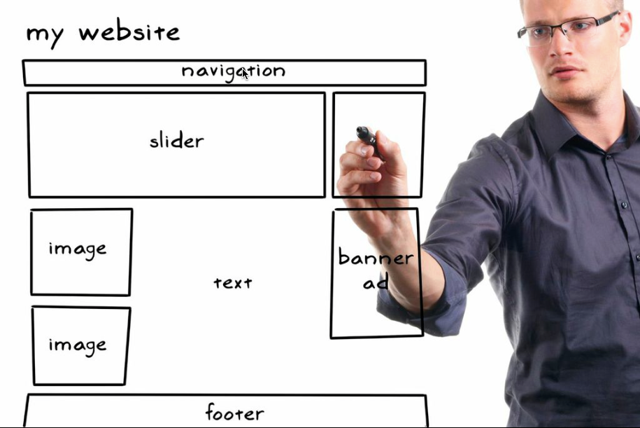
One of our unique requirements for the new website was to create a simultaneously scalable and modular set of page templates. With HubSpot, it didn’t force us to modify our normal creative process. The modular approach, from wire-framing, paper-prototyping, to design and execution is very much in our core; HubSpot’s apps are set up to share the same philosophy. The variety of available module types, from Rich Text and forms down to custom HTML made our redesign significantly easier.
We love our newfound ability to make real-time updates and easily create additional custom modules. Now we can focus on optimizing our messaging and our landing pages using HubSpot’s A/B Testing.
Unique Design Features We Created
Sub-Navigation
We used the HubSpot COS to create a way for our audiences to navigate our unique pages through a step-by-step story. Each page is designed to depict specific use cases and explain products that will fit best the vistor's needs. Persistent sub-navigation will appear as soon as the user starts scrolling, with various modules on each page, the visitor can quickly jump ahead to any part of the story that appeals to them.
Product sub-navigation also incorporates Skyhook iconography to give visitors a mental map of where they are on the site and allows them to easily find key pieces of information that they are looking for. Without sub-navigation, as shown on the left, it was more difficult for our customers to find key product information. Now as shown on the right, we created sub-navigation panels so that our customers can find important pages faster.

Icons
Our use of icons throughout the website is consistent for each of our products and delivery methods and we use them to establish a language to easily communicate about our technology in an engaging manner. With the COS, we were quickly and easily able to add new icons seamlessly throughout the site.

Parallax Scrolling
To continue our goal of delivering a compelling story for our audiences to navigate through, we used parallax scrolling to create an immersive experience where the product and themes follow the user as they scroll down the page.

2-Step Forms
Based on past data from our old website, we know that our site visitors are more likely to convert on forms that ask fewer questions. So we employed a 2-step sign-up design form process. Our website landing page forms asks only for an email address. The second step directs visitors to a second form where they can tell us more – if they choose. This process lowers the barrier to entry for visitors to learn more about our company and get placed in our marketing database, but it also qualifies visitors who are truly interested in buying our products.

What design elements has your company website used to tell its story?


