Most web developers have a long list of go-to plugins and templates that they use to avoid reinventing the wheel on every step of their projects. Chances are, you've probably got repos and Dropbox folders full of this kind of thing. In this post, we're going to walk through using modules in the HubSpot Marketplace to quickly implement a common design pattern: the ubiquitous logo slider.
A bit of context
Recently I was helping a coworker, Crystal, troubleshoot her personal site for a book launch. She had built it using the Crystal theme from the marketplace (whoa, meta…). She'd done a great job and was almost finished, but there were a couple lingering things she wanted some CSS help with. One of them was a logo slider that was built before the new module framework. It used a flex column and image modules to achieve a somewhat intuitively editable slider/carousel component. I figured this was a good chance to try out the new Logo Carousel from the marketplace and share that process here.
Here’s a quick screenshot of the finished carousel on Crystal’s site for reference:

Disclaimer up front: I'm purposefully going to go into a good bit of detail here and also share as much context as possible. If you're looking for a quick overview of marketplace modules, check out this post. If you're interested in a case study on integrating a somewhat complex module into a template with some careful examination of the process, please read on.
Why a module?
Before we dive into the tutorial style section of this post, it's worth taking a moment to lay out the rationale for using a module in the first place. Some folks may see modules as an unnecessarily complex approach to a simple problem. If it's possible to quickly cobble together the functionality you need using simple components in the template editor, why go through the trouble of building (or importing) a module? The truth is, there are two very compelling reasons to use modules whenever possible:
- To build a great editor experience - Modules are by far the best way to hand off a powerful and intuitive page-editing experience to your content editors. Later in this post we'll take a look at some editor options that will really drive this point home, but especially when working with complex functionality, a module is almost invariably the best approach. Also, since modules are consistent from instance to instance, once an editor learns how to use one instance of a module, they will be able to understand it throughout the rest of the site as well.
- To save yourself a ton of time - A fundamental aspect of coding is avoiding repetition and packaging things into reusable bits. Modules allow you to build something self contained and then use it wherever it's needed. This approach streamlines and compartmentalizes your assets. It makes maintaining your site(s) much easier, and also allows you to build a library of common solutions that can dramatically cut cost/effort in future projects.
Modules acquired through the marketplace share these qualities as well as a lovely bonus feature: someone else already built them. So even if you find something close to what you need, it may behoove you to download it and customize it to your needs.
In practice
Okay, with all of that groundwork laid, let's get back to our logo carousel case study. Crystal had a couple CSS tweaks she wanted to make to the existing carousel, but her main issue was that she was having trouble adding new logos. Specifically, she wanted to be able to change the number of logos that appeared at once. Since folks would be clicking these logos to buy her book from their preferred vendor, it made sense to show as many of them as would fit on the screen at a time. So in the end, we only enabled the slider behavior on smaller screens.
Since this component was built on slick slider but was not utilizing a module, none of the slick slider options were available to her as a content editor. She would have to dig into the JavaScript to adjust these options. Actually, she would have first had to figure out that changing the JavaScript was the way to adjust these options. Crystal is an expert social media marketer and author of lovely books, amongst other things, but a front end developer she is not. So, this editing experience was really coming up short for her.
Here's a step by step breakdown of how we customized a marketplace module to fit Crystal’s needs and gave her the editing options she needed to maintain her site.
Step 1. Grab the module from the marketplace
The easiest way to do this is from the portal where you'll be using this module. Just choose Marketplace from the Content dropdown. Once you're in the marketplace, choose Modules from the Category dropdown in the Filter products section.
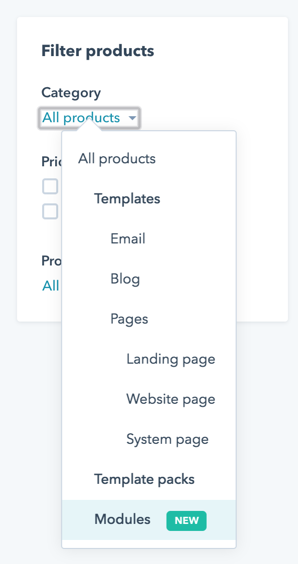
As of this writing, marketplace modules are brand new and there are only a few modules to choose from. That being said, the modules that are here tackle some of the most common design patterns on marketing websites. More likely than not, you've spent many a work day building out modules like these on countless sites.
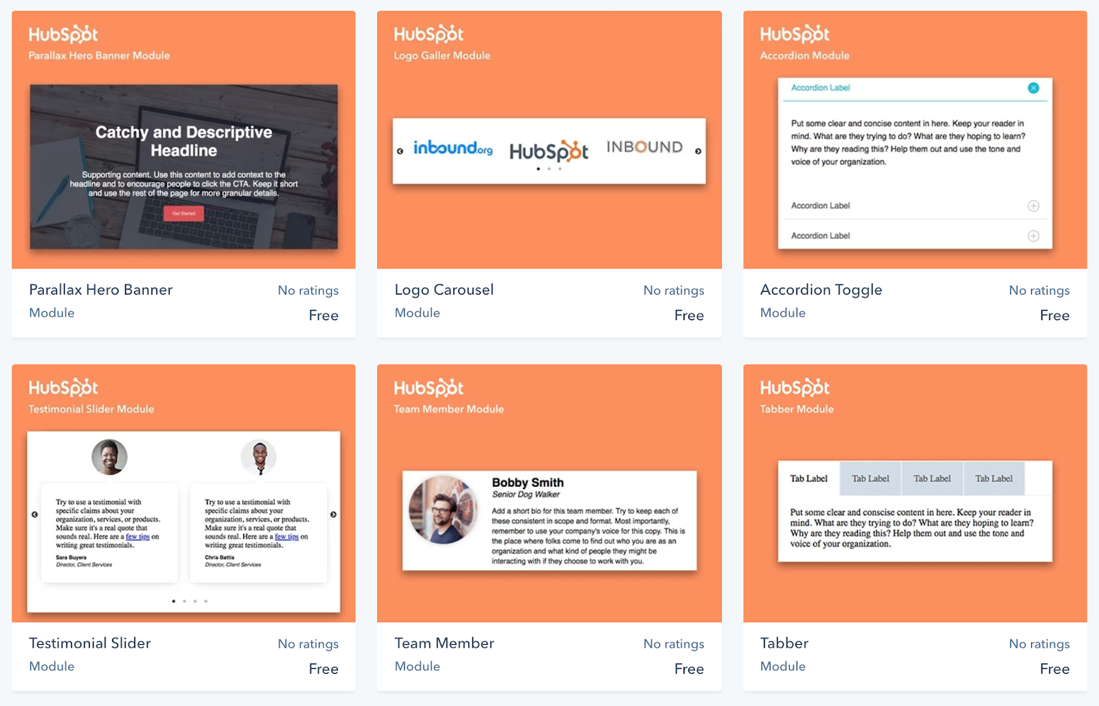
Let's grab the Logo Carousel to continue our example. To do this, simply click on this module and then click the "Get module for free" button. The module will be copied to the portal from whence you came.
Step 2. Add the module to your template
If you're building a template from scratch, this process is just simple drag and drop. In the case of our example, we're replacing a logo carousel that is currently integrated into a fairly complex template. Ideally, we'd like to keep all the styling of this template in place and just swap out the old flex column–based logo carousel with the new module-based logo carousel.
Pro tip: It can be nice to identify the spot where this new module will live and then insert it next to the old content. That way you can test things out and make sure you've got the module in the right place and the functionality is the same.
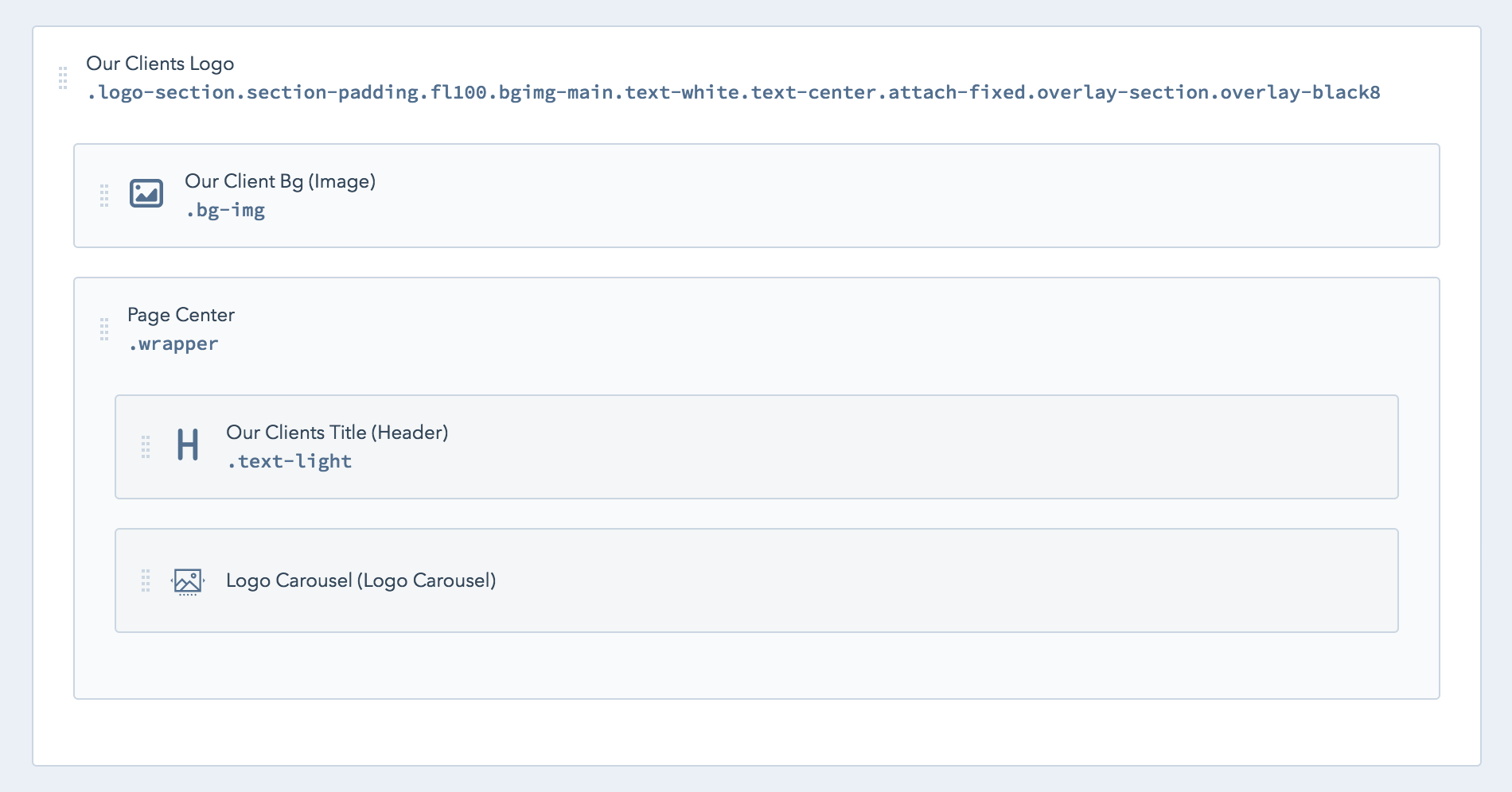
Use the Add tab of the inspector to select the logo carousel and drag it into your template. The search feature is pretty handy for this.
 |
 |
| The old flex column based logo carousel | The new module based logo carousel |
Once you're reasonably confident that the new module is the right way to go, remove the old one and move on to the customization phase.
Step 3. Customize the module
Customize settings
There are a few levels of customization available for any module. At the beginning of this post we mentioned that the editing experience of modules was one of the main arguments for using them in the first place. This module has quite a few carousel-related options such as number of logos to show at a time, arrow navigation, autoplay, etc.
There are three places you can set these options. Each one overrides the last.
- You can set defaults at the module level.
- You can set defaults at the template level.
- You can choose settings at the page editor level.
It's beyond the scope of this post to describe these options extensively but suffice to say: This is an area where developers will need to put some thought into their content editor's needs. With a little effort we can avoid handing off a confusing experience and help editors quickly intuit their part of the process.
In the case of this particular logo carousel implementation, the module is being used to display a list of buying options for Crystal's book. If you recall from earlier, one of Crystal's main complaints about the old logo carousel is that she couldn't figure out how to change the number of logos that appear at a time. So we'll assume this option is going to be set at the editor level and just set a somewhat arbitrary baseline. Here's the settings from the template editor:
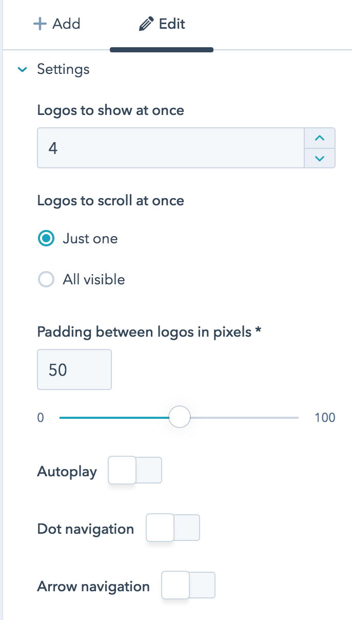
As you can see, we turned off almost all of the slider options by default. The rationale here is that on larger screens we'd like to show all of the logos at once. On smaller screens we'll turn the slider options back on conditionally using JS.
It's worth mentioning that this is a great example of a developer keeping an editor's needs in mind while making decisions about the editing experience. In another context, it might have been better to build these smaller screen settings into the editor instead of hardwiring them in the JS. In this case, it would likely just unnecessarily increase the complexity of the module.
Customize the CSS
The new module builder UI contains separate panes for HTML/HubL, CSS, and JS. The CSS in modules gets added to the rest of a served page's CSS and concatenated and minified. So the old fine cuisine adage "it's all going the same place" applies to some degree here. That being said, organization is a key component of creating a sustainable website, so you should probably establish some kind of convention for how and where you add styles.
Marketplace modules take the approach of only including styles critical to the baseline functionality of a module. You may choose to supplement these styles directly in the module CSS or to customize the module in your user stylesheet. For the sake of this example, we will take the former approach and tweak the module CSS slightly to massage it into our page layout.
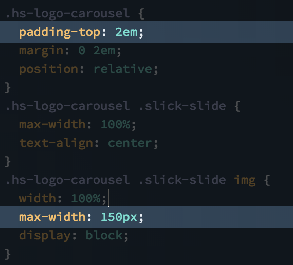
In these CSS rules we limited the maximum width of the logos to 150px and gave the whole carousel a little extra space on the top.
Customize the JS
As mentioned earlier, we decided to keep the smaller screen breakpoints of the flex slider options hardwired into the JS instead of building out a more complex editor experience. Here's a screenshot to show what we did here.
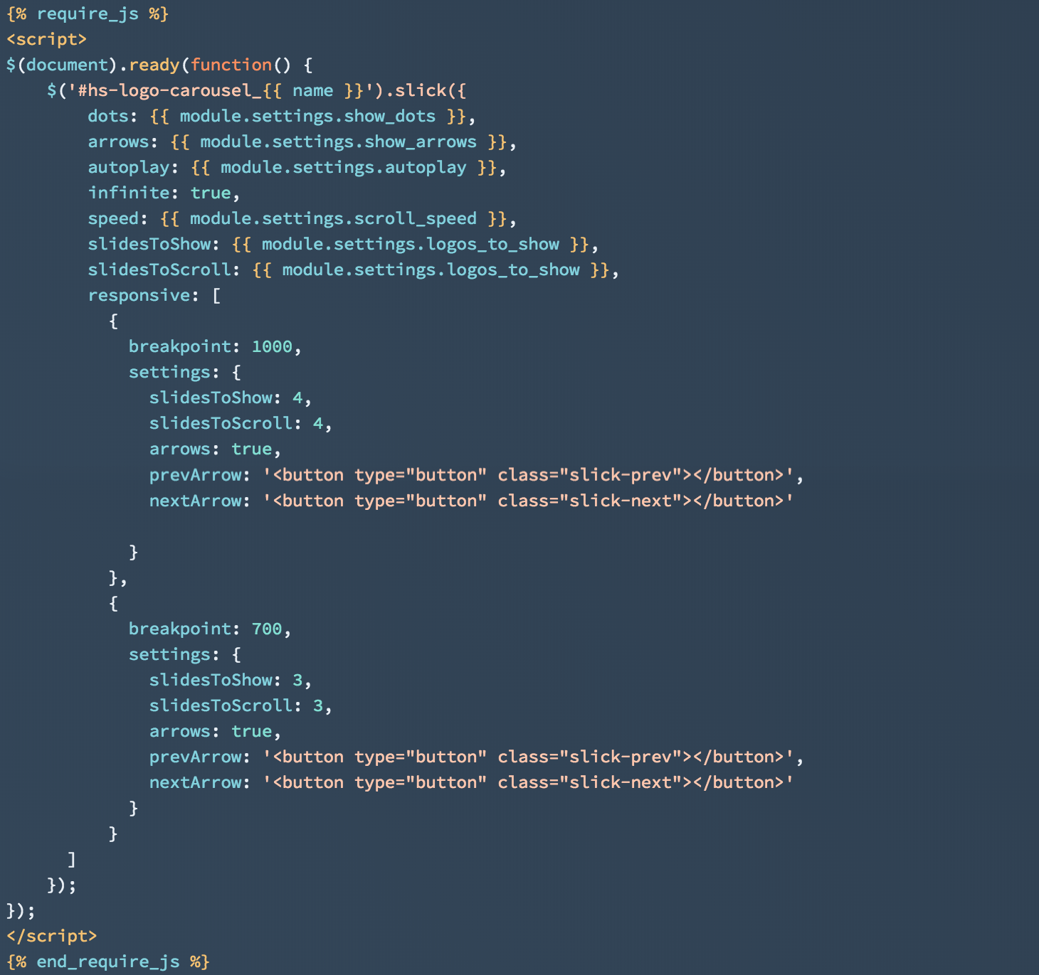
Notice that the default options are hooked into fields available in the editor. If you did wish to fold these breakpoints into the editor, you would create similar fields and groups for each breakpoint, or even use a repeatable group and let the editor pick breakpoints. As this example illustrates, there is a continuum of customization options available. The trick is to determine which options will be helpful and empowering for your content editor and which options will cause feature bloat and confusion.
Parting words
This has been a fairly deep dive on the subject of using modules and especially customizing modules. If you aren't intimately acquainted with using modules, no worries. This is a deep topic and it might be quite some time until your own site gets complex enough for some of the more advanced considerations examined here. Hopefully you've enjoyed this peek into the wide variety of available options. As your site grows, perhaps you may want to revisit this article periodically to plan out your strategy for expanding.