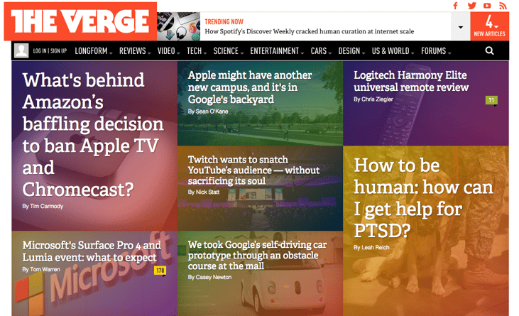
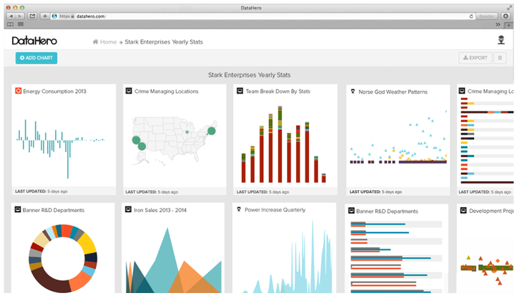
 You've seen this design everywhere. It was pioneered by Pintrest and popularized by many other web giants. You've probably implemented this design yourself. Card design has almost become a norm. But, web card design isn't just a trendy container style design popularized by social media sites. It's actually a viable web design style that can meet your usability needs. Keep reading to learn more about why card design has become so popular and how to optimize card design yourself.
Why Is Card Design So Popular?
1) You can easily communicate shorts bursts of information.
Card design can communicate very short bursts of information. In this tl;dr generation of users with extremely short attention spans, this design allows you to separate information into short blocks.
2) Card Design is inherently responsive and mobile friendly.
This design can be easily manipulated to fit into a variety of responsive layouts. If you're looking to go responsive, (which, by the way, you should), this design will be hugely beneficial. Card design provides a sense of flow and consistency in your layout across all devices. Further, one card is essentially the size of a mobile screen, so transitions between devices are seamless.
3) It's a great way to clearly organize your website.
Because of the nature of card design, you can succinctly and clearly organize your website. If you've struggled with an overcrowded website, this may be a great solution. Cards give the user an easy way to categorize and gather information.
4) It's social media friendly.
Card designs are inherently social media friendly due to the changing layout trends in many social media sites (parts of Twitter, Facebook, Google Now, Pintrest and more). You are optimizing your site to be "share-able" and to easily sync onto many of the social media channels listed above.

4 Ways to Optimize Your Site with Card Design
1) Think of each card as an individual thought and CTA.
Because one of the major pros of this layout is design simplicity and clarity, I'd suggest that you only include one thought, image and CTA in each card. This way, users can easily distinguish the differences between cards.
2) Prioritize card usability
Although I mentioned exactly how functional this layout can be above, it is also an aesthetically pleasing and trendy design. Don't get too caught up in the design. Think of your user first. This layout can become heavy and cluttered very easily so, focus on usability.
3) Use white space effectively
As mentioned above, this web design can easily grow cluttered and confusing. In an effort to optimize usability, utilize negative space. White space will help to encourage separation and organization within the screen.
4) The simpler the better.
When designing the cards, use a simple typeface and remember to optimize photos for crispness. Due to the small size of the card, choose a simple, timeless type that can be scaled to be smaller or bigger. Further, when it comes to images, scale your photos appropriately. To optimize separation, make sure your images take up 50%-75% of each card.
How to Implement Card Design with the Hubspot COS
If you want to learn how to implement card design with the Hubspot COS system, or want to learn about exactly what a card is please view this post, Web Page Design: How to Put Cards on your Hubspot COS Website Page.


