
This post originally appeared on Agency Post. To read more content like this, subscribe to Agency Post.
We’ve all seen them: the frustrating little pages that emerge from deep within a website when you’ve taken a wrong turn online. Maybe the developer forgot to remove that link when they deleted that blog post. Or maybe they updated the site and an extra sneaky character got into the link URL. Whatever the case, sending a website visitor to a 404 page is never a great idea. Ideally we’d want our sites locked tight and linked right, but sometimes, it just can’t be avoided. However, we can use this as an opportunity to not only build brand loyalty but delight customers at the same time.
Here are four different approaches that break the boring 404 error page mold:
1) Use a little humor.
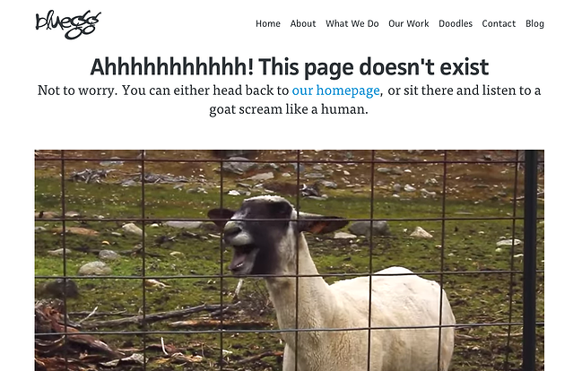
Do you remember that viral video of the goat that screamed like a human? It was a massive hit online, and it was brought back into the cultural conversation by a few brands at the 2015 Super Bowl.
Blue Egg used this memorable video in its 404 error page. By incorporating a part of pop culture, this page is a fun surprise for visitors. The brand invites you to watch the video as a sort of apology for the broken link. Then, you can find your way back to the homepage when you’re done.
One of the most prominent of all 404 pages is from Lego. Their playful approach uses clean imagery to highlight that the person has found a broken link. Using their own characters they are building brand loyalty and the different expressions on each character gives the page a light-hearted humor that can ease the frustration one might feel.
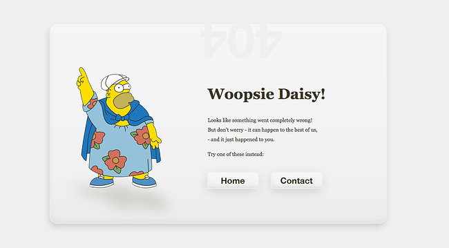
Another clever use of humor comes from the personal site of Henrik Hedegaard. Now who can resist a image of Homer Simpson? Henrik used the familiar character from the fat guy hat episode. By using a familiar character in a comical situation, this website also successfully eased the tension of landing on an error page and provided a simple, straightforward method to find your way back home.
2) Entertain the visitor.
Another tactic one might consider for their error pages is to take that opportunity and entertain your website visitor -- if only for a short time. The brief distraction could potentially make the person forget he even reached an error page in the first place. This is a wonderful treat to give your visitor at such an awkward juncture in their digital journey.
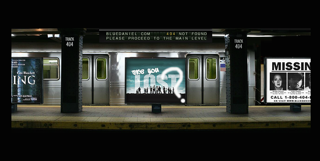
Blue Daniel does an amazing job with its use of animation and cinema. When you reach the 404 page, you might not even know it’s an error page to begin with. But as you watch what is happening on the screen, you begin to pick up on the little details that make this page so great. From the rotating letters on top to the train entering the station to the screeching of the breaks, this error page feels more like a TV show than a website page.
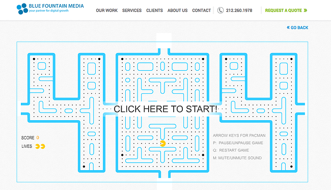
What's more entertaining than a game? Blue Fountain took a creative approach when they designed their Pacman-inspired 404 error page. It’s almost impossible not to play a game or two if you happen to land on this page. The distraction helps to alleviate the frustration from not ending up where you were expecting, and the creative use of the page leaves a lasting impression on the visitor.
3) Show off your skills.
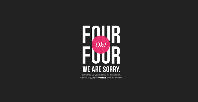
9GAG used creative topography and a modern color scheme to display their error page. It used a quirky headline to show off its creativity and a pop of color to make the page visually appealing. This page doesn't adhere to the design of the rest of the site, so it is a great attention grabber.
Another error page you can zone out on for hours is HotDot. This group of digital artists used millions of tiny dots to create an animated 404. You can watch the dots jump around and even respond to your mouse. The page showcases how the firm pays attention to even the smallest details, and it emphasizes its brand identity.

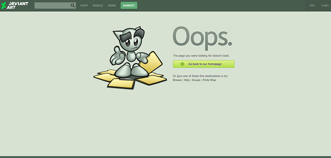
Deviant Art is known the world over for all things visual and creative. Its simple, yet effective, illustrated error page showcases the site's “mascot” character. It's a creative way to highlight the brand's identity and to show that the site understand how the visitor feels when he loses a file.
4) Be functional.
This is an important concept. Don’t just leave your website visitor hanging. He has reached this page because something is broken. Why not give him all the tools he needs to reach his desired destination?
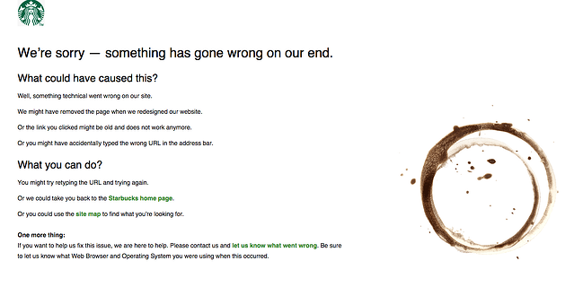
Starbucks created a functional 404 page. It informs the visitor what could have potentially happened. It also gives a number of options for what the person could do next, and like all good error pages, it invites feedback from the visitor directly.
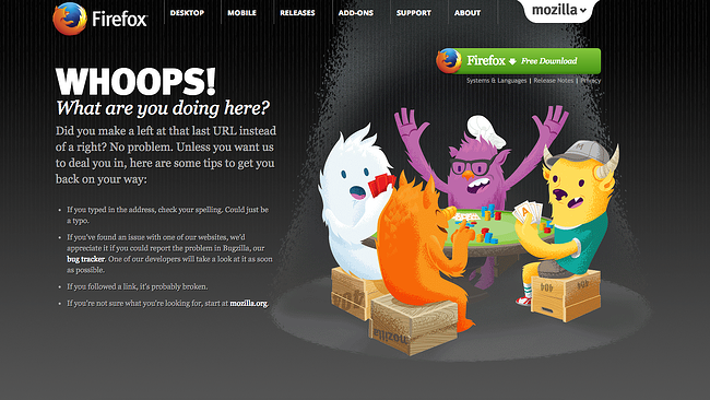
Mozilla also provides a helpful 404 error page. It gives the visitors numerous routes out of the dead end page. It keeps the main navigation menu. It also uses the page as an opportunity for a lead conversion by including a direct download link for its browser. This is a great way to delight a wandering traveler.
There are always opportunities to turn a negative situation around and use it as a way to delight your visitor and increase customer retention. By taking some extra time and giving some thought to your 404 error page, you might snag a potentially lost client or even wind up on a "best of" blog post somewhere. Regardless, it’s a great addition to client web project as it shows that you know even the smallest details matter when building an online brand.


