The new design manager is a huge improvement from the old version in a ton of ways. Check out these pro tips for a quick rundown on some of the new tools and functionalities to get the best use out of the new design manager.
Design Previewer
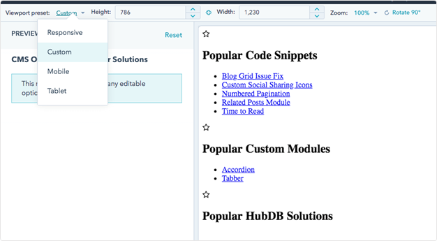
The new design manager has several new capabilities in its preview mode. You can see an example of what this view looks like in the image below, but I also encourage you to go into your own design manager, pick a template or custom module, and preview it by clicking the “Preview” button in the top right corner.

In the top bar you can select the browser size and orientation. You can use the mobile, tablet, or responsive browser presets, or set your own custom sizing. Once you’ve set the browser size, you can also zoom in and out and rotate the preview to see how your content would look when a smartphone or tablet are turned on its side. Using these preview settings, you can put yourself in the shoes of your website’s visitors; has your page analytics shown that most people are accessing your site from a smartphone? If so, use the mobile preset every time you create new templates.
The new preview app also auto-updates as you make changes to the template or custom module, so you don’t have to refresh the page every time you want to see your updates reflected.
File, View, and Actions Dropdowns
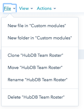
 The 'File,' 'View,' and 'Actions' drop downs within the finder on the left-hand side contain tons of functionality. View all pages (live and drafts) that are using the selected template, create a page using a specific template, clone a template, and perform a number of other actions. A general tip: if you’re looking for a functionality that deals with the template as a whole, check these drop downs.
Keep in mind that the drop down options apply to the template or file selected in the finder - not necessarily the template you are viewing. You can see this play out when you go to View > Collapse all folders. The folders will all collapse, and you’ll see the Actions tab gray out. Even though you are still looking at the same template, collapsing all the folders in the Finder deselected the template so the dropdowns don’t apply to any given template anymore.
Set Up a Folder Structure and Naming Convention That Works for You
It is remarkably easier to move and rename folders and templates in the new design manager. Use this to your advantage and stay organized. Think about your folder structure and a naming convention that works for you and your team. It’ll take some overhead time investment, but you’ll avoid the time-consuming headache of crawling through a mess of folders to find one template.
Figure out a minimum viable naming and organization system for you and everyone else working in your HubSpot portal’s design manager, and iterate on it as you figure out what works and what doesn’t. Here are a few examples you can pull from:
- Create one main folder of all the templates the site currently uses and one folder of all the templates that the site doesn’t use.
- Keep all of your landing page templates, website templates, blog templates, and custom module files in different folders.
- Name folders and templates based on their use and the year they were created (i.e. Whitepaper Landing Page 2018).
At the end of the day, there is no one right way to organize your design manager. Figure out what naming convention makes sense to you and your team, maintain the integrity of this system, and iterate.
Enlarge the Code Pane You’re Working In
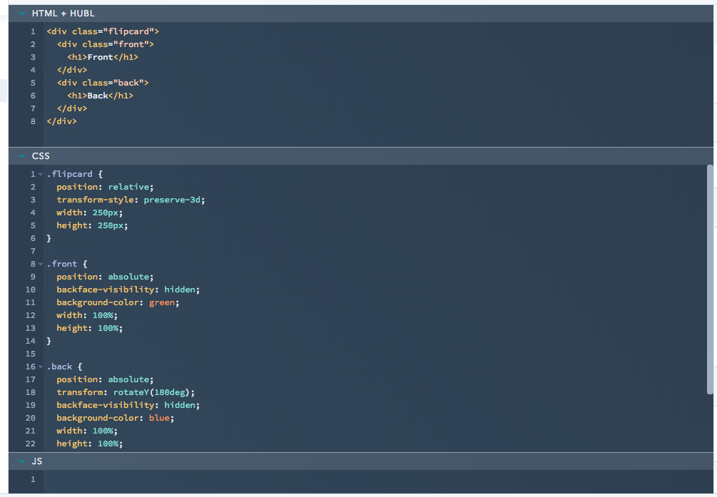
We put a ton of effort into easing the process of creating and editing custom modules in the new design manager. One key component was to break up the types of code into three different panes: HTML & HubL, CSS, and Javascript. This segmenting helps designers and developers understand where to put their code.

One awesome feature within this new custom module editor is the ability to shift the size of the code panes. If you’re working on your JS, there’s no reason to have the CSS taking up half the page. Shift up the bar separating the JS and CSS to close the CSS pane completely and give yourself some elbow room in the JS pane.
Links for Each Module for Easier Shared Editing
Go into any drag-and-drop template in your design manager, start clicking on the different modules, and watch the URL. The slug will change depending on what module you have selected. This is designed to create an easier group editing experience. You can make edits on a specific module or have questions about it’s placement or function, and you can send your colleague a link to the template with that module selected so they can jump right in.
Clone Module Groups
A great way to organize your templates is to put modules into groups so you can move and style the modules as a cohesive group. Say you grouped together a rich text module, an image module, and a custom tabber module side by side. You love how it looks, and you want to add this same grouping further down the page. Rather than recreate it step by step, in the new design manager you can save some time by right-clicking on the module group and select “Clone group”. Note the other options in the right-click menu while you’re at it - deleting or splitting up a module group is now just a two-click process!

If you’d like a more in-depth introduction to the new design manager, take a look at our intro blog post or take advantage of our new training!


