One of the common business struggles is getting prospects to demo your product or service. Prospects must be qualified and then agree to a demo before you even have the hopes of getting them signed on as a customer. As a designer, you have a huge hand in this with the creation of an engaging website.
Yet lately, it seems many designers are no longer asking for permission to demo their products. Instead, I've begun to notice they are taking matters into their own hands and giving prospects a demo, whether they like it or not, by integrating it right onto their homepage.
No, they aren't force-feeding prospects full, unsolicited demos. Instead, they are allowing prospects to get a peek at the product without taking any action.These sites aren't simply telling prospects what their product or service can do, they are showing how they do it. It seems others have noticed "the rise of the live-demo homepage" trend as well. So, who's doing it well? And how are they doing it?
Web Design Trend: Live-Demo Homepage Examples
A Comparison of Approaches:
The modern world offers consumers a seemingly endless number of products and services that accomplish the same "job to be done". Unfortunately for those services, it prompts a need to either be heavily differentiated or offer a lower price for the same value. Price aside, those looking to take on the differentiation approach may decide to do it through their websites.
Let's consider three products that exist in the same ecosystem (the world of prototyping, collaboration, and feedback tools): InVision, Conjure, and ViewFlux. Beyond their different design and visual styles, the three companies use a variation of the live-demo homepage to give site visitors insight into their products.
InVision
InVision is a prototyping, collaboration, and workflow platform. On their homepage, they call out that their app is "The world's most powerful design prototyping tool." To back up this claim, they "tell" site visitors by describing the process to do this.
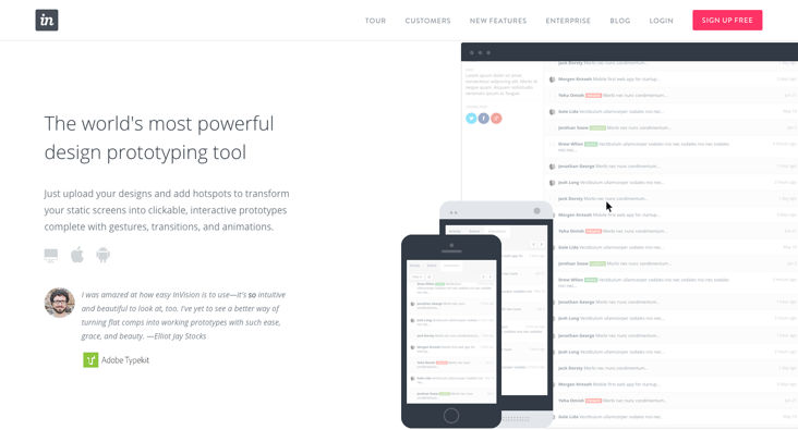
They further this claim with social proof from testimonials from prominent industry members and by "showing" with a focused animation that highlights how each component of the software delivers on the promise made. This tactic is used for each claim, offering an effective way to entice site visitors. With a distinction as the "world's leading," this simple approach is enough for InVision.
Conjure
Conjure is another collaboration and feedback tool. How are they to stand up against "the world's leading" tool in the same category? Conjure takes the animation approach one step further by making it an interactive preview of their software.
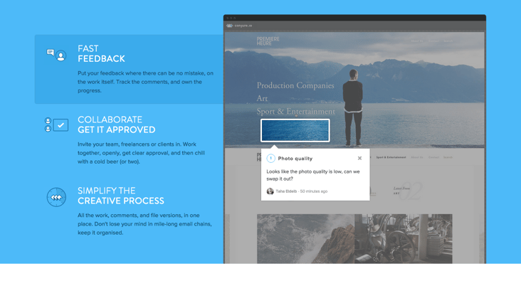
By pairing each high-level claim with the ability to actually click into how the software executes that task, site visitors get a feel for what it would be like to actually use this as a collaboration or feedback tool. This interactive approach gives Conjure a fighting chance to stand up against other apps.
ViewFlux
ViewFlux expands on Conjure's interactive live-demo homepage. Let's take a step back to the Conjure page. When I initially viewed the live-demo aspect of their homepage, I didn't realize that the demo was interactive. This is a drawback for an app trying to compete with any heavy hitters in the category.
ViewFlux works around this by using animations to emphasize the action to take. For instance, on their first preview, they show a mouse pointer clicking into the different tabs and on their second preview, there is a revolving highlight around the box to enter a comment. This subtle emphasis makes the live-demo homepage extremely effective.
There are a number of different ways to present a live-demo on your homepage. Here's a few more of my favorite animation tactics:
Inspiring Live-Demo Homepage Examples
1. BentoBox
BentoBox, a recent graduate of TechStars NYC, offers engaging and mobile-friendly websites for restaurants. On their homepage, BentoBox highlights their "Super Simple Features" and "Mobile First" design. Instead of simply listing out these features, the team at BentoBox took it a step further by adding in an animated preview of the process to edit a section of the website and back-end dashboard of their tool.
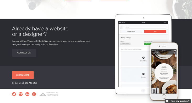
They also show the same website being edited on the animated showcase at the same time. Prospects aren't left guessing at how "Super Simple" their site builder is with this approach.
2. Venmo
Venmo's homepage is fantastically simple; there isn't much information on the page. Beyond the simplicity of the information presented and the CTA, they include a demo of the social stream that shows your contacts and your own payment history, styled within an iPhone mockup.
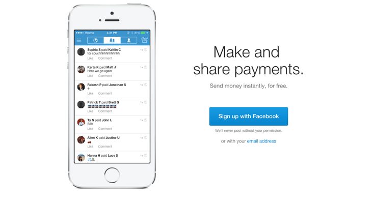
The real-time nature of the updates on the homepage emphasizes the real-time nature of Venmo payments. Combining this with the minimalist approach, visitors evaluating Venmo as a service to use will get an inside look into the app.
3. SmartHalo
SmartHalo is a product that promises to "Turn Any Bike Into a Smart Bike." I came across this product on Twitter and thought: Smart Bike? what exactly is does that mean? As I navigated to the homepage I was pleasantly surprised to see half-way down the homepage, they had used the live-demo tactic to better explain their product.
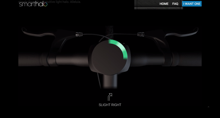
Along with copy that describes how SmartHalo allows you to "get turn-by-turn navigation straight on your handlebar," they feature an animation that places the site viewer in the context of riding a bike with a bird's eye view of how the SmartHalo lights up to show the navigation. Clears any confusion right up!
4. Tictail
Tictail allows users to get up and running with an online store within minutes. Tictail uses the animation approach to showcase the software, however, the unique aspect is that site visitors are taken through the onboarding process in the animation. You see the software as it would first load for a new user.
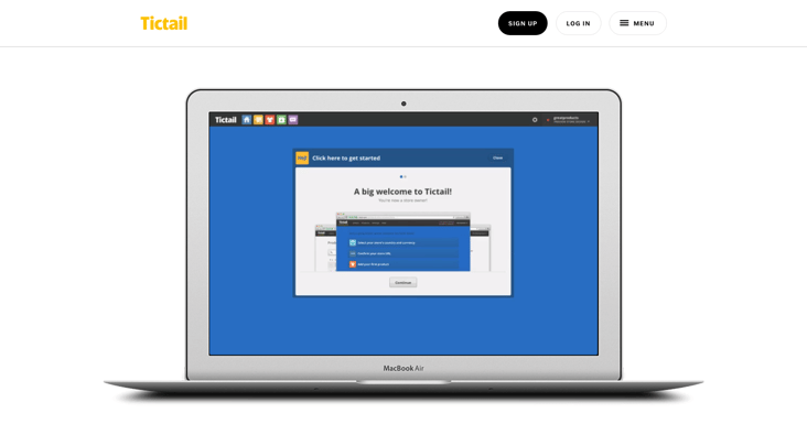
This is a great way to set expectations for prospects. Not only do they get a peek into the software, but they get a heads up on the first steps they will have to take to get their site up and running, like connecting social accounts, describing their store, and adding their first products.
5. Bounce
Bounce is the self-touted "fastest way to add a banner to your site." When you scroll on the homepage, you'll find that you are scrolling through a feature and benefit list. As this happens, the bar in the browser illustration changes, calling attention to how Bounce could be used on different pages of your website.
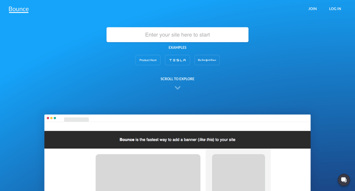
Putting this up front makes a pretty compelling case for you to try out the product, which is easily done by inputting your site or clicking on one of the examples they have prepared. If you follow this path and click through to create the bar, you'll be prompted to sign up for the service with a simple form before you can save the Bounce bar. Since all of the leg work is done, seems like a great way to drive usage, don't you think?
6. DigitalOcean
As a cloud hosting service built for developers, DigitalOcean has to make a compelling cause for developers to deploy on their cloud. So, how did DigitalOcean decide to attract developers to their control panel?
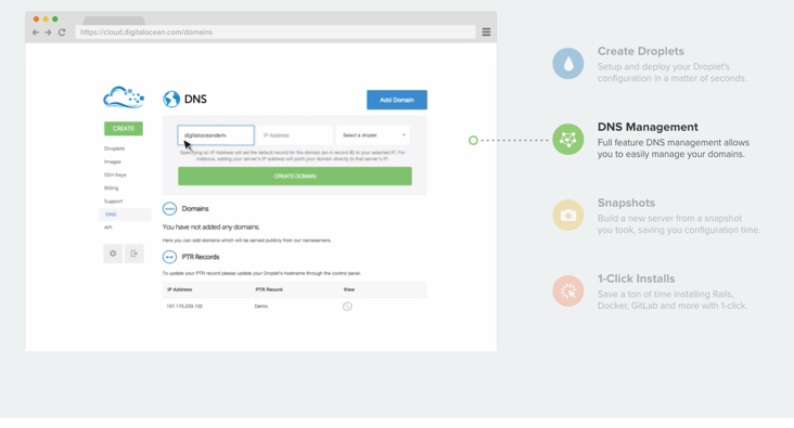
Through the use of a live-demo homepage, DigitalOcean shows the four main tasks you can accomplish on the platform with click to view animations that offer a great way to offer a holistic overview.
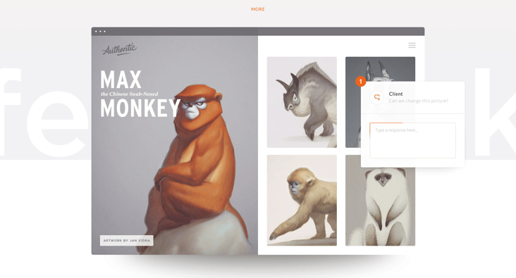
7. Crystal
Crystal is a service that shows you how to communicate with someone via e-mail based on their unique personality traits embedded in their online presence. To clarify the problem, they offer the copy that "different people have different communication styles," paired with two images that compare two different versions of the same email.
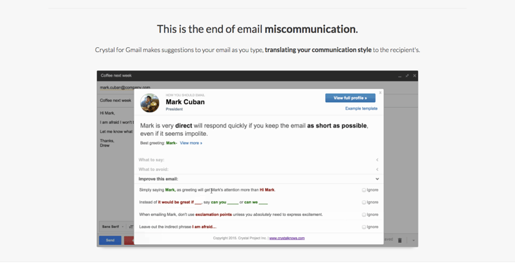
To "end email miscommunication", they clarify how their service does this with an animation that shows a user writing an email and how the software comes into play. With a full overview of exactly how the product works, users expectations are set and questions are answered before they've ever even signed up for the service.
8. Connect Mania
Connect Mania, an iPhone app, is a "simple game about connecting dots of the same color." There exists an inherent learning curve for games of any sort and yet Connect Mania boasts that the game is "Easy to pick up."
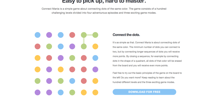
The team at One Wave, the creators of this app, decided to put an interactive version of the game right on the homepage. With simple rules to connect at least two dots of the same color, site visitors can give it a go and see just how easy it is. Learning curve mastered.
What other homepages offer a live-demo? How do you feel about this approach? What other web design trends have you seen in 2015? Let us know in the comments!