 Have you ever gone to a website that takes your breath away? Maybe there's a really cool video at the top that captures your attention. Or maybe the website uses parallax scrolling that makes the website's story really powerful. With modern web design, there is more often than not some type of web animation on the site. Whether it's to smooth the website transition or emphasize product features, web animations serve to enhance the visual content on site. Websites that execute web animation correctly capitalize on the chance to further engage site visitors.
We have compiled a list of some of these kick-ass animations. These are sites that you won't soon forget about because they are so powerful due to their animations. Let's get started.
1) Every Last Drop
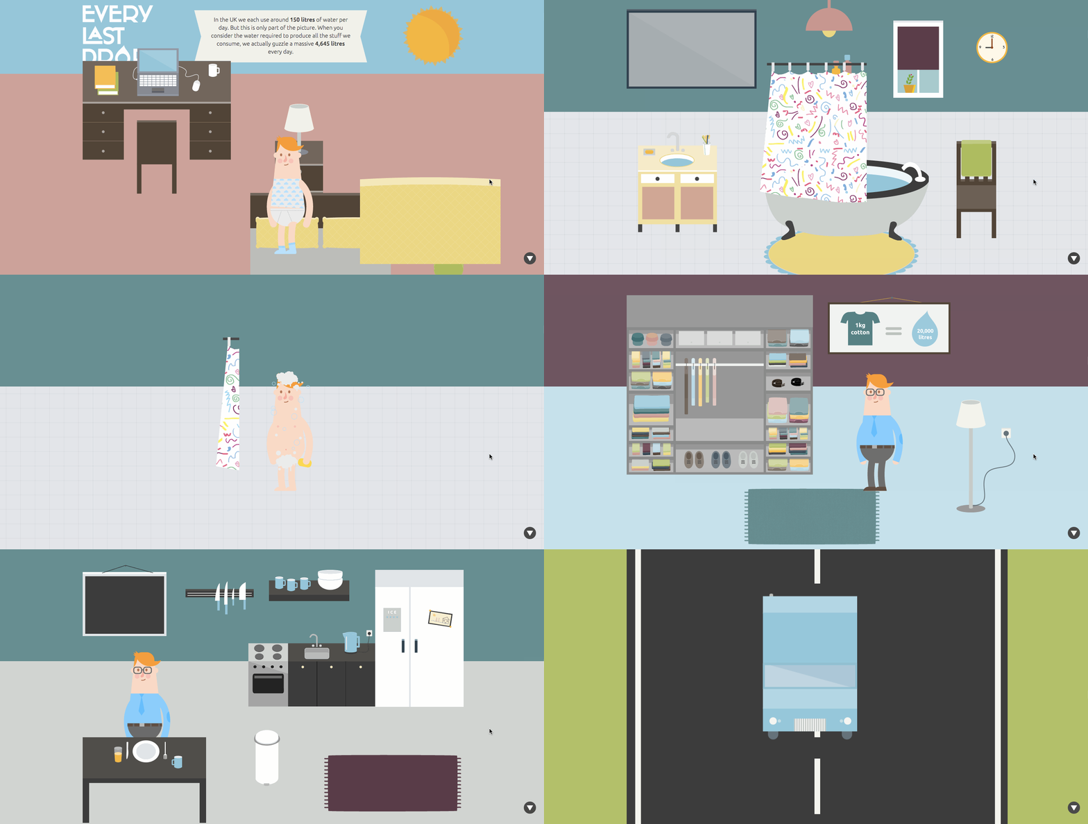
Every Last Drop shows how much water is wasted on a daily basis and the difference that can be made by using water in different ways. As you scroll through the website, you see a typical person's journey from waking up, showering, eating breakfast, getting dressed, and going to work. Along the journey, there are stats that appear showing the amount of water used for these different activities. What makes the website exceptional is the journey you take as you move throughout the website.
2) Bellroy
Bellroy sells wallets that are not just your typical wallet. They are thinner to make it easier for you to carry everything around. The way the website is set up allows you to scroll down along the path to find out more about the product. When you get to one section that says "Slim Your Wallet," you can see how Bellroy wallets compare to regular wallets when they are full of credit cards, receipts, and cash. This animation makes it very clear how the different products work.
3) Coin
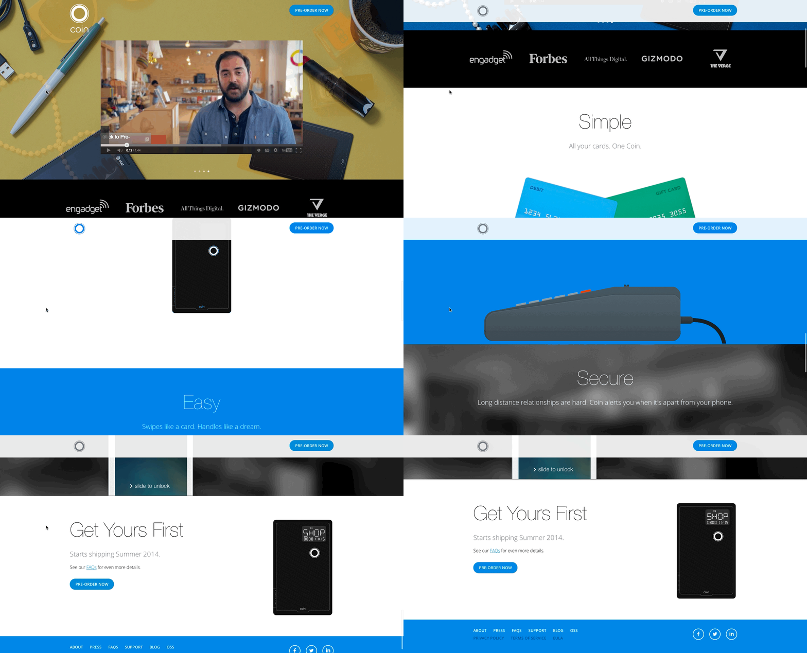
Coin looks like a credit card, but it is so much more. Coin is actually a credit card-like device that can store multiple credit cards, gift cards, or debit cards in it. Instead of carrying around multiple cards, you can just carry around Coin. When you go to their website, their animation shows how Coin works and answers some of the most important questions: How does it work? Is it secure? What happens if I lose it? The animation of the Coin card throughout the website not only walks you through the site but provides answers to your questions.
4) Orange Pegs Media
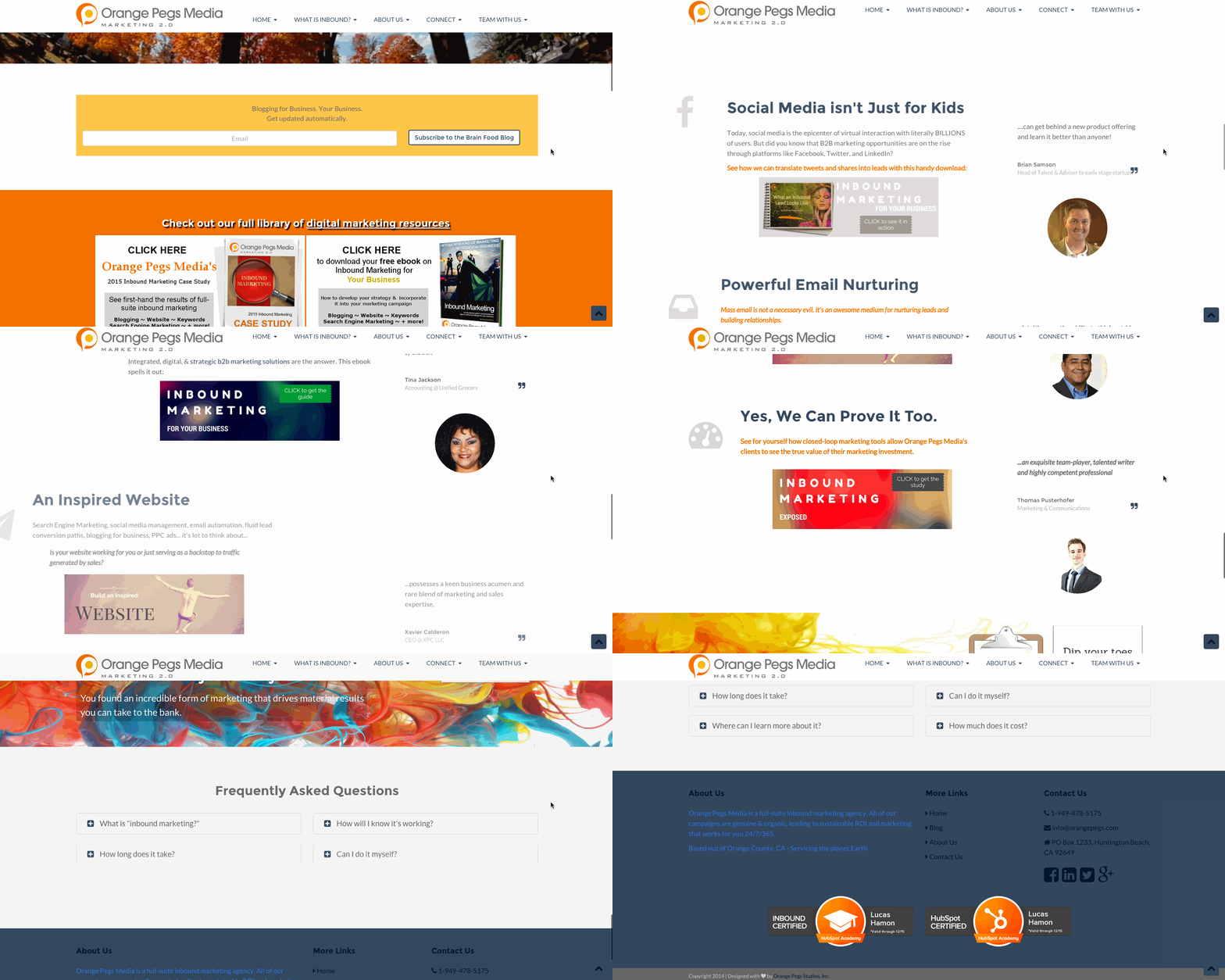
Orange Pegs Media is a full-suite inbound marketing agency. When you go to their website there is an animated video in the header with positioning saying "find your audience with inbound marketing." This gives you a feeling that you are literally finding your audience through the video and sets an inspirational tone with the rest of the website. This site was built on the HubSpot COS, so if you're looking to achieve these animations, check out the five free themes on the HubSpot COS that come prepackaged with animations.
5) Pharmacy Development Solutions
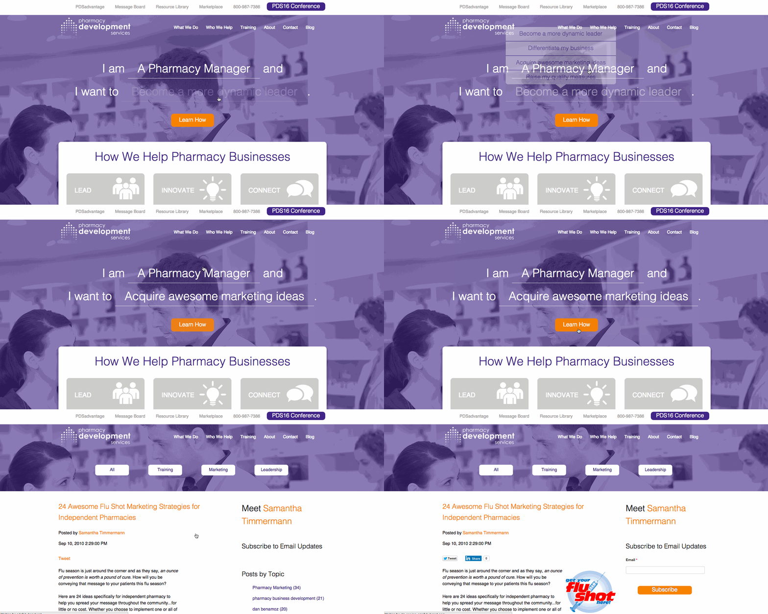
Pharmacy Development Services provides coaching for independent pharmacy owners running their businesses. When you go to their site, you see animation with the "Learn How" CTA flashing. You then see that you are able to customize your experience by choosing your title as well as what you are interested in doing. Then you click on "Learn How" to start your customized experience. The animation here serves an important purpose. Website visitors don't always expect that they are going to have such a personalized experience, but the animation shows them that they have to take an action before continuing down the website.
6) Upturn
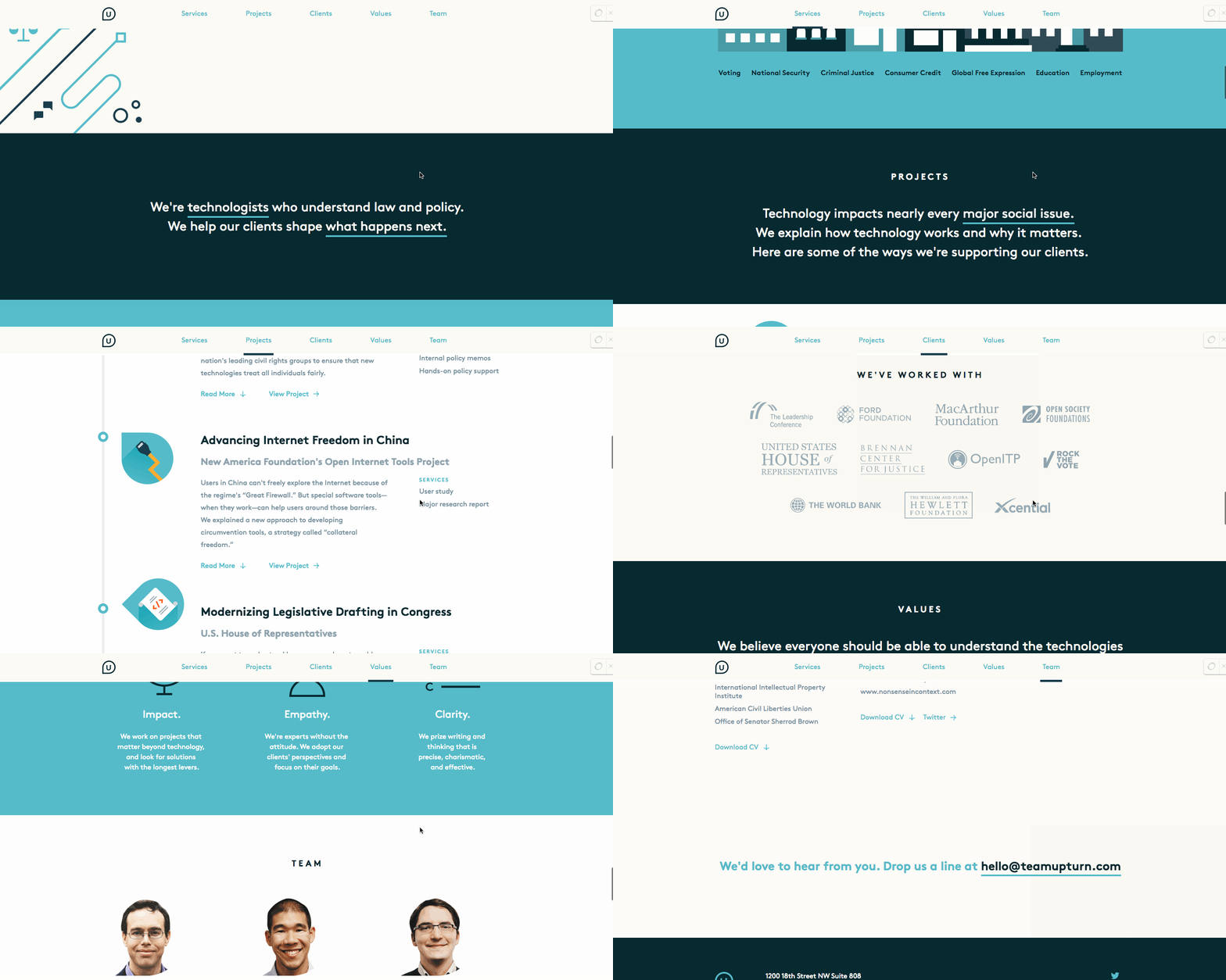
Upturn is an agency who helps their clients with law and policy situations. They have worked with everyone from the United States House of Representatives to The World Bank. Their website is unique because there is a subtle flair that actually makes it easier for users to scroll through their site. As we scroll down the website, you will notice that certain words or phrases are underlined. The underlined phrases include "technologists," "what happens next," "major social issue," and their email address. These are all phrases and keywords that they want their website visitors to walk away remembering. We all know that website visitors skim, but if they only retain some information, these underlined words will be it.
7) GoAnimate
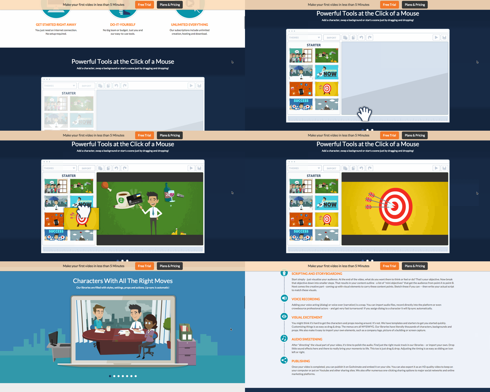
GoAnimate is a tool to make animated videos. Their positioning is around anyone being able to produce videos whether or not they have animation experience. When you scroll down their website, you can get a walkthrough of how the product works with different uses for it. This allows the website visitor to see just how easy it is to use the tool, confirming their positioning earlier on the website.
8) Gyroscope
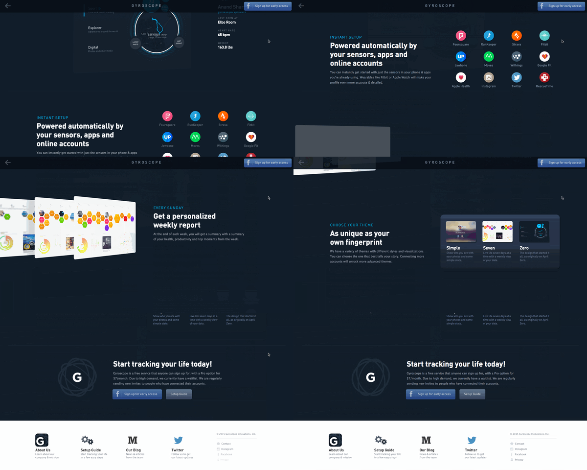
Gyroscope produces a personalized weekly report for its users based on their activity on different apps. When you first go to their website, there is an animation at the top that shows how the personalized report looks like, and you can click around to see more. As you scroll down through the website, you see more and more information that appears on the screen as you scroll down. This allows you to focus on one use case at a specific time to prevent information overload.
9) InVision
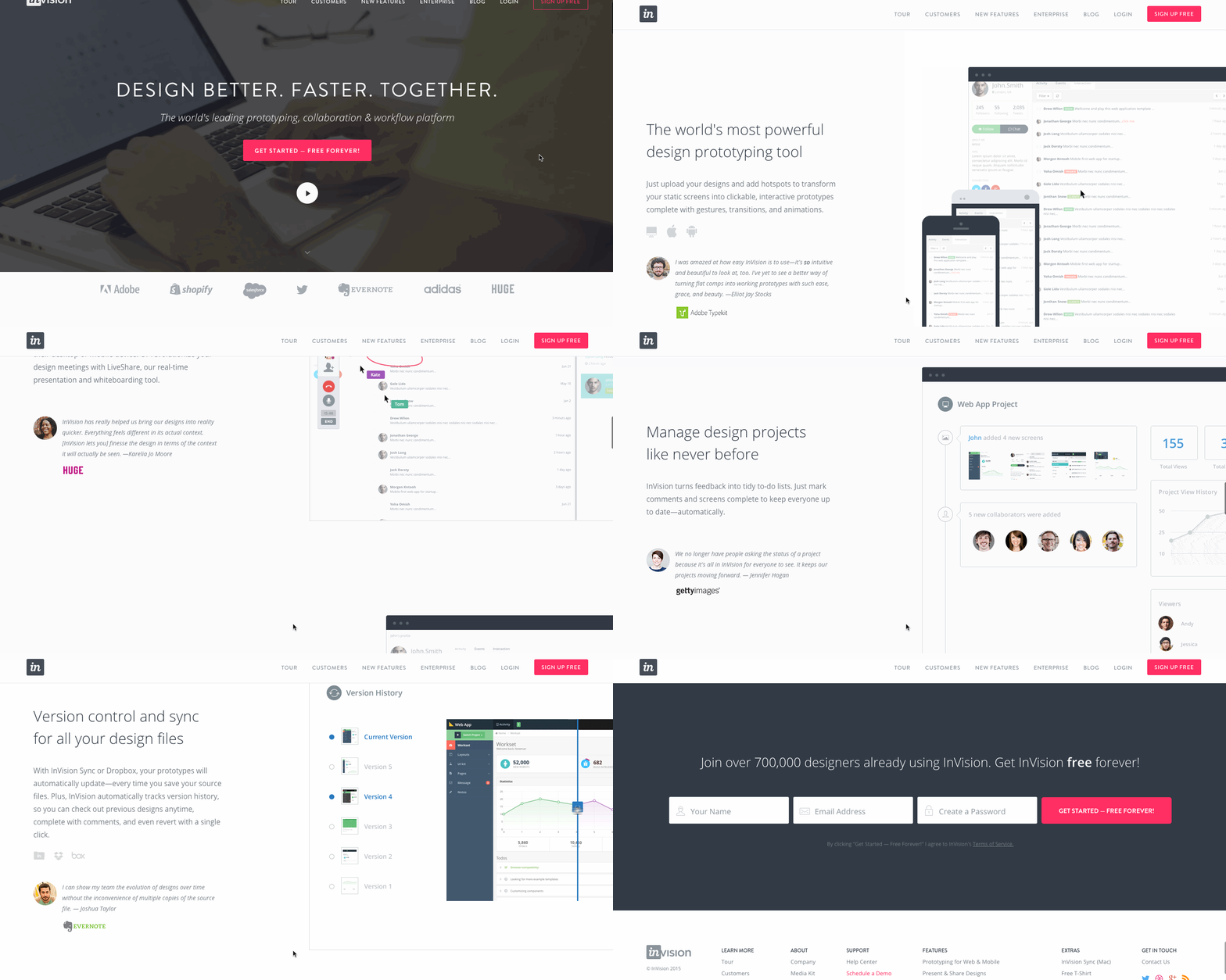
InVision is an app used for web and mobile prototyping. Designers can use it to create interactive mockups that can be used to test the effectiveness of their designs. As you scroll down their website, you see example use cases of what their product can do. They separate their website into these different use cases and provide a short explanation of it, a testimonial, and then their product in action. This makes it very easy for someone to immediately understand the value of their product as well as see it in action.
10) illustrio
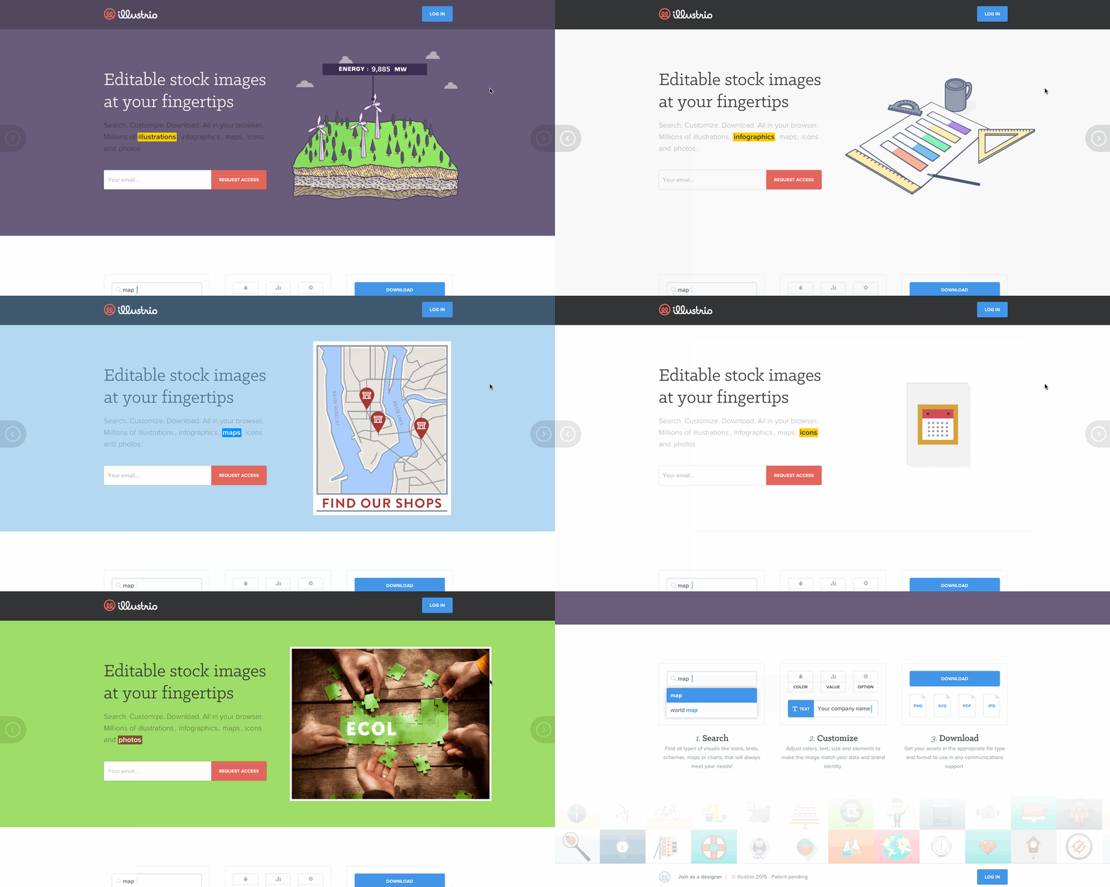
illustrio is a tool that lets you design an illustration and make it customizable. You can animate the images when you customize the images. As soon as you get to their website, they explain these use cases in the header. The header is actually a slider that changes for the different use cases. First you see illustrations and how they can be customized. The word "illustrations" is highlighted during this example. Then the highlighted word shifts to "infographics" then "maps" then "icons" then "photos" depending on the example the website visitor is viewing. This makes it extremely easy for someone to follow along and see the use case they are viewing.
What are some other websites with kick-ass animation that serve as your design inspiration?
