The first impression. In Real Estate, it’s called curb appeal. In the interwebz, it’s called your home page. There are a number of terms to describe this critical perception point, but the important thing to remember is that it's the first thing people see when they look or interact with your product, like a home or a website, and (spoiler alert) it matters.
Countless studies have been done and, yet, the old benchmark that a person forms an impression of your website within the first 3 seconds of viewing it still stands true today. That’s fairly judgemental, don’t you think? Turns out, humans can't help it. It's our job as designers to make sure that first impression is remarkable and exciting.
Our brains process imagery 60,000 times faster than we do words. When we see something, we immediately generate some sort of emotion or response, a response that is formulated quicker with graphics. This is why it is so vitally important for any website owner to dedicate the necessary time and effort to presenting the best first impression they possibly can.
So, this begs the question: What makes an engaging and beautiful homepage? Are there specific rules or guidelines one should follow to ensure successful website curb appeal? As much as we’d like to have a single list of items that guarantee a baller website, it is completely subjective and highly dependent on your business, your industry, your target audience and much more. Perhaps we can come closer to a set of guidelines by taking a look at recent trends within web design.
Web Design Trends:
The Rise of the Grid
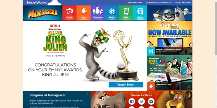
A standout trend that has resulted from the increase in mobile browsing is websites based on a grid format. Patrick McNeil, Professor of Graphic Design at the University of Missouri St. Louis, highlights that grid or modular layouts are making a big splash in 2015. A driving force behind this trend is how easily they respond to different devices. When viewed on smaller screens, grid or modular layouts collapse elegantly to present the content in a neat and orderly fashion across a variety of resolutions. An example of this can be seen on DreamWorks Madagascar website (below). Organizing content into modules allows the page to resize smoothly and align beautifully when resolution changes. Thankfully the HubSpot COS makes working with multiple modular layouts a breeze.
Bigger is Better
99designs said it best: "'Make it big' seems to be the single most important principle of web design today." This concept is applicable to fonts, images, whitespace, copy and beyond. Long gone are the days of presenting every little detail at the onset of the website funnel. Using impactful imagery and bold, concise statements trumps over jam-packing your content above the fold in an effort to showcase all of your services. This helps guide your visitor toward the information that is relevant without overwhelming them. We’re seeing a lot of this with minimalist designs that utilize lots of white space and high-quality imagery and/or topography to grab the users attention.
Full Width Imagery
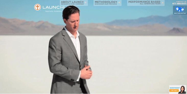
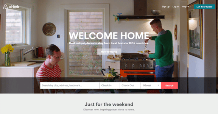
Piggybacking off of the “Bigger is Better” mentality, we’ve seen a lot of full width imagery appearing in sites as of late. There are many creative ways to implement this style that aren’t limited to just .jpg’s and .png’s. Video is playing a larger role as well, sometimes even replacing static images. Full screen background images and video was one of the major design trends of 2014, and will continue to play a large role throughout 2015. Some of the most appealing and creative examples of this are:
Through the use of a minimalist navigation and a lack of content clutter, the intro video is captivating and draws your attention. By cutting out all of the distractions, this company makes sure to convey their message effectively by drawing the focus to the video.
Again, here we see a clean simplistic layout with little distraction and an impactful video. Directly targeted at the traveler, the video drives home the essence of AirBnB with a personal connection that any visitor can understand.
As you can see, there are trends happening in the web design sphere that are producing some really creative ideas. Now, I’d like to take a minute to emphasize the fact that although these are trends, they are not meant to be absolute necessities. What's necessay is to note what they all do well and try to solve for those accomplishments. The examples above all:
-
Target their personas. Each of these examples knows who their audience is and uses each of these trends to further connect with them on a deeper level. First, this requires developing those personas. (If you need help developing buyer personas, this post on our Revenue River blog can help you out!).
-
Guide the visitor. Each site does a great job of guiding the visitor toward the content they have determined is most relevant. This also helps them guide their targeted personas down an intended path.
-
Organize for optimal information. None of these sites are overwhelming. They use styles like minimalism or grid based architecture to lay out their sites so as to not overwhelm the viewer. The information is presented in a clean manner that allows the website visitor to find what is important to them.
-
Use responsive design for friendliness across devices. This is nothing new, but none the less deserves a mention. It’s become an unwritten rule that your website must be mobile friendly. In addition to the new update from Google, which will affect your search engine ranking, you want to make sure you don’t sacrifice the user experience on alternate devices.
But I'm not done yet. What good would any self respecting blog post be without a "Top X of the Best Y" list? So without further ado, here are my top 5 greatest homepage designs for 2015:
My Top 5 Greatest Homepage Designs for 2015:
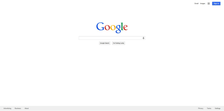
1. Google
Google is the quintessential example of persona driven design. Who are their targeting? Well, 1) just about everybody and 2) everybody who has a google account. The sole need Google serves is to produce the most relevant answers to any question. They have stayed true to this by refusing to clutter their home page with gobs of information like Yahoo and other search engine providers. This design is the most effective example of guiding users toward a desired action. They have literally removed any and all distractions, allowing the person to focus solely on their need: getting an answer for their particular question.
Then, for the secondary persona who uses Google accounts and services (which let’s face it, it’s still everybody), there are minimalist controls on top and bottom to discover additional features and functionalities. In this case, it’s ok they take a back seat to the primary objective. And, again, this secondary persona is familiar with Google accounts and doesn't need the direction a new user would need. Lastly, this design is easily (almost too easily) adapted to various resolutions and devices so the user experience is extremely consistent.
2. Spotify
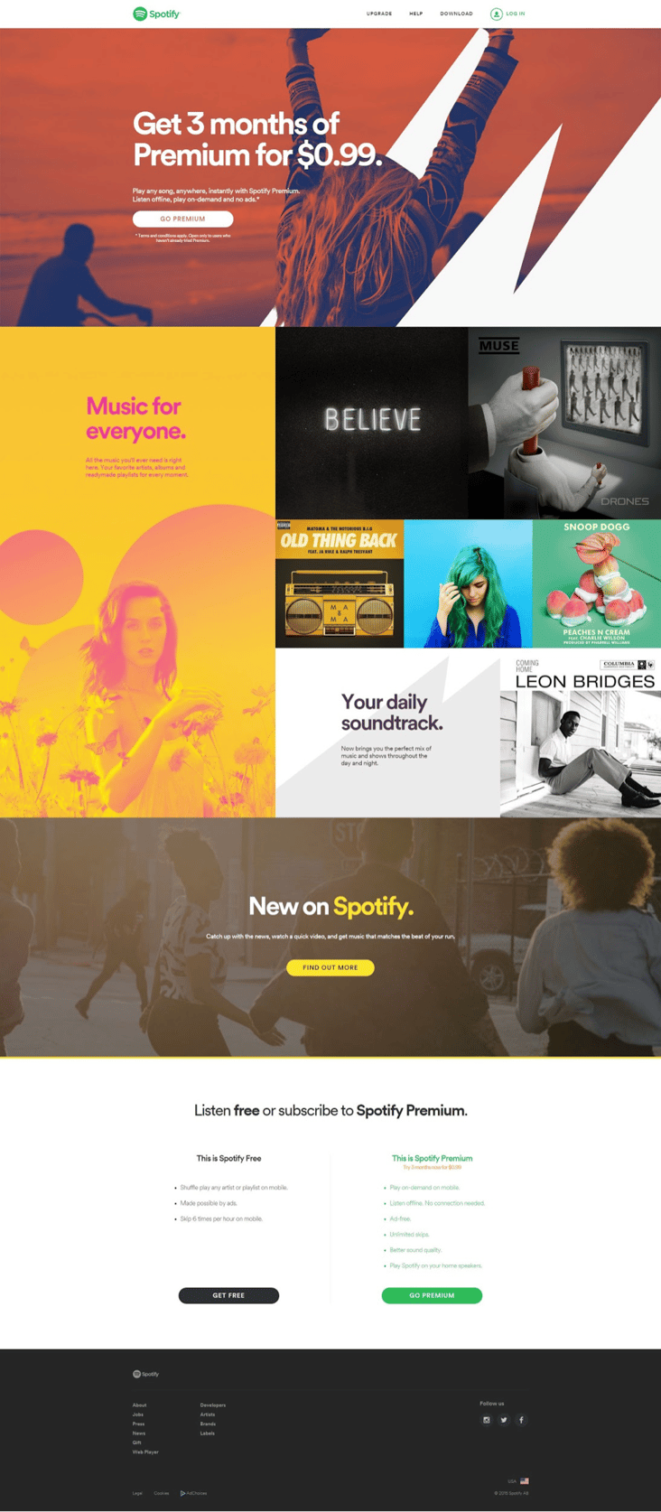
With the Spotify homepage, we see the convergence of many recent trends. First, we have the “Bigger is Better” rule in full effect with the main banner image and bottom of the funnel Call to Action that targets the persona of potential premium subscribers. As we scroll down we see a beautiful grid or modular layout that features what? MUSIC FOR EVERYONE! And then we see a variety of artists that can appeal to all tastes.
The grid layout is effective in keeping your visitors attention because natural curiosity leads most people to scroll further down to see what other features or boxes there are. This then leads to a very effective secondary call to action that targets the persona of new subscriber. Lastly, they end with a standard value prop that is presented in a clean, easy to digest manner.
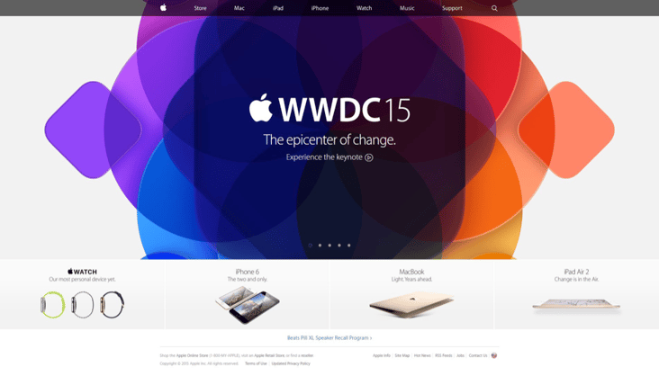
3. Apple
Apple has always had a reputation of presenting a clean and modern image. From their products to their website, Apple has set the standard. On their homepage, they pay close attention to the fold. Even with a large colorful image, they are still able to present all of their offerings without causing the user to scroll to see more info. How much easier could it be?
Apple fans are also considered to be fairly tech savy and on the cutting edge of new technology. The messaging on the main banner directly targets this persona and provides additional information in the form of a video. Notice the use of the carefully crafted “Experience” language as opposed to "Watch", "See", or "Download". Sexy Apple, very sexy indeed. And I think we can all assume that the maker of the iPhone and iPad takes careful consideration in the responsiveness of their website.
You might be thinking at this point, “Google? Apple? Spotify? What kind of list is this? Anymore Fortune 500 companies you got on here?” Actually, yes, but take a second to think about how much time, money, R&D, etc. these companies put into their marketing efforts. We can learn a lot from them as they are the most successful in their individual niches. But back on track…
4. Square
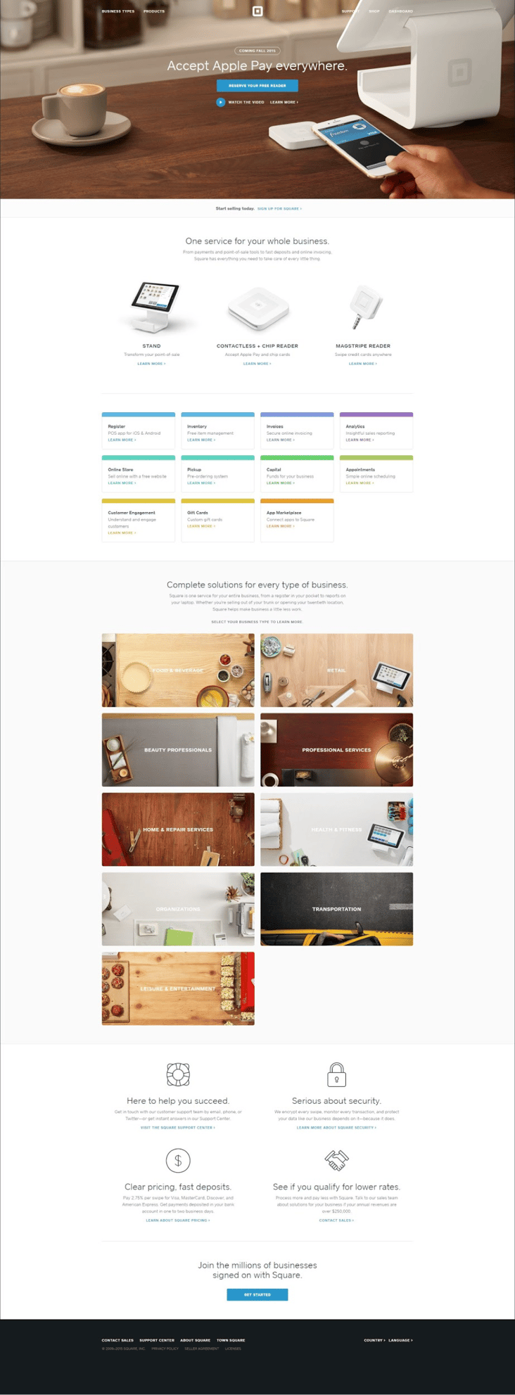
Arguably due to the influence of it’s big brother (hint: Twitter), Square follows in the same clean impactful design. Here, we’re dealing with a fairly complex concept of payment processing. There’s a whole lot of information surrounding Square and the services it provides, information the visitor likely doesn't understand. It would be very easy to crowd the page with 1,000s of facts, statistics, calls to action, and so on, but Square does a fantastic job at presenting all the information in an easy to digest fashion.
Through use of whitespace, the eye is guided through a sequential process which allows you to easily find the information you need. The structure of the page is organized in a way to present educational information at the beginning, followed by a very inconspicuous bottom of the funnel call to action. Further down the page you see very deliberate product positioning followed by a wealth of information. The color pallet for the resources allows the user to easily distinguish categories providing them an easier time locating the topic they are interested in.
As we continue, we see a very appealing grid of images targeting even more segmented personas based on industry. This is now the third opportunity to target a persona just on the first page. And each one considerably different than the preeceding image. Finally, we have the "consideration stage" content targeting the four biggest considerations for a potential client gathering info about new payment processing options. Clean, organized and visually appealing, Square does a great job on their home page.
5. Big Commerce
How could you not love the Big Commerce site? It has it all: full width imagery, clean layout, strategically placed calls to action and a guided user journey. Think about it. What is important to someone who needs an eCommerce store? They need to know it works. So, if you’re not automatically driven to sign up right away by the straight forward sign up call to action on the banner, you might scroll down. BOOM!! Reassurance that this company works. Well laid out images of successful store owners with testimonial to boot.
Not only that, but Big Commerce goes one step further by showcasing the success of their clients using well known corporate logos. This is directly targeting the owner persona. Ok, so it works, but what good is it if people can’t find you? With exposure on the top of mind, How can they attract customers? Big Commerce anticipated this, so we are hit with a visual and accompanying information about SEO and marketing services.
The page is essentially leading the visitor down the thought process of the high level important considerations of a new eCommerce store owner. You can see how they then lead you to thinking about design, metrics, and other important considerations that you may have not even thought of initially. Finally, they wrap up with a reassurance that you will be supported and can feel confident that you are not alone in this endeavor. This page hits on all the major aspects of a good home page and presents it in a beautiful, responsive fashion. Score one for the Big Comm designers!
To Sum it All Up...
All-in-all you can see trends in web design are constantly changing. Regardless of
|
Never neglect the fact that this website isn’t for you or your business. It's for your customers. |
what looks hot this season, there are constant underlying best practices that will make or break your website. So, maybe your homepage doesn’t have the most beautiful font choice in the world. Maybe you really want to use creative parallax scrolling (bonus honorable mention site for parallax scrolling is Jack Daniels Bar Stories. Definitely check this one out when you have time).
No matter how crazy or insistent your designers are, Never neglect the fact that this website isn’t for you or your business. It's for your customers. As long as you keep them at the forefront of your efforts, consider where and what they are viewing your site on, and make an effort to present your site in an easy to digest fashion, your homepage will be the most effective contributor to your overall site.
Do you have any homepage examples to share? Let us know in the comments!
